CDP Widgets Themes (SVG)
About
This chapter provides a brief introduction to creating custom themes and how to extend the default themes with additional elements.
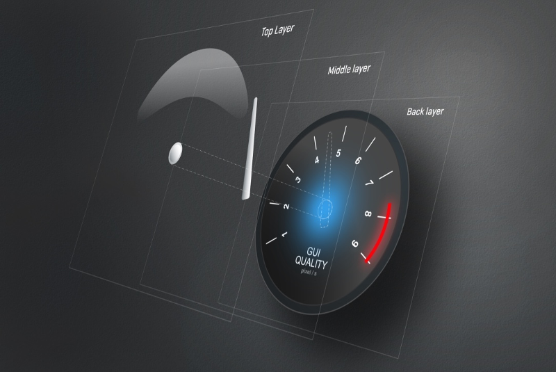
SVG
Scalable Vector Graphics (SVG) is an XML-based vector image format for two-dimensional graphics with support for interactivity and animation. SVG 1.1 is a W3C Recommendation and forms the core of the current SVG developments in Qt as stated in the the Qt documentation.
All SVG files within CDP widgets are in the SVG 1.1 format.
Note: Some features from SVG 1.1 are not be supported. Be sure to test your work carefully before deploying.
Where to find the svg details for each widget
The svg structure used to style the different widgets are described in the widget details. To find it while in the studio designer, select the widget and press F1. The svg styling is described in the detailed description of the widget (click on 'more' in the brief description).
Theme directory structure
The svg files must be placed within theme directories to enable switching of themes at runtime. Create a directory named themes next to the binary and add your custom theme directory within it. E.g. if you have a theme named sunshine the path will be themes/sunshine.
Note: Theme directories are recommended, but not required if you know that an application will never use a different theme.
Create new themes
To create a new theme and be able to switch between it and the existing themes, the full path of the existing svg files must be used. The paths are found by clicking on a widget in the form and browsing to the svgFile property in the property browser. As an example, the default svg path for buttons is :/themes/cdp_light/buttons/buttonPlain.svg. In a custom theme we would thus create our button svg at this path, but switch out the name cdp_light with the name of our theme.
The custom themes should be placed within the working directory of the application for the theme selector to find them. To locate this directory, open up the theme selector in Design mode by right-clicking the main widget and pressing "Select theme..." from the context menu. Inside CDP Studio this is likely to show the CDP Studio working directory. The themes can be placed there when working with the design, but must be copied to the Application directory or added to the application resources when deploying the application. Hence, it is probably better to add the themes in your application and use CDPBaseMainWindow::themeRootDir to ensure that the themes are found.
Note: When working on a project from different project locations, for instance when several developers are working on the same project, they must ensure that CDPBaseMainWindow::themeRootDir is correct before editing the form (.ui) files. If a project is saved without having the correct theme in place, this might affect properties like button text colors.
To see a preview of the theme in the theme selector, the custom theme directory must include a png file with the same name as the directory. The size of the png file should be 300px x 330px.
The existing theme source is available in the toolkits and can be copied and modified in CDP Studio projects. This is a good starting point for users that do not want to create everything from scratch. Manually copy the theme of choice from the following path:
<Installation directory>/toolkits/<architecture>/CDP-<version>/templates/themes
to the CDP Studio working directory as described a few lines back.
The current version of the GUI framework caches the SVG files, but as long as the file is not a resource, it will get refreshed by toggling the svgFile property back and forth. Note that the file is detected as a resource if the file name starts with :/ even when the file was loaded/cached from disk. Hence, make sure to remove this from path if wanting to refresh without restarting CDP Studio.
Theme files can also be placed within the project directory by using the property in CDPBaseMainWindow::themeRootDir. Press F1 on the property in design mode for further details.
When it's time to run the application, the theme files must be copied from the studio working directory into the application. The files can be placed in the Application root or they can be added using a resource file. If adding the theme files using a resource file, the user must ensure that the paths in the resource file are similar to having the theme in the application root. To ensure proper loading of resources in design mode we also need to set the themeRootDir as described in the previous section.
Where to configure what theme to use
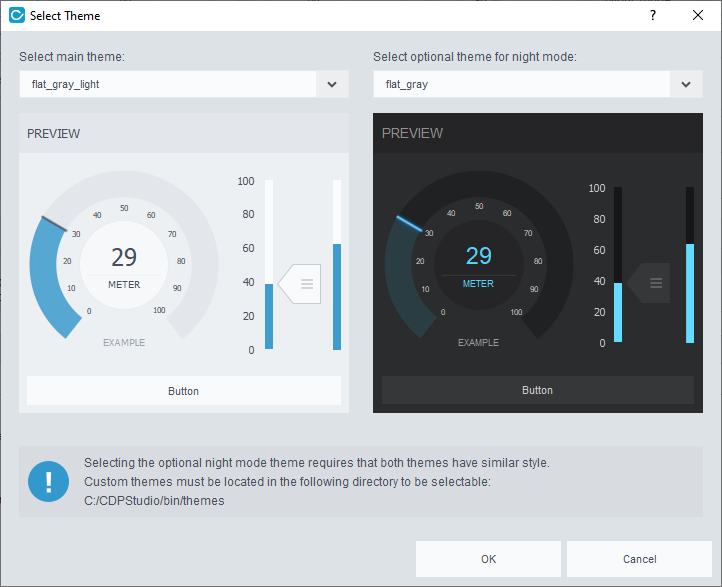
The CDPBaseMainWindow has two properties, themeNight and themeDay for selecting light and dark themes. These properties can be edited manually or by using the theme selector dialog. The dialog is available from the main window context menu as described in the Create new themes section. The dialog can also be launched in runtime using CDPBaseMainWindow::selectTheme.
Auto generated theme files
Some widgets, like CDPBaseComboBox, CDPBaseLineEdit and CDPBaseSpinBox, render svg elements to raster image files. The raster image files are stored in the default application data directory of the OS. Usually, the paths would be something like the following:
| Linux | Windows |
|---|---|
| /tmp/cdp/themes | C:/Users/<USER>/AppData/Local/Temp/cdp/themes |
Users can override the default path by creating a cdp2qt.ini file next to the binary and adding a variable named ImageSaveDir. Setting the variable to empty will select the working directory of the application.
ImageSaveDir=
Important Notes about Creating SVG
Tools
Adobe Illustrator (AI) is our preferred tool when working with vector graphics. Thus, most of the issues discussed in this chapter is in regard to AI. Users that want a free alternative tool should check out Inkscape.
CDP elements
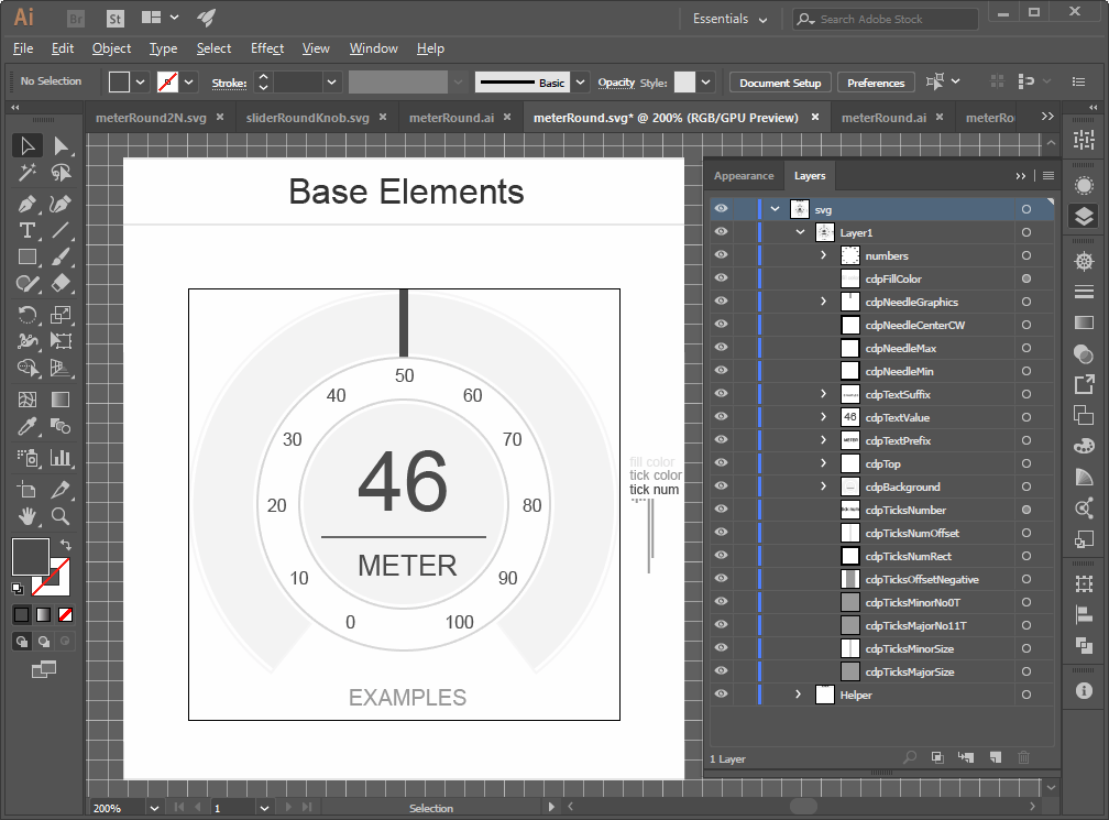
All elements that are to get parsed or painted by name are prefixed with 'cdp' (e.g. 'cdpBackground'). To enable the svg parser to get the original size of a CDP element, they should all contain a group with the actual graphics and a transparent rect describing the size of the group. The exception is when the CDP element itself is a rect.
cdpBackground    (element group)
 ├─── < Path >   (transparent rect/path)
 └─── < Group >  (background graphics)
Note that all elements in this chapter that are written within '<' and '>' can be given any name.
Unique element id's
All element id's must be unique across all layers. That means that if 'cdpBackground' is defined in 'Layer1' we cannot give an element in 'Layer2' the name 'cdpBackground'.
Tools like AI will add postfixes to elements to ensure that all names are unique. The postfixes will not show within AI. Hence, we have to be careful when copying and renaming elements.
The following explains how to reproduce the copy problem:
- Make a copy of an element named cdpText and note that the layer palette of AI now shows two elements named cdpText.
- Save the file as svg, open it in a text editor and note that one element is named cdpText and the other cdpText_1_.
- Delete the old element and keep the copy (the old element will usually show after the copy in the layers palette).
- Saving and opening the file in a text editor will show that the text element is named cdpText_1_. This will prevent some widgets to read the element as they look for fixed names.
To avoid the above problem, always make sure to rename, save and then rename back and save. This will ensure that the copy gets the correct name.
Blending modes
Do not use blending modes other than normal transparency.
Shadows and effects
Illustrator effects like 'Drop Shadow' can be exported to SVG. Note however, that shadow effects might change the size of the element. Specifically; when loaded from svg, the elements that have shadows will get the same size as they had in illustrator without shadows. Thus, the elements are actually smaller than drawn in illustrator. This will be a problem when drawing overlays as the overlay item wont match the size of underlying element.
Transparency
Transparency can be used as long as blending modes other than 'Normal' is avoided.
Hidden elements affect size
The size of an element in illustrator depends on the position and size of all its child elements. This also includes hidden child elements. Thus it is important to ensure that all elements are positioned within our transparent rect.
Text
When adding symbols or text to a graphical element it is usually a good idea to convert the text to graphics using the create outlines functionality in AI. This ensures that the elements will display correctly on all platforms.
Saving to SVG
All files in the current themes are stored with SVG Profiles set to SVG 1.1 and Image Location set to Embed. The latter avoids that we get separate files for shadows etc.
Also, make sure to set CSS Properties to Presentation Attributes. This is required for the widgets to parse properties like size, color and font.
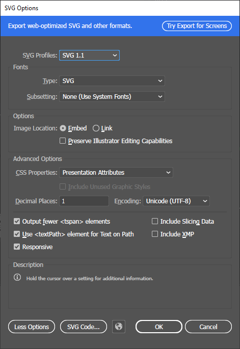
Note: Saving the file with wrong CSS Properties option, like Style Attributes, can be hard to detect as the file might still load. Check that this option is correct if experiencing wrong colors or other random problems.
General Theme
The general theme can be used to decide the global colors of a theme, like default text colors etc. It is currently only used by a few widgets and it can be overridden, but the user should know that it's there.
The general theme class contains static functions that can be used by any class for retrieving a custom look and feel for classes that are not styled by their own svg file.
The following tree view shows the svg structure of themes/cdp_light/general/theme.svg.
svg
└─── Layer1
  ├─── cdpFontColorUnit     (text)
  ├─── cdpFontColorMain     (text)
  ├─── cdpFontColorMainInv  (text)
  └─── cdpBackPixPath       (text)
The following table explains the named elements in more detail.
| Property | Type | Description |
|---|---|---|
| cdpFontColorUnit | text | The general font color on unit texts. |
| cdpFontColorMain | text | The general main font color. |
| cdpFontColorMainInv | text | The inverted version of the main font color (e.g. white if main is black). |
| cdpBackPixPath | text | Text containing the path to the main background. |
Get started with CDP Studio today
Let us help you take your great ideas and turn them into the products your customer will love.