CDP Studio - Analyze Mode Manual
Introduction to Analyze Mode
Control systems run functions in parallel and functions can be distributed over different applications running on different hardware units.
The Analyze mode allows you to plot any value in the system in real-time across all functions (components and operators) and applications regardless of the hardware distribution.
This enables a system-wide overview and analysis of the system. Being able to see value changes in relation to each other in real-time is paramount when testing and fault finding for developers and service engineers.
Several values can be plotted in a single graph and in multiple graph windows.
There is a seamless integration of real-time and historical data and historical data can be plotted off-line.
The plot setup and configuration are automatically stored with the project and reloaded for ease of use.
Overview of nice to know functions
| Feature | Description |
|---|---|
| Autofit x-axis | Action button “<->” autofits the x-axis for multi-variable plots |
| Autofit y-axis | Action button “vertical line” to Autofit the y-axis |
| Precise axis scaling | Click on the maximum number and type the new max value (x-axis: seconds, hh:mm:ss.ms or use units) |
| Quick zoom | Select the axis and use the mouse scroll wheel (default x-axis) |
| Box zoom | Ctrl-left click and drag |
| Undo zoom | Right-click |
| Alias names in legend | Right-click on legend name and select "Set Alias…" |
| Line color | Right-click on legend name and select "Set Color…", or click on the color symbol to change it |
| Pan plot | Left-click and drag (pause plot is automatically enabled) |
| Rename plot title | Click on title name |
| Rename tabs | Double-click on tab name |
| Undock graph | Click-drag-drop the graph tab |
| Hide legends | Click the dotted button in the upper-right corner of the page and uncheck "Show Legend" |
| Resize legends | Click and drag the right edge of the legend to adjust its width. |
| Reset legend width | Click the dotted button in the upper-right corner of the page, then select "Reset Legend Width" |
| Fixed height | Click and drag between the graphs to adjust to a fixed height |
| Hide x-axis | Click the "cog-wheel" action button and uncheck "Show Timeaxis" |
| Reorder graphs | Click and drag the graphs using the dotted area to the left of the graph title |
| Move graphs between tabs | Similar to reordering graphs, but begin by dragging them to the desired tab button |
| Hide headers | Click the dotted button in the upper right corner of the page and uncheck "Show Header" |
| Lock headers | Click the "cog-wheel" action button and select "Lock Header" to ensure it always displays |
| Reveal headers | Hover over the top of a graph to temporarily reveal its hidden header |
| Boolean View | To configure the graph for boolean viewing, hold Ctrl and double-click either the legend or the top of the header. This option is also accessible via the "cog-wheel" action button by selecting "Boolean View" from the menu. |
| Move signals between plots | Click and drag the signal label to the target plot |
| Copy signals between plots | Click and drag the signal label, but hold down the Ctrl key upon release |
| Event List | Toggle by clicking the dotted button in the upper-right corner of the page and selecting Show Events |
| Event Beams | Click the settings button (cogwheel) and select Add Events to display events in the graph |
| Full routing | Press Ctrl while hovering to show the full value routing in the cursor display box |
Specific plot configurations can be saved and loaded; plot data can be saved to CSV format and loaded to view historical data or view offline.
Analyze Mode
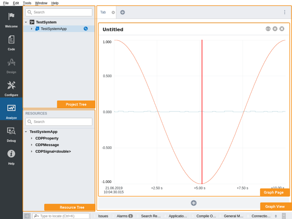
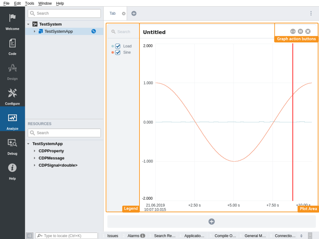
The Analyze mode consists of a Graph view, a Project tree and a Resource tree. The Graph view can contain several Graph pages. Graph pages can be detached from graphview and opened in separate windows.
In Analyze mode you can plot any resource value in your system. To see realtime values, the system must be running and connected to CDP Studio. When offline, you are still able to set up the graphs, but the values won't update until you are connected to the system.
Each Graph consists of a Legend and a Plot area. The Legend shows the value name and its corresponding plot colour. The Graph visualizes the values in a given time window. Each Graph has autoscale, pause/resume and close action buttons.
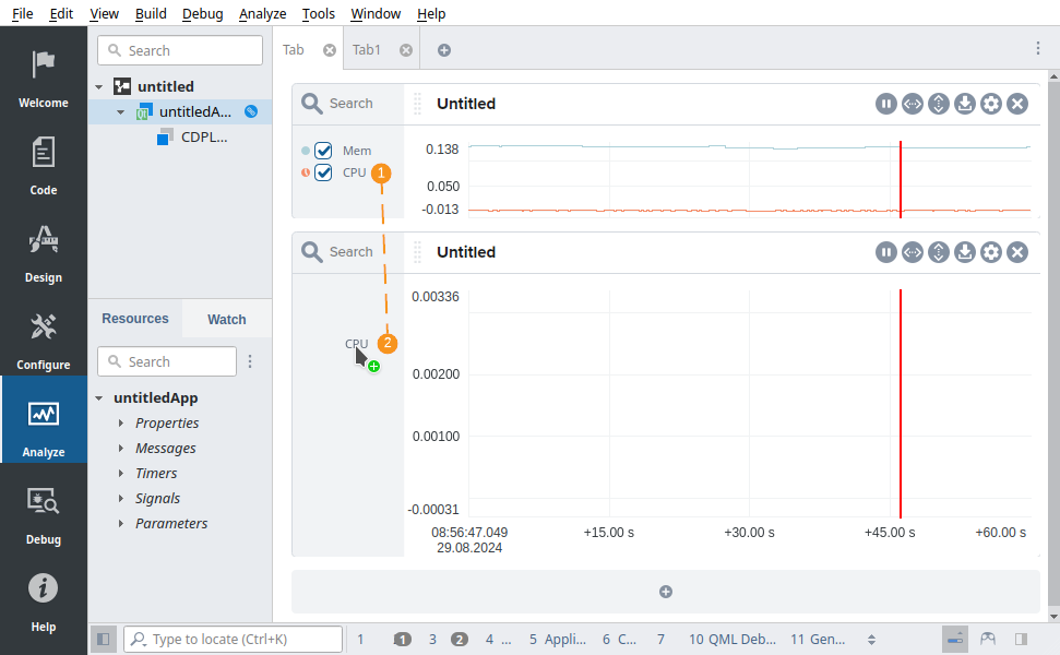
Adding Items to Graph
The items to plot can be selected from the Configure mode or Analyze mode.
To add an item from Configure mode:
- Open Configure mode
- Navigate to the item in the Block Diagram or Table Editor
- Right-click on the item and select “Add to plot...”->”<tab name>”->”<Plot title>” (e.g. “Add to plot->Tab1->Untitled”)
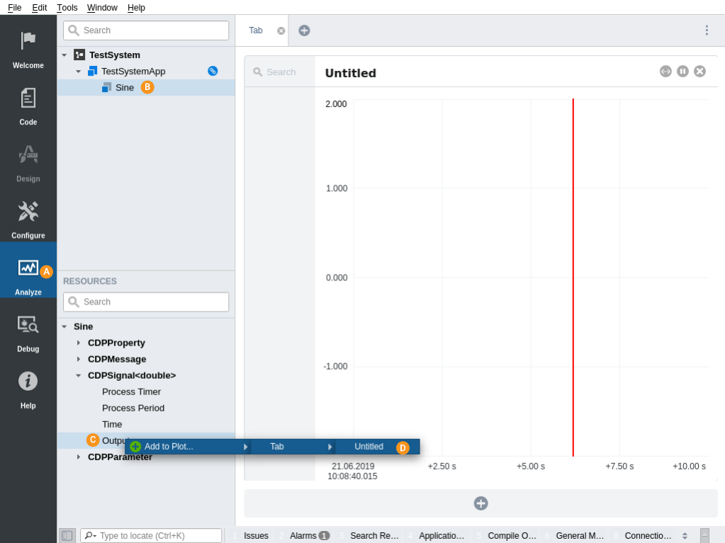
To add an item from Analyze mode:
- Open Analyze mode
- Select a component from Project tree to analyze
- Right click on a value from Resource tree
- Select Add to Plot... from the context menu
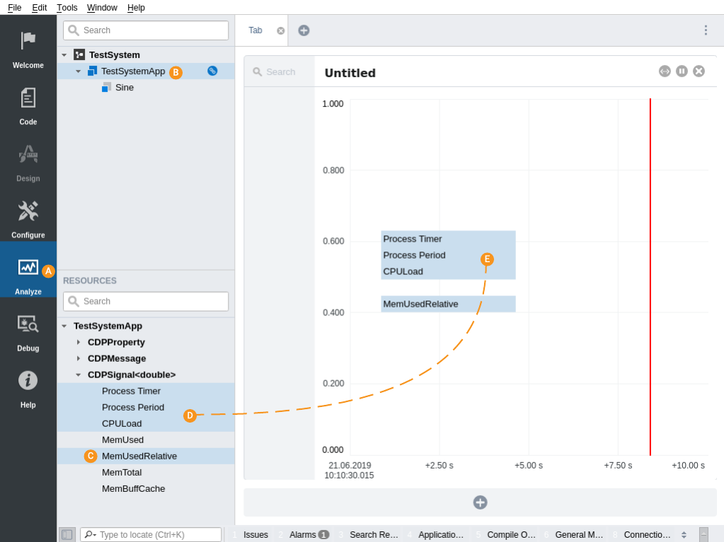
To add multiple items to a Graph:
- Open Analyze mode
- Select a component from Project tree to analyze
- Select multiple resources while holding down Ctrl or Shift key
- Drag resources into the Graph and
- drop them.
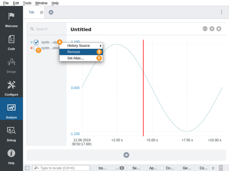
Altering Items in a Legend
To remove the resource from the Graph:
- right-click on the resource name in the Legend
- select "Remove"
Each item can also be temporarily hidden using a checkbox in front of a resource name in the legend.
An alternative text (alias) can be set to be shown in legend instead of the default name by selecting "Set Alias...". Setting an alias to empty restores the default name on the legend.
To select a custom color for a curve, which will be displayed both on the plot and in the legend, use the "Set Color..." option, or click on the color symbol to change it.
Show and Hide the Legends
The graph legends can be shown or hidden in the following way:
- Click on the options menu

- Select the Show Legend menu item:
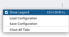
The legend can also be toggled on or off by using the key-combination assigned to this action (default 'Ctrl+Shift+L').
Note: The Show Legend preference is stored as a global setting whenever it changes.
Resize the Legends
The legend width is a global setting shared across all graphs. It can be modified by clicking and dragging the right edge of any graph legend to the desired width.
To revert the legend width to its default behavior, where it adjusts dynamically with the graph's dimensions, navigate to the global options menu (accessible via the three-dot icon located in the upper-right corner of the page) and select "Reset Legend Width" from the context menu. If this option is unavailable, it indicates that no fixed width has been applied.
Undocking the Graph page
To open a Graph page in a separate windows drag and drop the tab of the Graph page out of the tabbar.
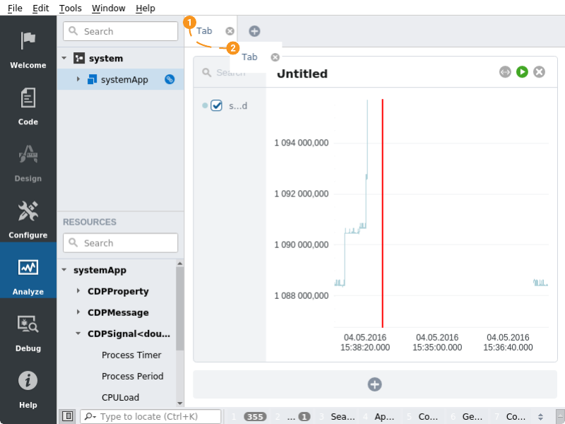
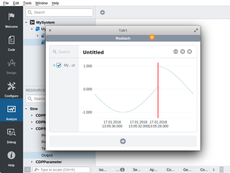
To reattach the Graph page click the "Reattach" button.
How to Scale the Axes
To scale the graph axes, use the Auto-fit x-axis and Auto-fit y-axis buttons or enter values directly, see Precise Axis Adjustment. It is also possible to use the scroll wheel on your mouse. You may first click at the x-axis and/or y-axis to select which axis to scale. Move the mouse cursor into to graph-area before using the scroll-wheel on the mouse to scroll the selected axis. If none or both axes are selected, both axes will be scaled. By right-clicking in the graph, you will undo the last scaling.
Scaling done on the x-axis (time) will affect all plots/graphs in the current Tab.
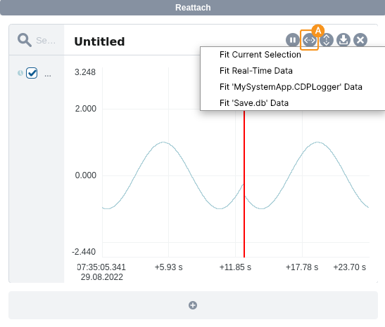
Auto-fit When Multiple Data Sources Are Available
Sometimes multiple data sources are available for plotted values. The source can be real-time data when connected to the system but also data from a logger in the system or a previously saved plot. See the Historic Data page for details about logging, saving and loading plot data.
In this case, clicking the Auto-fit x-axis button will pop up a menu asking which data source to use for scaling the horizontal axis. The Fit Current Selection will fit all data from current active data sources to the plot area. Selecting any other option will first activate this data source for all plotted values and then scale to fit all data from that source.
How to Zoom in the Graph
By holding the Ctrl-key while dragging the mouse over the wanted graph-area, you will block-zoom the marked area. This can be done several times to zoom into details. By right-clicking in the graph, you will undo the last zooming.
Note: If an axis is selected, zooming will be restricted to that axis.
Precise Axis Adjustment
The minimum and maximum values of the y-axis can be set by clicking on them: To set the maximum value for the y-axis, click on the topmost axis-value. The whole text becomes selected. Type in a new value, and hit Enter. The maximum value will now be set to what was typed in.
Similarly, selecting the bottom y-axis value makes it possible to set the minimum value.
Note: The Tab key will toggle between selecting the minimum value and the maximum value once one of them is selected.
The x-axis start-time can be set by clicking it and typing in the time in the time-format hh:mm:ss.ms. The date can be changed in a similar way; select it and type in the wanted date.
The x-axis range can also be adjusted by clicking the rightmost label and typing the wanted timespan. Values are in seconds if unit is omitted, otherwise the following units can be used:
| Unit | Description | Example |
|---|---|---|
| ms | milliseconds | 30 ms |
| s | seconds | 10 s |
| min | minutes | 42 min |
| h | hours | 3 h |
| d | days | 4 d |
The plus sign can be omitted when inserting values. Spaces between a value and unit is ignored, so 1h and 1 h is interpreted as the same.
How to Pan the Graph
You can click and drag the graph to pan it to any direction.
When you drag the graph to the right, the graph will also automatically pause.
To resume the graph, press space or click at the resume/play button in top right corner.
Rename Tabs
Tabs can be renamed so they are easier to find. To rename a tab, either double-click the text in the tab, or right-click the tab and select 'Rename Tab' from the context-menu.
Save and Load Tab Configurations
Tab configurations can be saved and loaded from the options menu . By selecting Save Configuration, all the current tab configurations can be stored to a single file. A single tab configuration can be saved by right-clicking the tab and selecting Save Tab Configuration. A previously saved tab configuration file can be loaded by clicking the options menu and selecting Load Configuration.
Extracting/Saving Data
The Analyze mode is capable of exporting data to CSV format and CDP Compact Datastore format. See the Historic Data page for details.
Viewing Historic Data
The Analyze mode is capable of showing historic data if the system contains a logger or by loading CDP Compact Datastore file. See the Historic Data page for details.
Hiding the Time-Axis and Adjusting Graph Height
Instead of combining values of varying data types in a single graph, using multiple graphs with different scales is recommended. This prevents signal overlap and ensures accurate scaling. Boolean signals require less vertical space than analog ones; allocating reduced height to boolean graphs allows for a better representation of analog data nuances. This approach enables a distinct display of each signal without overlap, facilitating clearer analysis and interpretation.
Click between the graphs and drag to adjust to a fixed height. To get back to automatic height, click the settings button (cog-wheel) in the graph header and uncheck the "Fixed Height" sub-menu option.
To further maximize vertical space, hide the time-axis labels for each graph. The graphs displayed within the same tab will show using identical x-axes; only one is needed to see the range. Hide the time-axis labels of a graph by clicking the settings action button and deselecting the "Show Timeaxis" sub-menu option.
Graph Reordering and Moving between Tabs
To reorder the graphs, click and drag them using the dotted area to the left of the graph title. Dragging to a different graph will display target position using a blue rectangle. Releasing the mouse will move the source graph to this location.
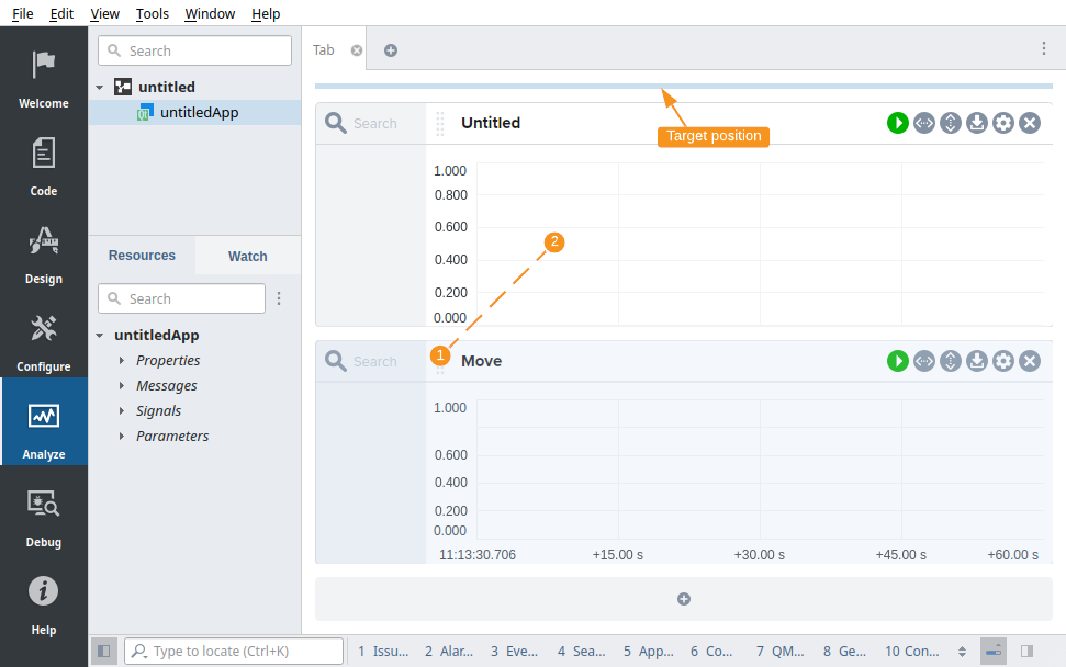
Moving to a different tab is done by dragging the graph across the desired tab button and then to a target location.
Pressing Esc on the keyboard while dragging, or releasing the mouse on an invalid location, will abort the move operation.
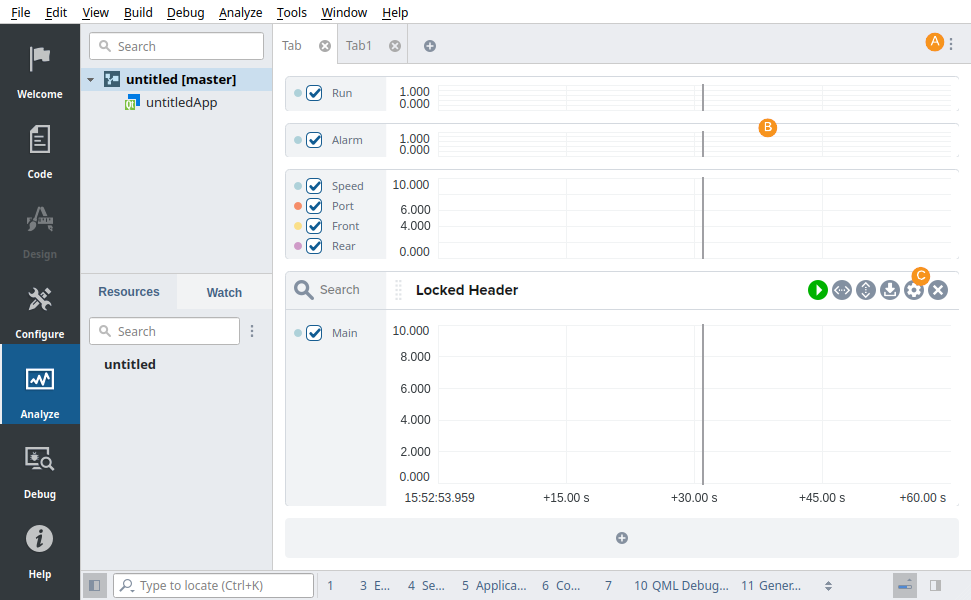
Hiding and Showing Headers
The graph headers can be hidden, revealed on hover, or locked to always show:
- Click the dotted button and uncheck "Show Header" in the context menu to hide all graph headers.
- Hover over the top of the graph to temporarily reveal a hidden header.
- Click the settings button and select the "Lock Header" option to always display the header (even when the global "Show Header" setting is disabled).
Moving and Copying Signals between Plots
To move a signal from one graph to another, click and drag the signal label from the legend to the desired plot and release the mouse button.
Hold down the Ctrl key while releasing the mouse button to copy a signal instead of moving it. The mouse cursor will change to indicate whether you are moving or copying the signal.
If you want to avoid copying the historical data associated with the signal, hold down the Shift+Ctrl keys while releasing the mouse button.
To move a signal to a graph in a different tab, drag the signal label over the tab button of the desired graph and then move it to the target plot.
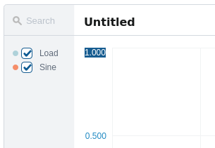
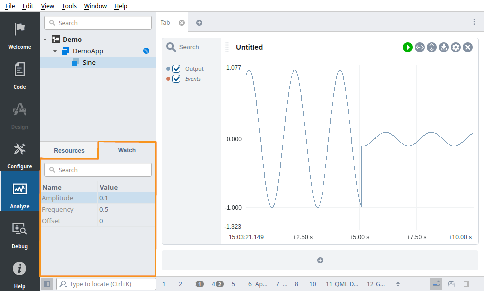
Watch List
In many cases, it is useful to adjust configuration parameters while simultaneously observing their effect in the plot. The Watch list, located in a tab alongside the Resource tree, allows for this type of workflow by supporting both monitoring and modification of values.
For example, you can adjust a control parameter in the Watch list while observing the corresponding signal response in the plot view, making it easier to fine-tune system behavior in real time.
Objects are added to the Watch list in CDP Studio Configure mode, by dragging the object names from the tables to the Watch list, or by right-clicking the names and using the context menu.
In the following example we control the Amplitude of a Sine using the Watch list while observing its Output in the plot:
Boolean View
The Boolean View option configures the graph for optimal display of boolean values. It reduces the graph's height, hides the time axis, ensures the header is unlocked, and sets the appropriate minimum and maximum values.
To configure the graph for boolean values, hold Ctrl and double-click the legend or the top of the header. Alternatively, you can access it via the "cog-wheel" button by selecting "Boolean View".
In the image below, the top three graphs show boolean signals, while the bottom graph contains an analog signal for comparative analysis. This setup is typical for analyzing boolean events alongside analog data. Displaying all signals in one graph would make it difficult to differentiate boolean values.
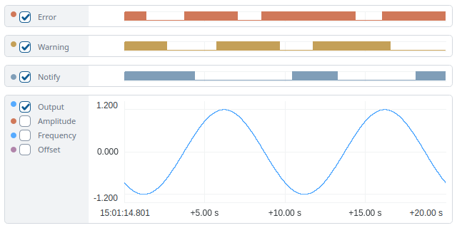
All headers are hidden in this example, as detailed in Hiding and Showing Headers.
Press Ctrl while hovering to toggle between full and short names in the cursor display box.
Events
CDP Studio Analyze mode supports visualizing events in two complementary ways: as vertical lines directly in plots, and as a synchronized event list below the plots. This allows you to correlate signal data with event activity for more effective analysis.
Display Events in Plots
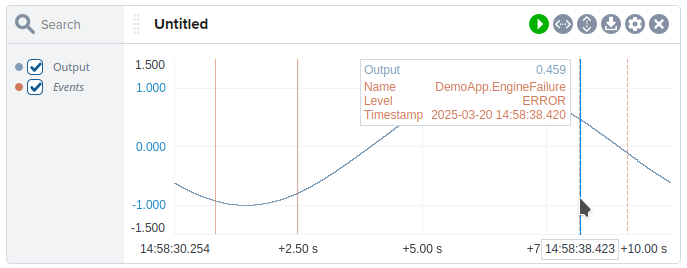
To enable this feature, you must add a special legend item (event plotter) for each plot that should display events, as described below. Once added, the Events item appears in the legend and can be used to toggle visibility or change color, just like regular legend items.
- Click the plot settings button to open a context menu.
- Select Add Events to add an event plotter and display vertical lines for each event.
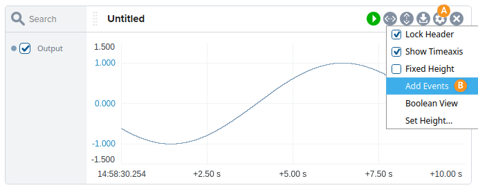
- Alarm events are shown as solid lines when set and dashed lines when cleared.
- Hovering over an event line displays its details, as illustrated in the image.
Display Event List and Select Events
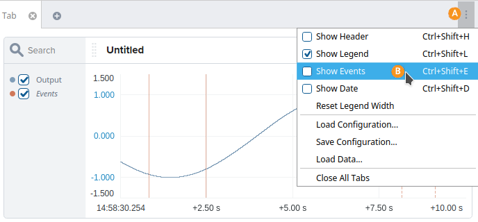
For additional context, each tab in CDP Studio Analyze mode can display an event list synchronized with the plots' time axis.
- Click the global settings button in the upper-right corner of the tab.
- Select Show Events to display the event list below the plots.
Clicking on events in the event list will select them and highlight them as bold vertical lines with labels in the plot.
- When an event is selected in the event list, it appears in bold with a title in the plot.
- When unselected while other events are selected, the event is toned down to indicate it is inactive.
- Selecting an event in the event list triggers the selection and highlighting of the corresponding event in the plot.
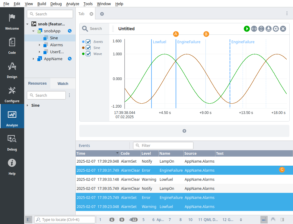
The filter box above the event list filters out all event rows that do not contain text matching the provided filter string. All columns are included in the search, allowing filtering based not only on the event name, but also on fields such as event text, timestamp, or level.
Get started with CDP Studio today
Let us help you take your great ideas and turn them into the products your customer will love.