Block Diagram
Block Diagram
Block Diagram shows a visual representation of the system or configuration and gives a good overview. Systems can be built in the Block Diagram by adding components/blocks and creating connections.
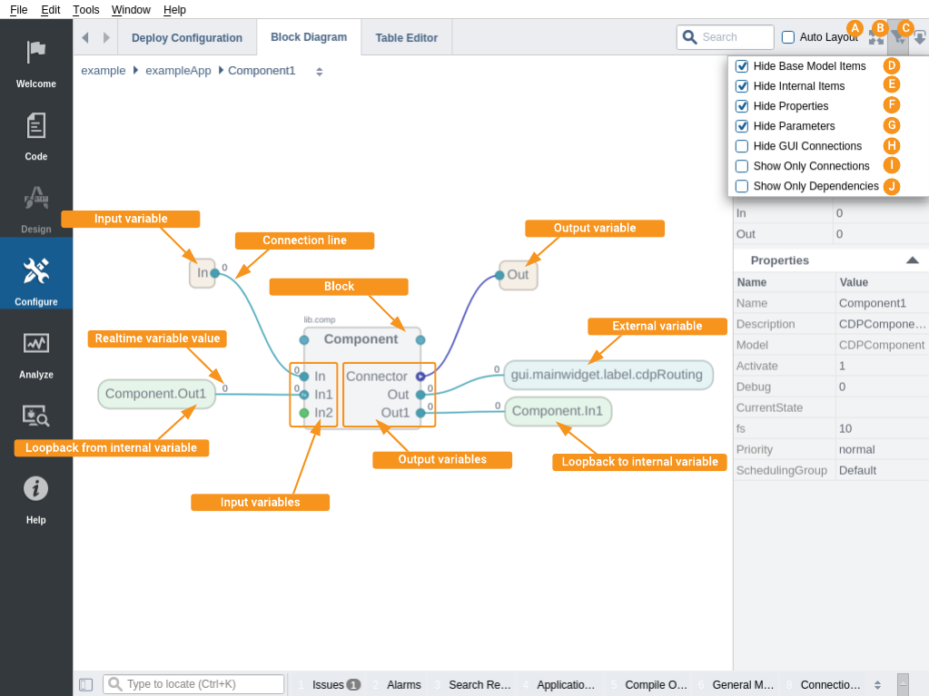
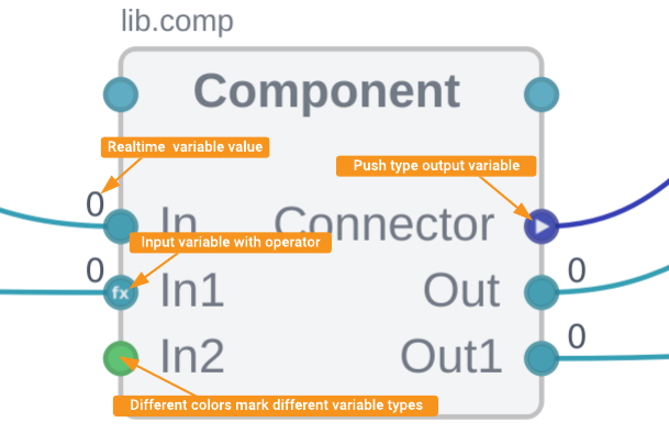
Default setup shows components (non-value items) as blocks. Signals, connectors, parameters, ports etc (value items) are shown as inputs/outputs on the block. Different colors mark different item types. To simplify the overview, only signals, connectors and ports are shown by default. The routing between blocks are shown as connection lines. The inputs to the block are shown on the left and outputs on the right.
When a connections source or destination (sink) is outside the current level, the connection line starts or terminates with a External variable label. The connection label displays the block name where the value(s) are used. To view these specific values, hover over the connection line for the tooltip.
Connections are drawn from left to right and for connections that cannot be drawn in this direction Loopback labels are used. Loopback labels always come in pairs. The loopback labels are used to avoid having back loops that clutter the diagram. The order of components/objects in their tables decides which connections will use Loopback labels. This is due to the fact that in CDP the processing of components depends on the order they are listed in sidebar. Connections that are made in the same direction as the processing order can be processed in the same cycle. The connection that go in the opposite direction require a separate cycle for each connection in the reverse direction.
It is possible to use manual layout by simply unchecking the Auto Layout checkbox or by dragging components to desired position. You can always click Fit In View to get the whole layout centered and as big as possible. While being in manual layout mode, make sure the component/object order is optimal for data propagation and if needed reorder the components/object in the sidebar. This can be done simply by dragging components/objects in the sidebar up and down. Notice that once auto layout is checked again, all manual layout changes are lost.

Navigation
To view a specific Component's configuration, select it in the Project tree. To navigate into a block in the Block Diagram, double-click on the block. To navigate out from the block, double-click on the background. To navigate into an Input or Ouput on a block, double-click on the Input or Output pin. It is also possible to navigate to a connection line sources or sinks by double-clicking on the labels representing the sources and sinks.
Changing Properties in the Sidebar
Properties for the currently selected object can be changed in the sidebar. Double-clicking on an object Name in the sidebar will navigate into that object (if possible). To change a value, click in the Value column and make the wanted change. For editable objects, it is also possible to change its Model; Please see How to Change the Model for more information about this.
Creating and Deleting Components and Connections/Routings
Components (blocks) are added from the Resource tree by drag-and-drop or right-click a component and select Add.
The Connections can be created in the Block Diagram by simply hovering over an output, left-click and then drag the mouse pointer to the input of the destination (sink) block.
To make a connection between two blocks on different levels (not in same view), right click on the output, select Copy Path, navigate to the destination block and right click on the input and select Connect....
There is also a way to pin/unpin blocks for easier connecting between different levels. Just choose Pin from block context menu and the block will be present in every view. To unpin use the pinned block context menu or select Unpin All from backgroung context menu.
Deleting an item, simply select the block/line and press Delete on the keyboard or right click and select Delete....
Filtering
By default, some items (nodes) displayed in Block Diagram are filtered out. To toggle filters, do the following:
- In the Configure mode toolbar click on the filter icon.
- Hide Base Model Items filter. This hides all nodes that are inherited from node's base model except nodes having Important flag (or DisplayHint="Important" in model).
- Hide Internal Items. When enabled, nodes having Internal flag (or DisplayHint="Internal" in model) are hidden from tables.
- Hide Properties. When enabled, Property type values are not shown as Outputs on blocks.
- Hide Parameters. When enabled, Parameter type values are not shown as Input/Output on blocks.
- Hide GUI Connections. When enabled, connections to GUI forms are hidden.
- Show Only Connections. When enabled, when both Input and Output are unconnected that variable is hidden on blocks.
- Show Only Dependencies. When enabled, only single connection line will be shown between any two blocks to indicate dependency.
Notation
Some inputs/outputs might have special badges to display additional information about them.
- Push badge means data is pushed instead of pulled.
- Fx badge means the item has operators inside.

Get started with CDP Studio today
Let us help you take your great ideas and turn them into the products your customer will love.