How to Create Adaptive GUI
It's beneficial to read through the visual introduction in the design mode manual before continuing.
About
The following sections discuss how to use layouts and configure scalable GUI that looks good on both mobile and laptop screens.
Adding Simple Layouts
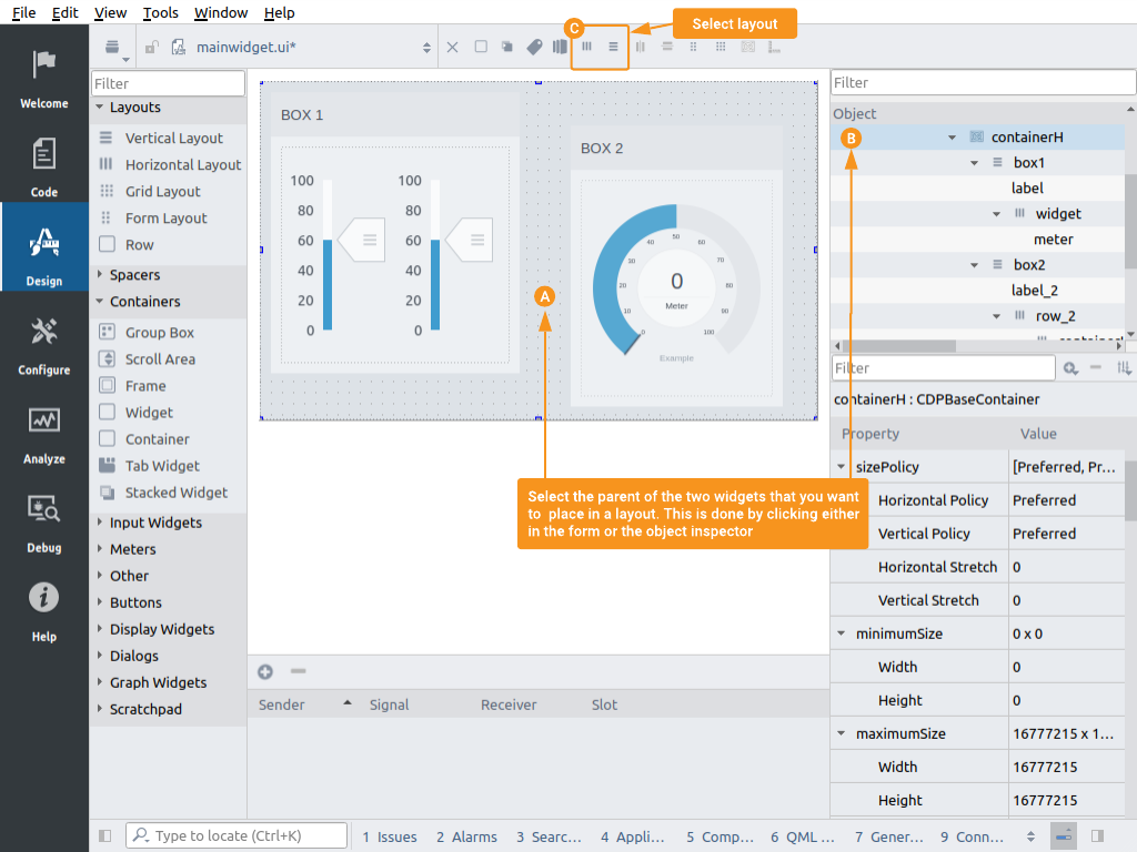
Add widgets to a layout by clicking the parent widget and selecting layout.
In Design mode, the best way to add layouts is first to drag widgets into the container/widget where you want a layout, then select the container/widget by clicking it in the form or the object inspector . The next step is to select a layout from the layout box located above the form in design mode .
Most users will never use anything from the layout box other than the horizontal and vertical layouts . The icons for the two layouts are horizontal and vertical lines. When added to a widget, the same icons will show on the widgets in the object inspector panel.
After adding a layout to a container/widget, a new set of properties will be available for controlling its margins and the spacing between child elements. Click the container/widget in the form or the object inspector and the properties should show at the bottom of the property panel.
| Property | Description |
|---|---|
| layoutLeftMargin | Margin to the left. |
| layoutTopMargin | Margin at the top. |
| layoutRightMargin | Margin to the right. |
| layoutBottomMargin | Margin at the bottom. |
| layoutSpacing | Spacing between the elements inside the layout. |
See the first sections of the tutorial in How to Use Meter Widgets in HMI GUI for a detailed demonstration.
Widget Stretch in Layouts
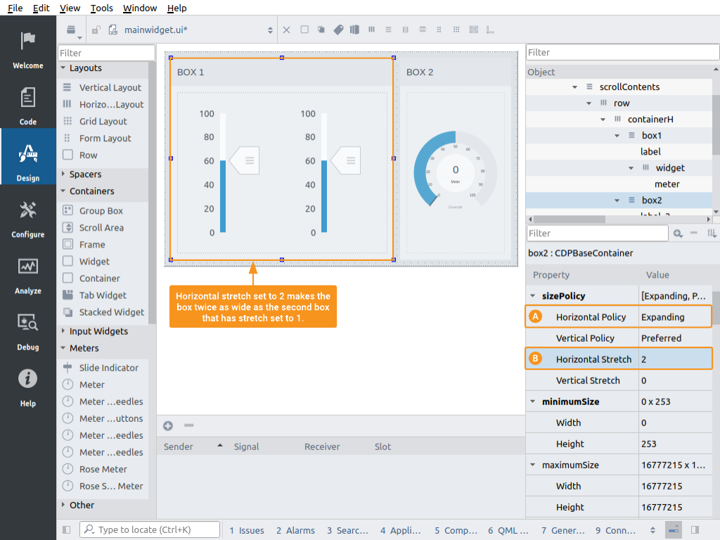
Two containers in a horizontal layout, configured to expand with stretch set to 2 and 1.
When a layout has been added we need to decide how the widgets should behave when the size of their parent container/widget is changed. Should all widgets expand/shrink along with the window? Should some expand more than others? Should some elements keep their size no matter the size of the container? You can configure these settings on the different widgets in the layouts. Click on a widget to configure the following properties.
| Property | Description |
|---|---|
| sizePolicy | This property includes settings for policy and stretch in both horizontal and vertical directions. Use the policy to decide if and how the widget should be stretching, and use the stretch factor/number to decide how much it should be stretching compared to the stretch factor/number in the other layout widgets. As an example, consider having two widgets in a horizontal layout. We want both widgets to expand when the window size is increased. Thus, we set the Horizontal Policy on both widgets to Expanding . Now, if we want one of the widgets to increase twice as much as the other, configure that widget with Horizontal Stretch set to 2 while the other widget is configured with stretch set to 1. |
| minimumSize | Some widgets might be hard to read if they get scaled below a certain size. If this is the case, it is a good idea to use the minimumSize property and set the lowest size that makes the widget usable. |
| maximumSize | If at some size it does not make sense to keep expanding a widget, it might be a good idea to set its maximum size to allow other widgets to make better use of the available size. |
Use Row to Switch Layout Depending on Window Size
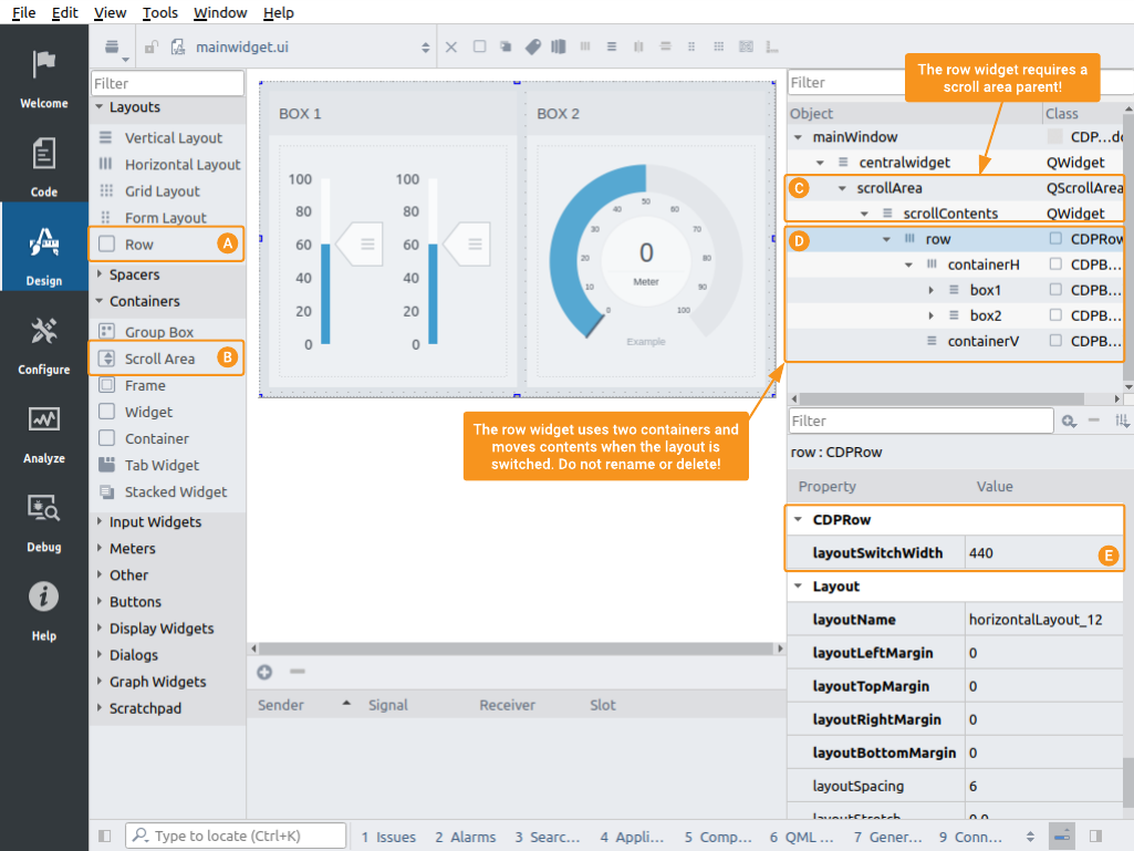
Boxes placed in Row widget - window size adjusted above layoutSwitchWidth to show horizontal layout.
Adaptive GUI that should run on both mobile and desktop screen sizes might require a horizontal layout (row) to switch to vertical (column) when the screen size is below a certain width. This is handled using the widget named CDPRow, showing in the widget panel as just Row . This widget has a property named layoutSwitchWidth where you can specify the width at which the layout will switch from horizontal to vertical layout.
The developer has to be aware that the height of the widget will change when the layout is switched to vertical, and should thus make sure that the page displaying the row contains a QScrollArea . The QScrollArea is named "Scroll Area" in the Design mode widget panel.
Test All Row Layouts in Design Mode
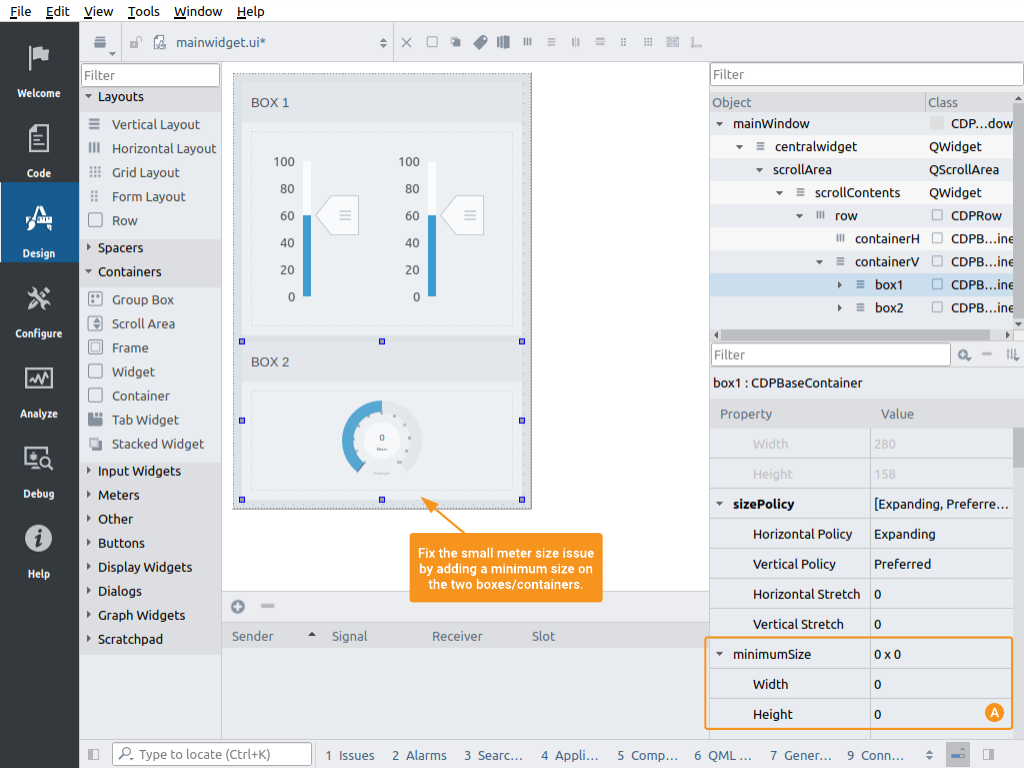
Boxes placed in Row widget - window size adjusted below layoutSwitchWidth to show vertical layout.
The row widget has two separate internal containers for the two layouts. This enables having separate margins and spacing in vertical and horizontal layouts, and allows the developer to switch between the two in the design mode while designing the GUI. In the above image, we have adjusted the form/window size below the layoutSwitchWidth to test how it looks in a vertical layout.
We notice that the height of the meter/gauge in the second box is now too small to make the meter readable. To solve this, we can adjust the minimum height of either the meter or the entire box . Usually, it is a good idea to set the same minimum height on all boxes in the page.
Use Rows Inside Rows to Tune the GUI
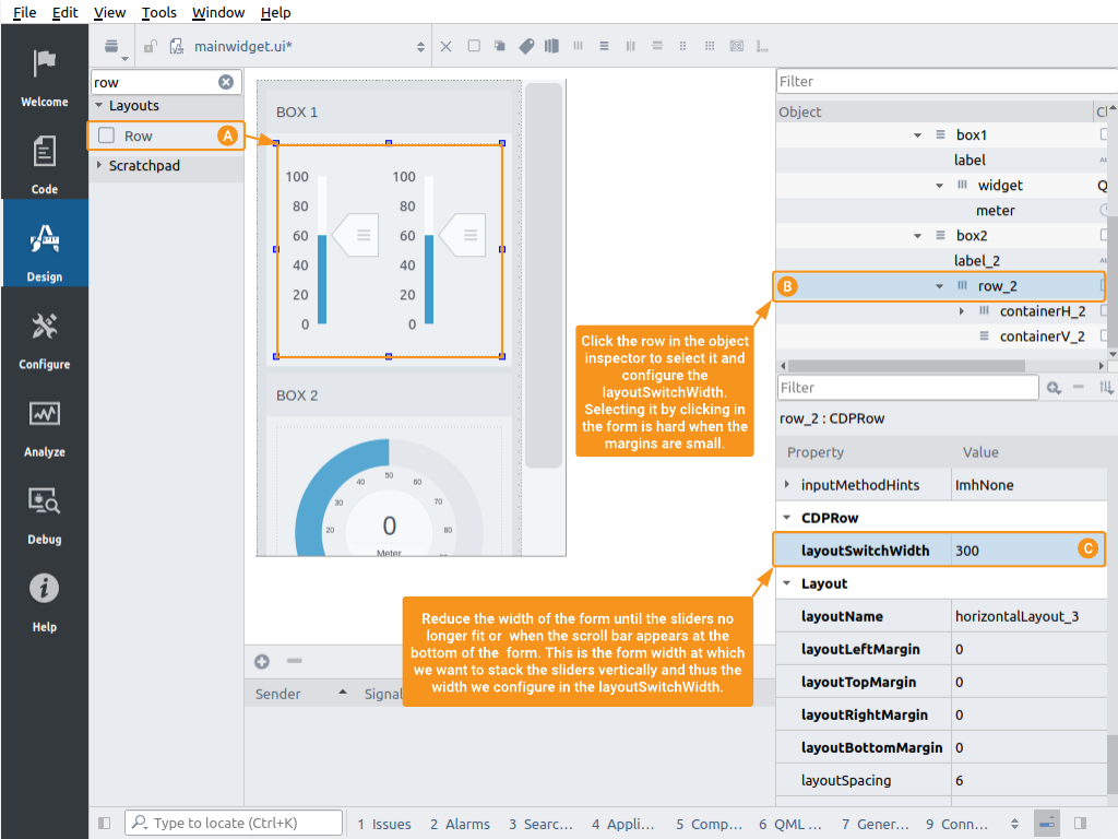
Row placed inside Row to also make the sliders stack vertically (and avoid scroll bar) on tiny screens.
To support all kinds of screen sizes and make use of all available space, we need additional Row widgets inside row widgets. The child row widgets will usually have different layoutSwitchWidth than their parent row.
The above example shows the steps in making the sliders in the top box stack vertically when the window width is too small to show them horizontally. First, we need to drag in a new Row from the widget panel and move the sliders into it using ordinary drag and drop . Then, click somewhere inside the row and use the object inspector to select the row widget parent and not its children . We can now edit the layoutSwitchWidth in the property panel .
The easiest way to find the perfect width to make the switch, is to adjust the width of the form until there is not enough space for the sliders or the horizontal scroll bar at the bottom appears. Check the width of the form at this size and you can set that as the layoutSwitchWidth.
Note: To center the sliders horizontally when showing in the vertical layout; first, adjust the form width to trigger the vertical layout. Then, right-click on the sliders to open the context menu and select "Layout Alignment > Center Horizontally".
Hide and Show Elements Based on Window Size
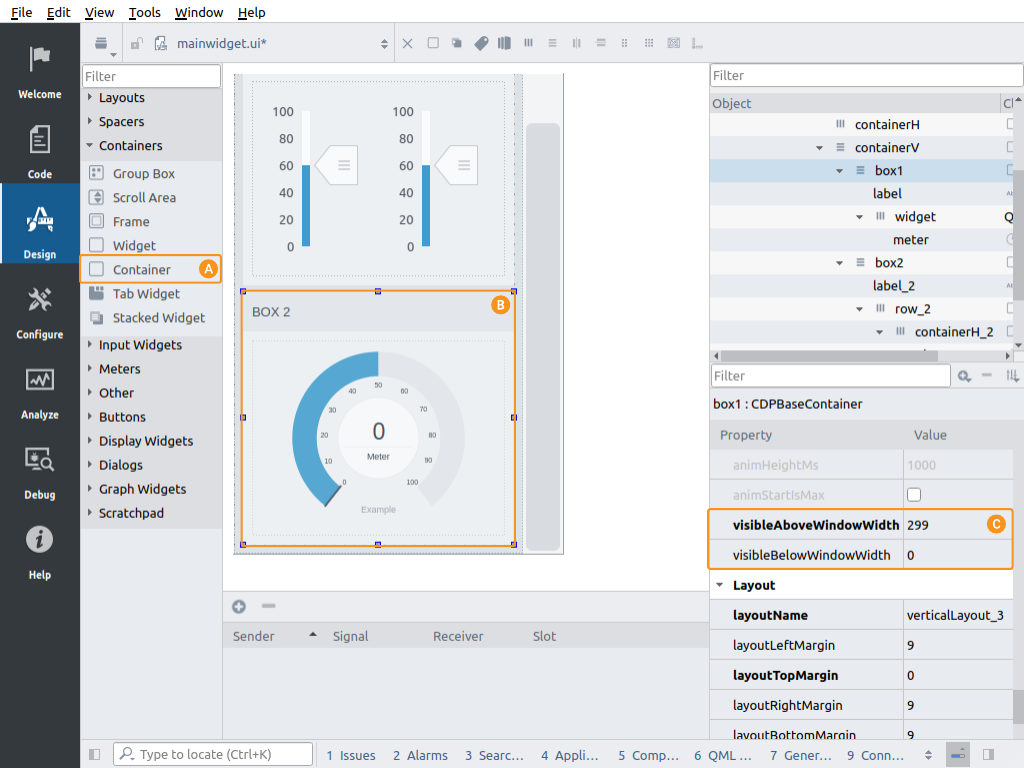
How to configure a container visible only when the window width is 300 px and larger.
In some designs, we want to hide or switch out certain elements depending on the window size. For instance, hide the left side menu on a mobile device to have more width for the contents, or perhaps only show an element when the screen size is large enough to make it usable. The Container can be used to solve this. It has two properties, visibleAboveWindowWidth and visibleBelowWindowWidth, to control when it should be visible and hidden.
To hide the box with the meter when the window width is below 300 px; click it in the form or the object inspector and configure visibleAboveWindowWidth to 299 .
Get started with CDP Studio today
Let us help you take your great ideas and turn them into the products your customer will love.