GUI - Design & Widgets
Introduction
This manual provides an overview of the CDP Studio Design mode widgets.
The CDP Studio Design mode allows to visually edit user interfaces using drag and drop, and configure graphical elements (widgets) by adjusting properties from a table. The output will be saved as a human-readable XML file with a .ui extension, also referred to as a form.
The widgets include properties for a wide range of features such as styling, scaling, control, text display, and communication with the control system. Most widgets are rendered from SVG files, making them highly scalable and resolution-independent. They also support themes that can completely change their appearance, as described on the CDP Widgets Themes (SVG) page.
Some aspects of theme styling are implemented using CSS, as discussed on the StyleSheets (CSS) page.
The widgets support styling according to the Open Bridge Design Guideline as described on the page about Open Bridge.
Visit the Design Mode Manual for an overview of CDP Studio Design mode and information about GUI features like language support, QML, custom widgets/graphics, and how to connect the widgets to a control system.
For a structured approach to GUI design in CDP Studio, see the Design Guide. It covers widget basics, layout scaling, styling methods (including CSS and SVG), and a practical design process to help you build adaptable and professional interfaces.
The Simple Meter Tutorial is a good starting point for understanding the different steps in creating a GUI application using CDP Studio.
Main Window
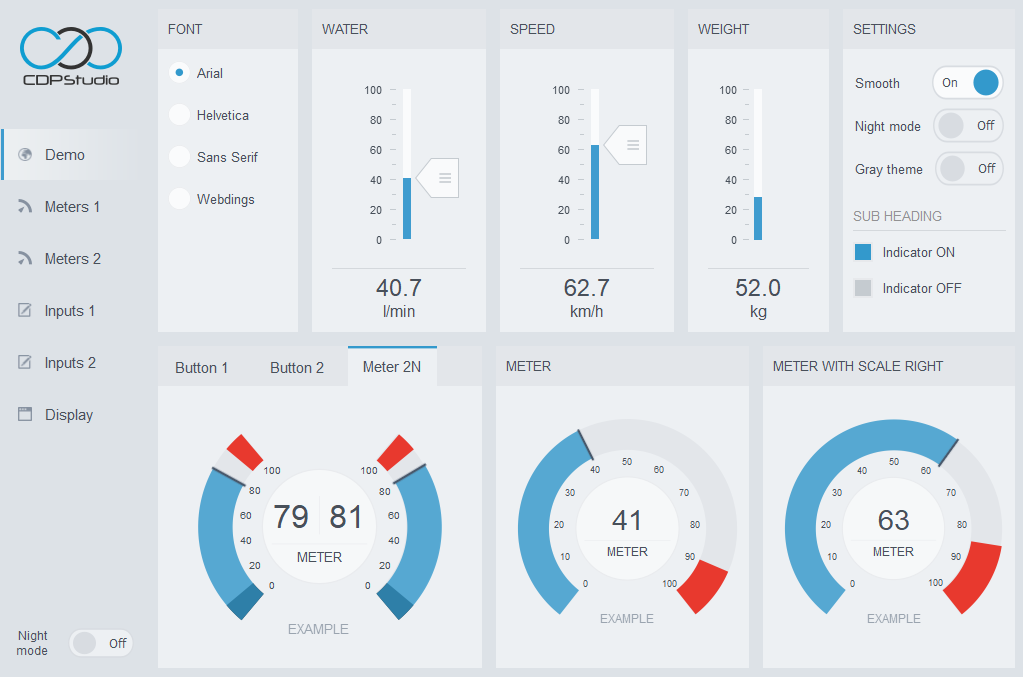
The Main Window is the backbone of the GUI and always the starting point when creating a new GUI application. It includes features that affect all widgets in the GUI, like selected themes, text translation, fullscreen shortcut keys, and playing sounds.
There can be only one main window in the GUI application. Other form files must be created as dialogs as described in the Design Mode Manual.
Widget
The Widget is the most basic graphical element that can be added to a form. All other widgets are based on this element to get base properties like geometry, font, layout/size control, tooltip, and stylesheet. It also handles events from the window system and paints itself on the screen, but there is no need to worry about any of this unless developing custom widgets in C++.
In the CDP Studio Design mode, the Widget shows as a transparent rectangle that can be used as a container for grouping other widgets. To ensure that child widgets are aligned and resized when the widget size is changed, we can add a layout as described in How to Create Adaptive GUI.
Layouts and Spacers
A layout is used to group widgets inside a container widget. The Vertical Layout and Horizontal Layout covers most use cases and are probably the easiest layouts to control. There are properties for configuring the layout margins, spacing, and the stretch factor of the different elements. The stretching can also be configured on the different widgets placed in the layout, using the properties in the sizePolicy group. In addition, we have properties like minimumSize and maximumSize that comes in handy for controlling the widgets.
The Grid Layout places widgets in a grid with rows and columns. Similar to the vertical and horizontal layouts, margins, spacing, and stretch can be controlled. In addition, we have the option to set minimum row and column heights.
The Form Layout is a special kind of grid limited to two columns. Its second column gets stretched by default, but there is a layoutFieldGrowthPolicy property to play around with. There is also a property, layoutRowWrapPolicy, that can be configured to wrap long rows. This can be useful when making adaptive designs.
The final layout is the Row. It is not a pure layout, but a container widget that will switch its layout from horizontal to vertical at a configurable screen size. This functionality is used when creating adaptive designs to ensure that widgets are still at a functional size on small screens. The details are discussed in How to Create Adaptive GUI.
The Horizontal Spacer and Vertical Spacer are used to add space to the design. Configuring a spacer with sizeType set to Expanding will make it expand to use as much space as possible. This depends on other expanding elements in the layout and can be tweaked using the sizeHint. Using a spacer like this will compact the other widgets in the layout when needed and ensure that the design looks good when the window size is increased.
Containers
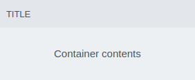
In addition to the Widget, the Design mode includes multiple container widgets for grouping elements that belong together in a GUI. The Container widget is the main container for grouping elements along with a title. It is used by almost all GUI examples in CDP Studio and is designed for placement directly on the main window background. The feature list includes animated size and overlay to show a form on top of its contents.
When multiple pages are required on a sub-page, the Container is often replaced with a Tab Widget. We could also use a Stacked Widget for multi-page usage, but this requires adding separate buttons for controlling the pages. The Stacked Widget has a lot of other use cases like showing slideshows or showing different pages based on control system values.
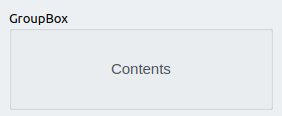
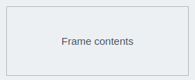
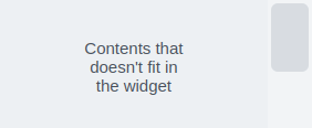
The Group Box and Frame containers do not have a background and are designed for grouping elements within other containers. We also have the Scroll Area which is important when creating adaptive designs, to make widgets usable on the screen also when they are larger than the display. Click the container widget names in the below texts for detailed descriptions.
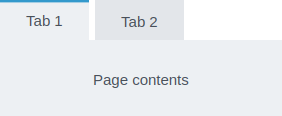
The Tab Widget is a container with multiple pages and buttons that selects which page to show.
The Stacked Widget is a container with multiple pages like the tab widget, but without buttons for selecting the current page. This is controlled using widget signal and slot connections or connecting it to a control system.
Input Widgets
The widgets in this group get user input and send it to the control system based on configuration. The communication is bi-directional, meaning that the widgets will always show the latest control system value. All input widgets that accept keyboard input can also be configured to open a virtual keyboard, usually selected in the padType property. Other common properties include precision, scaling, postfix, and styling.

The Line Edit is used to input text or numeric values from the user. The supported features include precision, touchpad, postfix, styling, and much more.

The Combo Box is used for displaying and changing values or texts in the control system.

The Spin Box is used to input numeric values from the user. The supported features include precision, touchpad, postfix, styling, min/max value, and much more.

The Check Box is used for toggling a remote value to 0 or 1.
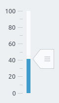
The Slider is used to input numeric values from the user. It can show both vertically and horizontally by configuring the orientation property. Other useful properties are min/max value, fill, styling, number of ticks, and much more.
Meters
There are multiple meters available in the CDP Studio Design mode, ranging from meters with one to four needles. A designer can easily make more variants with up to four needles using SVG files as described in the styling guidelines. No coding is required. Wanting more than four needles is possible, but this requires making properties for the additional needles in C++.
The meters are based on SVG files, but most visual features can be overridden using properties. Other supported features range from alarms, ticks, decimal numbers, texts, and much more. In addition, the meter can be used as a container. This means that other elements can be placed on top and placed in a layout.
The meter is a display widget. This means that it can show control system values, but not send anything unless configured with input child widgets, like the Meter 2 Needles 2 Buttons.
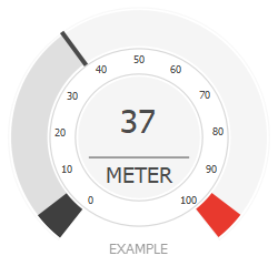
The Meter has properties and slots for controlling one needle.
The image shows a meter styled using the flat_light theme. It is configured with alarm sectors showing in black and red, a range from 0 to 100, and fill to the current value enabled.
Note that other themes might show the meter in a very different design.
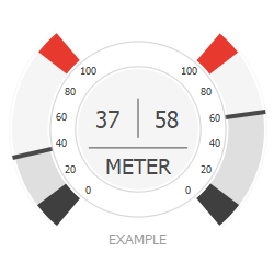
The Meter 2 Needles has properties and slots for controlling two needles.
The configuration shown in the image is similar to the meter with one needle, but here the settings are duplicated for the second needle.
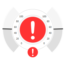
The Meter 2 Needles 2 Buttons has properties and slots for controlling two needles. In addition, it has properties for including 2 buttons, showing as red circles in the illustration.
Note that as the meter is a container, we can create similar functionality by placing buttons on top of a meter.
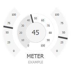
The Meter 3 Needles has properties and slots for controlling three needles.
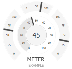
The Meter 4 Needles has properties and slots for controlling four needles.
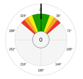
The Rose Meter is a meter with two needles and colored sectors for showing movement and danger zones. It is the same widget as Meter 2 Needles, but with additional properties for the alarm sectors, and a different SVG file.
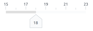
The Slide Indicator is a linear meter that can have up to four indicator knobs on a rail.
The image shows it styled with one knob using a slightly modified sliderRoundKnob.svg from the flat_gray_light theme, ticks, knob text, changed orientation, and numbers.
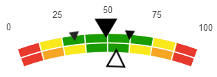
The Rose Sector Meter is an arc gauge with 4 needles and colored sectors for showing movement and danger zones.
Buttons
The push button is probably one of the most commonly used widgets in any graphical user interface. We usually push (click) a button when we want some action performed, like switching a GUI page, sending a control message, or setting a value in the control system. The CDP Studio Design mode buttons can also show images based on control system states and values. More use cases and example configurations can be found on the examples page.
There are several buttons listed in the Design mode button group. The Button is the base button, extended by Message Button and Popup Dialog Button. This means that the Popup Dialog Button includes all the functionality of the other two and is the only one you need if memory is not an issue. It is used in other button types, like Menu Button, Radio Button, and Button With Lamp, to add text or simply show using a different SVG. The Toggle Button is a bit different and requires a different styling file structure.
- How to show markers/bubbles on buttons
- How to make buttons load dialogs
- How to make buttons send CDP messages
- How to make buttons set a CDP signal or property value
- How to make buttons in GUI identical to IO buttons
- How to make buttons show the state of remote objects
- How to configure buttons in a radio group
- How to use buttons in a menu

The Button includes base button functionality, like pressed, checked, disabled, and normal states, that can be connected to a control system using properties, or other GUI widgets using widget signals and slots.
In addition to sending events when pressed and released, the button can show different images based on variables in a control system. This might require creating custom SVG files.
Looking at the button examples is probably the best way to understand how to use and configure the different control properties.

The Message Button includes all functionality of the Button and adds functionality for sending messages.
The messages will be sent to the control system as text commands and can include parameters. You can also use the functionality to set a value as described in the button examples.

The Popup Dialog Button includes the functionality of the Button and Message Button. In addition, it has support for showing markers/bubbles and opening dialogs using its uiFileName property.

The Button with Lamp is identical to the Popup Dialog Button, but configured with an SVG styling file that includes a lamp. The lamp is controlled using the style or checked functionality.

The Menu Button is designed for use in a side menu and includes features like icon, text, and background.

The Radio Button is used to select one out of multiple options.

The Toggle Button is used to toggle a control system variable between two different values. It also supports sending messages when the button is toggled. Click the link above for configuration examples.
The toggle button in the image is checked and configured with allowBorderPix set to false to avoid the knob from stretching.
Display Widgets
A display widget is used for showing images, texts, or animations. Most display widgets in Design mode can be connected to show the state or value of control system variables. The QQuickWidget and the WebEngineView can accept user input depending on their contents.

The Label is used to display text or animations. Use the stylingType property for consistent title and value styling across the design. Show control system values or remote control animations using routing properties.

The Text Selector is used for displaying different texts based on control system values. Texts are configured in Design mode by right-clicking the widget and selecting "Edit Items..." in the context menu.

The Bar can be either vertical or horizontal. It shows a graphical representation of a value using a filled rectangle.
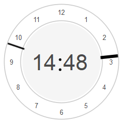
The Analog Clock shows the time using a circular clock face.
Clicking the clock in runtime opens a global dialog for setting a local time offset. This will affect all widgets that use the local time offset interface.

The Digital Clock shows the time using numerically. Similar to the analog clock, clicking the widget in runtime will open a global dialog for setting local time offset.

The Line widget is a vertical or horizontal divider for separating functions or controls in the GUI. Use the maximumSize and minimumSize properties to ensure a fixed size in all themes.

The Picture widget can show raster images/pixmaps and scalable vector graphics (.svg). It supports showing different elements in the SVG file using styles.

The Picture Sequence widget can show raster images/pixmaps and scalable vector graphics (.svg). In addition to the support for styles, the picture sequence can show multiple images from the SVG file. Using both style and picture numbers is like selecting rows and columns in a matrix. The SVG file must include elements according to the styling guidelines for this to work.

The Lamp is a widget that shows a lamp in configurable colors.
The mapping of value to color can be changed in three ways: updating the SVG file, using a Stacked Widget with lamps on different indexes, or do the mapping in control system logic.

The Loading Indicator shows a rotating image to indicate that something is in progress.
Use the cdpRouting property to hide or show the widget, or consider adding it in a Container Widget overlay to make it show on top of other content.
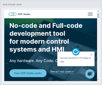
The WebEngineView is used for displaying web content in native user interfaces.
The widget is supported on Linux targets and will not display on Windows or for Web UI made using Web Assembly.
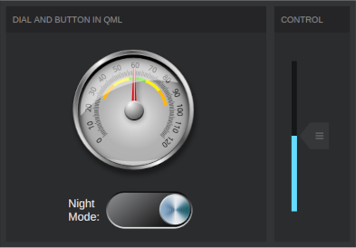
The QQuickWidget can load QML as demonstrated in the Using QML in HMI GUI example.
Dialogs
The CDPBaseDialog (Dialog) and the CDPBaseMainWindow (Main Window), are not supposed to be dragged into forms. They can be selected in the custom template step when creating a new form file. The main difference between the two is that there can be only one main window in a GUI application while you can add any number of dialogs. Creating a new GUI project includes a main window form by default, meaning that you should never need to create one.
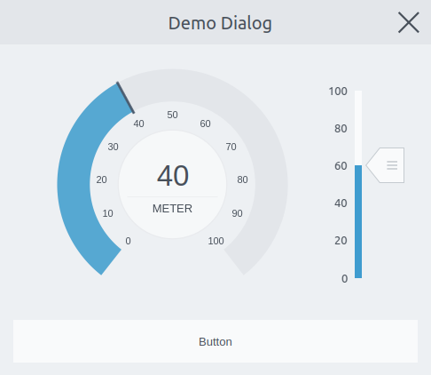
The Dialog, as shown in the image, is a top-level window that can be opened in GUI using the Popup Dialog Button. It can be internal or external to the GUI main window using the preferParent property on the button. The most important dialog properties cover features like animated open and close, title, styling file, translucent background on dialogs without a parent, and whether or not to allow external events (modality).
To be able to add widgets to a newly created dialog we must ensure that it contains a page. This is done by right-clicking on the dialog and selecting Insert > Intert Page After Current Page.
Node Widgets
The widgets in this group will adapt their number of elements during run-time, based on the number of matching objects/nodes found in a configurable target object - routed in the widget cdpTargetRouting property. This is useful when creating dynamic GUIs where the number of control objects is not fixed, or when making reusable UI elements for use in different UI pages or across applications. For instance, making a GUI that shows 100 control valves would be a lot simpler creating the element once and specifying one target routing to look for valves, rather than having to make duplicates and configure routings 100 times.
All widgets in this group have properties for configuring a target routing and a model type filter. The widgets that show matching objects using text, like table, list and tree can be connected using widget connections to enable text search/filtering. This means that a Line Edit or similar text input widget can be placed next to a node widget and configured to do the filtering by connecting its textChanged(QString) signal to the setFilterString(QString) slot in the node widget. The details of the connection mode is described in the Design Mode Manual.
In addition, the node widgets that show items as text have widget signals for emitting selected node(s) and thus enabling connecting them to each other to change target routing or send data using a communication widget like the Com Widget.
See Creating a Dynamic GUI for Showing Dialogs for an example demonstrating how the Node Container can be used to load dialog buttons for controlling Sine components.
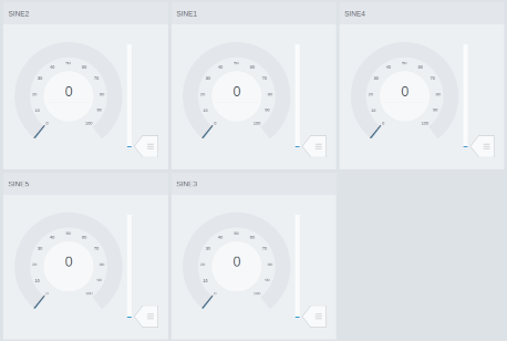
The Node Container is a powerful widget that loads a UI file for every matching object it finds on a specified target routing. A matching object must have a model type that matches one of the types configured in the widget modelFilter property.
The Node Container supports different layouts and container types using the childContainerName property.
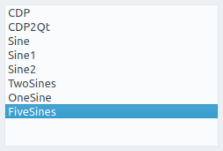
The Node List shows matching objects found on a target routing in a vertical text based list, and is mostly used for selecting object(s). It can connect other node widgets using widget signal and slot connections, for instance to select a target to show in the Node Container.
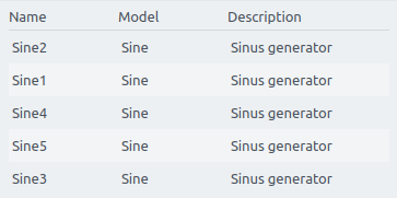
The Node Table lists matching objects found on a target routing with configurable columns for showing object data. Similar to the list and tree view, it can be configured to emit selected row(s) and supports filtering using widget signal and slot connections.
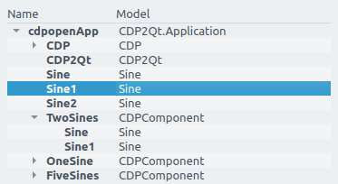
The Node Tree shows data in a text based parent-child tree structure. It lists matching objects found on a target routing with configurable columns for showing object data. Similar to the list and table view, it can be configured to emit selected row(s) and supports filtering using widget signal and slot connections.
Other Widgets
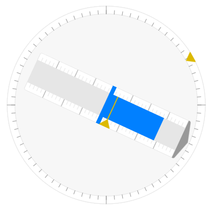
The CDP Studio Design mode includes widgets that solve specific problems. For instance, we have the Com Widget that can be used to connect widget signals and slots to a control system, and the Lost Routings Label which is used for debugging lost or invalid control system routings in runtime.
The UI Loader Widget can load any form file like it was a widget in the form. It supports replacing strings in form widget routings, controlled from the control system or widget signal and slot connections. There is a separate widget for doing replacements on text elements that are not routed, the Routing Replacement Widget. It is used in the form as described in its widget details.
The Rotation View is used for loading and rotating form files. This can be used to make advanced widgets like the azimuth, in Open Bridge.
The Open Bridge example includes multiple widgets that do not show in the Design mode widget panel. These were made by creating custom SVG files and combining the widgets that have already been mentioned on this page. The example includes details about how the different widgets are created and also how to use them in your design.
Note that the widgets might look very different in different themes. Mixing and modifying theme files are done as described on the Themes (SVG) page.
Event List
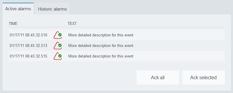
The CDP Studio Design mode includes an event list widget as explained in CDP Event List Widget.
Get started with CDP Studio today
Let us help you take your great ideas and turn them into the products your customer will love.
