Design Guide
Overview
This documentation provides a structured and comprehensive guide to HMI development in CDP Studio. It is intended for both new and experienced developers building adaptable, maintainable, and professional-grade user interfaces. The guide is organized into four major chapters:
- Chapter 1 - Widget Basics Introduces the core widget types available in CDP Studio and how they function. The chapter explains the difference between input and display widgets, how their states behave, and how communication is handled through routing. Special focus is given to Button widgets due to their versatility and extensive configuration options.
- Chapter 2 - Layout Scaling Describes how to design responsive and scalable interfaces. Covers layout behaviors, scaling with size policies and stretch factors, and how to build adaptive UIs with scroll areas, visibility routing, and orientation-aware containers. It also contrasts this flexible system with traditional SCADA-style uniform layouts.
- Chapter 3 - Widget Styling Explains the different ways to style widgets, from adjusting properties in Design mode to applying theme-based SVG files and using runtime style switching. The chapter also covers styling through CSS—both inline and file-based—and introduces best practices for working with the stylingType property. It includes guidance for theme-aware styling and how to use the CDPBaseContainer and qproperty- approach to support theme-dependent UI behavior.
- Chapter 4 - Design Process Outlines a structured, practical process for building HMI applications in CDP Studio. Begins with theme and template selection, using examples such as Open Bridge as a starting point. Then describes how to place and configure widgets properly, how to reuse design elements, and how to ensure responsiveness across devices. Emphasizes the importance of early layout decisions, consistent design, and clear naming for better project structure.
- Chapter 5 - HMI Features Highlights powerful features available in CDP Studio’s Design mode, including routing, UI modularity, and dynamic behavior. Summarizes the official Design Mode Manual and introduces advanced topics such as relative routing and the UI Loader Widget. This chapter serves as a gateway to important tools and techniques that enable you to build modular, adaptive, and maintainable HMIs.
Note: Each chapter contains examples, best practices, and links to tutorials to help you make the most of CDP Studio’s HMI features.
Chapter 1 - Widget Basics
Widgets are the fundamental building blocks of any CDP Studio HMI. Whether you're building control panels, dashboards, or operator interfaces, understanding the types of widgets, their states, and their communication behavior is essential.
This chapter introduces the most important widget concepts, including input and display roles, widget states, routing behavior, and buttons - one of the most versatile and state-rich widget types.
See the CDP Widgets page for an overview of available widgets.
Connecting HMI Widgets To System Logic
HMI widgets in CDP Studio are connected to the control system using routing, which defines how data flows between the user interface and the system logic.
Connecting HMI widgets to system logic is always done using HMI routing properties in the widgets. No HMI - control system logic connections are defined in the control system logic. This separation allows multiple independent HMIs to connect to the same control system without requiring modifications to the system logic.
Routing addresses use a name-based format:
Application.Component.Signal.Value
This identifies the parameter, signal, or property to which the widget is connected.
Learn more in the Design Mode Manual – Routing.
Widget Types: Input vs. Display
Widgets fall into two categories:
Display Widgets
Display widgets are used to visualize system values or states. They show the values and statuses from the data sources to which they are connected.
Display widgets use unidirectional routing:
- Receive values from the control system.
- Update automatically when the value changes.
- Does not send values back.
- Example: A meter or bar widget displaying current engine RPM.
Input Widgets
Input widgets are used to get input from an operator (user) and to send the data or commands to the system. Examples include:
Input widgets use bidirectional routing:
- Send user input to the control system.
- Update automatically when the value changes elsewhere.
- Example: A slider or spin box – Changing the value updates the routed object. If the control logic or another HMI changes the value, the widget updates automatically.
Some widgets, such as buttons, can also send discrete commands or messages to trigger system actions.
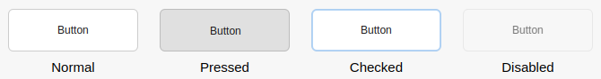
Input Widget States
Input widgets support various states that provide interaction feedback:
- Normal – default state, ready for input.
- Pressed – active user press (momentary).
- Checked – toggle state (e.g., maintained On/Off).
- Disabled – grayed out and inactive.
States affect both visual styling and routing behavior.
The button is a good example of a widget that visualizes all input states and provides properties for routing and external control:
Button Widgets
Buttons are a special class of input widgets with multiple modes, states, and routing options. They can behave differently depending on their configuration, and are often used to send commands, toggle values, or control modes.
Key Behaviors
- Momentary (Push Button): Sends a value only while pressed similar to IO (hardware) buttons.
- See How to Make Buttons in GUI Identical to IO Buttons for an example.
- Toggle (Checkable Button): Maintains a state (e.g., ON/OFF) across presses. Common use cases include:
- Message: Buttons can be routed to send CDP messages to trigger events.
- See How to Make Buttons Send CDP Messages for an example.
Connecting a button using signal and slots can send different values for press and release, or toggle between multiple values depending on the state.
For practical usage patterns and configuration options, see the Button Examples.
Chapter 2 - Layout Scaling
In our HMI development environment, we follow standard principles for managing visual layout and scaling behavior. This approach gives developers precise control over how each component adapts to different screen sizes and resolutions, providing flexibility that is especially valuable when targeting a wide range of devices, from large monitors to compact mobile screens.
While it is possible to create static interfaces by placing widgets at fixed positions and sizes, we recommend using layout-based design to ensure responsiveness and visual consistency across different screen formats. Layouts also simplify alignment, spacing, and proportional scaling of interface elements.
For a hands-on walkthrough of layout options and widget configuration, refer to the How to Create Adaptive GUI tutorial, which complements the concepts described here.
Flexible and Property-Driven Scaling
Each HMI element is placed into layouts (such as horizontal, vertical, or grid layouts), and its scaling behavior is determined by its properties:
- Stretch Factors: Widgets within a layout can be assigned stretch factors to control how extra space is distributed. This allows some elements to grow more than others, depending on your design needs.
- Size Policies: Every widget has a size policy that defines how it should behave when the layout is resized. For example:
- Bars and sliders typically scale in one direction only (e.g., horizontally or vertically).
- Meters and other graphical widgets often scale in both directions by default.
- Minimum and Maximum Sizes: Developers can fine-tune the sizing behavior of widgets, ensuring important UI components remain usable and legible across varying resolutions.
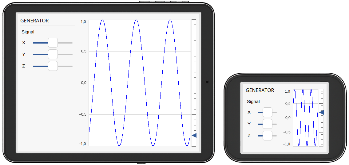
Example: Selective Scaling
The HMI design above consists of two top-level elements: a section with a title and control sliders on the left, and a graph on the right. These components are arranged in a horizontal layout. Both sections are intended to expand and shrink in response to the available display size. However, it is important to ensure that the control area does not become too small to operate. This is achieved by setting an appropriate minimum width on the left element.
Since it is not beneficial for the control sliders to stretch excessively on wider screens, a maximum width is also applied to the left element. In contrast, the graph is meant to use all remaining space and does not require any size limitations.
To ensure that both elements participate equally in layout resizing, the size policy of each widget is set to Expanding, and the stretch factor is set to 1.
Finally, note the vertical space below the sliders on larger screen. This spacing is implemented using a spacer element in the layout.
Special Features for Adaptive Design
In addition to the core layout behavior, our HMI framework introduces specialized widgets and tools that make it easier to build responsive interfaces that adapt intelligently to screen size and orientation:
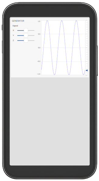
- Dynamic Visibility: Widgets can automatically be shown or hidden based on the available window space, configuring properties in the container widget.
- Responsive Layout Direction: Layout orientation (horizontal/vertical) can change dynamically depending on the window size, using a Row widget.
- Scroll Areas: When screen space is limited, scrollable containers can be used to ensure all content remains accessible.
- Spacers and Wrappers: Special layout helpers allow for better proportional scaling and structured grouping of interface elements.
These features enable you to design UIs that remain functional and aesthetically consistent, from control rooms to handheld devices.
For usage examples, see the How to Create Adaptive GUI tutorial.
Contrast with Uniform SCADA Layouts
Some SCADA tools use layout systems where both widgets and spacing scale uniformly, regardless of context or widget role. This approach may simplify layout configuration in some cases, but comes with trade-offs when adapting to various screen formats.
Key differences include:
- Equal scaling for all elements: All widgets are often treated the same, making it difficult to emphasize certain elements over others in the layout.
- Limited responsiveness: Uniform scaling does not easily accommodate different screen sizes or aspect ratios, which may result in cramped or stretched interfaces on mobile or portrait screens.
- Less control for developers: The layout engine typically handles resizing automatically, offering fewer ways to fine-tune the interface for clarity, usability, or the importance of specific components.
By contrast, our layout approach enables purposeful scaling: developers can choose which elements should grow or remain fixed, and adapt layouts for clarity and usability across device types.
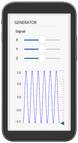
This image demonstrates how the previous HMI might appear when uniformly scaled to a mobile device — in contrast to adaptive scaling, all elements shrink equally, potentially impacting usability.
Responsive Design with Purpose
Our layout system is designed to support responsive design with intent. Developers define what should expand, what should remain fixed, and how each part of the interface behaves during resizing, leading to better usability and cleaner visual structure across all devices.
Best Practices
- Use nested layouts to organize complex designs.
- Adjust size policy and stretch factors according to widget importance and content.
- Utilize adaptive layout tools like scroll areas and direction switching where appropriate.
- Test across screen sizes to ensure a consistent, accessible design.
Chapter 3 - Widget Styling
Styling widgets in CDP Studio’s Design mode provides both simple and advanced options to control how widgets appear across themes and configurations. This chapter describes the key methods for adjusting a widget’s look and feel, from using properties to referencing theme-based SVG files and runtime style switching.
Using Widget Properties for Styling
Most visual updates in Design mode are performed by selecting a widget and adjusting its properties in the property editor. The available properties differ based on the widget type and may include visual, functional, or style-related settings.
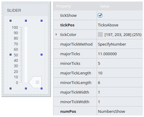
For example, a Slider widget provides properties like:
- showMajorTicks, showMinorTicks
- showTickNumbers, tickStep
- tickColor, numColor
- minimum, maximum
- alarmSections, alarmColor1, alarmColor2
Note: Some of these - such as tickColor and numColor - can override the theme’s default styles. However, note that changing themes will reset these colors unless they are explicitly restored after the theme switch.
Note: Properties that have been explicitly configured by the user appear in bold within the property panel. When the value cell of such a property is selected, a reset button will be displayed on the right-hand side. This allows the user to easily revert the property to its default value.
Styling with SVG Files
The widgets rely on SVG files for styling by default. These files define the graphical layout and themeable elements of the widget.
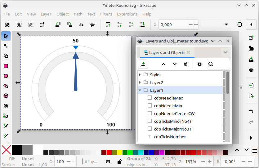
The SVG file used by a widget is typically specified by the svgFile property. The path includes a theme-relative root, which changes depending on the currently selected theme. For instance, for a meter showing in the openbridge5_day theme, the svgFile property has its value set to, :/themes/openbridge5_day/meters/meterRound.svg
For additional details on creating or modifying SVG files, refer to the CDP Widgets Themes (SVG) documentation. This guide covers theme selection, the structure of SVG files, and recommended external tools for editing.
Key points:
- Widgets use SVG files to define their layout and styling.
- The
svgFileproperty specifies the widget's SVG file. - Paths are theme-relative and adapt based on the selected UI theme.
- See CDP Widgets Themes (SVG) for editing guidelines and theme structure.
Dynamic Style Switching with widgetStyle
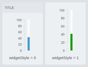
Some SVG files support multiple visual styles within a single file. These styles represent variants like alternative shapes, label placements, or color schemes.
Use the widgetStyle property to select between them. The value is typically numeric (e.g., 0, 1, 2) and maps to a group or style defined in the SVG file.
Alternatively, you can dynamically switch styles at runtime using style routing in your configuration logic.
The image shows a container and slider with the default widget style compared to the two being configured with the widgetStyle value set to '1'. This makes the container show without the title background and the slider switches to green fill color.
Note: Style colors like the one showing in the example image is only guaranteed between the color palettes of a specific theme. For instance, switching from the flatgray theme to an openbridge theme will not maintain the green color for style value '1'. Hence, always test your design using the production theme.
Alternate Styling Methods
To control appearance, many widgets expose the type or stylingType properties. These allow you to choose between pre-defined visual styles or different rendering options, such as SVG, CSS, or raster images.
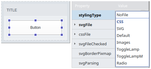
Example: Button
The stylingType property enables multiple rendering methods:
- NoFile: Disables file-based styling. Use the
styleSheetproperty for inline CSS customization. - CSS: Loads a CSS file specified by the
cssFileproperty. - SVG: Uses the SVG file defined in
svgFile. - Default: Applies the default CDP theme SVG styling.
- Image: Uses the
imageNormal,imageChecked, and related properties for raster-based styling. - ToggleLamp: Uses SVG to render a toggle button with a small lamp indicator.
- ToggleLampM: Similar to ToggleLamp, but with a larger lamp graphic.
- Radio: Renders the widget as a radio button using SVG.
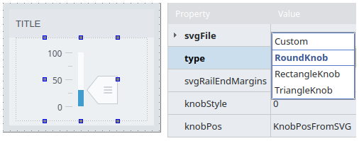
Example: Slider
The type property on a Slider widget lets you choose from a set of predefined SVG files:
- Custom: Allows configuration of a custom SVG file.
- RoundKnob: Uses a round knob style.
- RectangleKnob: Uses a rectangular knob style.
- TriangleKnob: Uses a triangular knob style.
Note: Theme implementations may not include all knob shapes. In such cases, the selected type will fall back to the round knob by default. When creating a new theme, all knob styles can be implemented as needed.
Styling with CSS
In addition to SVG-based styling, many widgets in CDP Studio support styling via CSS. CSS can be applied either inline using the styleSheet property, or externally using the cssFile property.
This is especially useful for widgets that do not support SVG files, such as scroll bars, frames, and group boxes. CSS can also be used in combination with theme-aware containers and dynamic properties to apply fine-grained control over visual appearance and behavior.
When using CSS from a parent container, make sure child widgets have their stylingType set to NoFile to allow inherited styles to take effect.
For detailed guidance on using selectors, theme-aware styling, property-based rules, and best practices, see the StyleSheets (CSS) documentation.
Text and Fonts
All textual content in the HMI should be displayed using the Label widget to ensure consistent styling and proper integration with the active theme. The appearance of each label is controlled by the stylingType property, which defines how the text is styled and where the styling information is sourced from.
Styling Types
The following values can be set on the stylingType property of the label:
- NoFile – Disables theme-based styling and enables the
styleSheetproperty for full manual control. - CSS – Applies styling from a CSS file via the
cssFileproperty. - SVG – Uses an SVG file defined in the
svgFileproperty for styling. - General – Applies a general stylesheet generated from the theme’s color configuration.
- Title – Used for major headings; styled via the theme's title font and color settings.
- SubHeading – Used for subheadings; typically smaller than Title but still prominent.
- Value – For numeric or key values; generally bold and visually distinct.
- Unit – For value units (e.g., “kn”, “°C”); usually smaller and aligned to the right of the value.
- Main – Default styling for general-purpose or body text.
Global Font
The font family used throughout the HMI can be changed globally using the setGlobalFont slot in the main window. This provides a consistent font across all widgets without the need to set it individually.
Theme Overrides
Although it is possible to override font settings manually using the font property on individual widgets, these changes may be reset when the theme is switched. This is because many widgets retrieve font and style information from the theme. The behavior depends on the widget type.
For stable custom fonts, it is recommended to set the stylingType to NoFile and apply styling manually using either the styleSheet property or dynamic properties.
This setting is also required if you want the label to inherit font styling from its parent widget. To enable inheritance, the styleSheet property must be left empty.
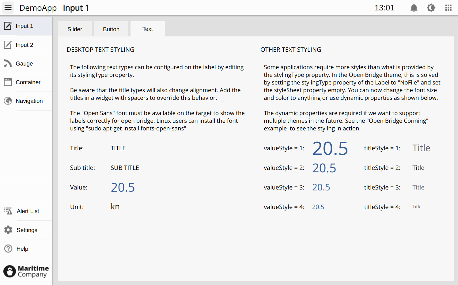
Extended Styles in the OpenBridge Theme
In themes like OpenBridge, where additional style variants are required, labels are set to stylingType = NoFile. Their appearance is then controlled through dynamic properties such as valueStyle and titleStyle. This approach enables support for multiple visual variants while still allowing theme-based customization.
The valueStyle and titleStyle elements are defined in the main.css file of the theme, which is provided by the main window.
The image below shows an example from the Open Bridge template where valueStyle and titleStyle are used to apply extended visual styles:
Best Practices for Styling
- Theme-aware placement: Place all custom SVGs in theme-specific subdirectories to ensure seamless switching.
- Avoid hardcoding colors unless theming flexibility is not required.
- Always test with the theme you intend to release: Theme changes can affect layout, spacing, font sizes, and component shapes. Even small differences in styling may impact usability or alignment, so thorough testing in the target theme is essential.
- Use
widgetStyleandstylingTypethoughtfully to ensure style logic is clear, maintainable, and discoverable. - Use
stylingType= NoFile for special cases: When custom styling is needed via CSS or dynamic properties (e.g.,valueStyleortitleStyle), explicitly set the styling type toNoFileto bypass theme logic. - Prefer dynamic properties over inline styles for reusable and theme-aware customizations.
- Provide fallback fonts and colors in CSS to ensure graceful degradation if theme resources are missing.
- Avoid mixing conflicting style mechanisms: Do not combine theme-based styling with inline overrides unless absolutely necessary.
- Test font inheritance: In container-based designs, confirm that fonts propagate as expected when using
NoFileand emptystyleSheetsettings. - Group related styling rules: Keep font, color, and layout styles logically grouped for readability and maintainability. The placement could be in top level containers or in the main.css for new themes.
Chapter 4 - Design Process
Designing a high-quality HMI in CDP Studio involves a structured approach—from selecting the right theme and layout structure, to applying widgets and tuning visual details. This chapter outlines the process from concept to layout implementation, ensuring consistency, adaptability, and visual clarity.
Step 1 - Selecting GUI or WebUI
When creating an HMI application in CDP Studio, the first decision is to select the application type. You can choose between:
- GUI – a native desktop application that runs locally on the target system.
- WebUI – a web-based interface that can be viewed in a standard web browser.
The design process in CDP Studio is identical for both types. You create and edit the HMI using the same tools, structure, and layout techniques regardless of whether it targets desktop or browser deployment.
WebUI applications are compiled to WebAssembly and served from the internal web server included in the deployed CDP application. This means no external web server or backend is required, and users can access the HMI from any modern browser connected to the same network.
If you initially create a native HMI application, you can enable web access later by adding the WebUI feature through a CDP Studio wizard. This allows you to build an HMI that runs natively on the device while also being accessible remotely via web browser.
Step 2 - Selecting Design and Theme
Before placing widgets or modifying layouts, it’s essential to choose a suitable theme and design foundation. Start by reviewing the built-in examples in CDP Studio. These showcase various UI setups and are excellent for inspiration.
For new applications, the Open Bridge template is highly recommended:
- It provides professionally designed color palettes, icon sets, and menu structures.
- It includes top and side menus, structured spacing, and consistent font and title settings.
- The theme ensures accessible contrast levels across components.
See the Open Bridge Introduction to learn how to add the Open Bridge template to your project, and how to enable the Open Bridge Scratchpad containing theme-specific UI elements.
Once you’ve selected a template:
- Decide early whether you’ll retain or remove the side/top menus. This impacts the layout logic across all screens.
- Adjust the initial geometry to match your target hardware display size. Ensure the layout can scale down to a minimum usable resolution.
- Use the principles outlined in How to Create Adaptive GUI to make your design flexible for various screen sizes and aspect ratios.
Step 3 - Adding Widgets
With your theme and structure selected, begin designing by adding widgets. The selected theme ensures a visually consistent color base, but effective layout also depends on spacing, container use, and component clarity.
Theme and Guidelines
If using the Open Bridge theme, follow the Open Bridge Design Guideline. It specifies rules for:
- Spacing and alignment
- Font styles and sizing
- Title hierarchy
- Layout behavior per screen type
Even if using another theme, always strive for internal consistency in widget placement, color application, and sizing.
Reusing Design Elements
Choose from the following approaches to reuse and adapt UI content:
- Reuse via libraries: add forms/UI (.ui) files to a library project. The CDP Studio Design mode widget box then lists a library category where those forms appear as widgets. Dragging one into a form inserts a
CDPBaseUiLoaderWidgetthat references the library’s .ui file (reuse without copying). Benefits include a single source of truth and updates that propagate everywhere the form is used (after redeploying). See Reusing Widgets. - Relative routing: if routings in the form are relative, you can reuse the same form for multiple objects by setting only the target routing on the UI Loader (e.g.,
cdpTargetRoutingorsetCdpTargetRouting). - Local edits: hold Ctrl while dragging to insert an editable copy. Note that any widget connections inside the form are not preserved and must be recreated.
- Scratchpad for quick experiments: the Scratchpad lets you copy and experiment with widgets and layouts from examples. Be aware that example content may include demo logic that does not fit all use cases, and copying does not preserve internal connections (signals/slots).
You can also use complete examples as starting points by copying their .ui files into your application or a library, but be aware:
- Some examples include adaptive behaviors or demo routing logic intended to showcase features and not all use cases.
- Internal widget connections (signals/slots) are not preserved when copying via the Scratchpad or manually; they must be recreated.
- Hidden/demo behaviors can be confusing if not understood in context.
Containers and Layouts
- Always place widgets inside a Container to ensure correct background contrast and scalable behavior.
- Adjust the main layout before adding page content:
- Decide if top/side menus should remain.
- Tweak margins, spacings, and paddings as needed.
Geometry and Responsiveness
- Aim for a layout that remains readable and functional across different screen resolutions.
- Test the layout in both minimum and large-scale window sizes.
Step 4 - Naming and Object Inspector
To maintain structure and enable component referencing:
- Assign clear and descriptive object names to all widgets.
- This improves discoverability in the Object Inspector, especially for larger designs.
- It also helps with style routing, scripting, and debugging.
Naming conventions should reflect:
- Widget purpose (e.g.,
speedLabel,headingGauge) - Group membership if applicable (e.g.,
engineTemp1,engineTemp2)
Step 5 - User Authentication
User authentication in CDP Studio is enabled through the control system configuration. Once activated, the HMI automatically presents a login dialog before the main interface is shown. To customize the appearance of this dialog, use the CDP Studio wizard to add a logindialog.ui file to your project.
For configuration guidance and a working example, refer to the Security Demo Example.
Controlling HMI Access by Role
Access-based visibility in the HMI can be implemented using display-level signals defined in the control system.
In the Security configuration:
- Define roles such as
DisplayLevel1,DisplayLevel2, etc., to represent access tiers. - Assign users to one or more of these roles depending on what level of access they require.
- Users with full access should be assigned to all display-level roles.
- Restricted users should only be assigned the lowest applicable role.
Next, in the Table Editor:
- Create one boolean signal per display level (e.g.,
DisplayLevel1,DisplayLevel2). - Set the signal value to
true. - Configure the
RolePermissionsfor each signal:- Higher-level signals (e.g.,
DisplayLevel3) should only be readable by their corresponding high-level role. - Lower-level signals (e.g.,
DisplayLevel1) should be readable by all roles that represent equal or higher access. - Ensure that all other roles are reset to false.
- Higher-level signals (e.g.,
In the HMI, bind the visible property of widgets to these signals. For instance, to make a label visible only for users at DisplayLevel2 and above, set its cdpVisibleRouting to the DisplayLevel2 signal.
This enables structured control over which users can see specific interface elements based on their role, without hardcoding usernames or access logic in the HMI itself.
Summary
The CDP Studio design process combines thoughtful theme selection, layout planning, consistent styling, and practical testing. By following this workflow:
- Pick a Theme and Template suited to your use case.
- Adapt the layout before adding content—plan for screen sizes and menu structures.
- Place widgets within containers and follow the design guidelines of your chosen theme.
- Use the scratchpad and examples to jump-start layouts, being mindful of advanced behaviors.
- Name your components clearly to simplify configuration, navigation, and styling.
This structured process ensures maintainability, scalability, and a professional appearance for your HMI projects.
Chapter 5 - HMI Features
CDP Studio offers a robust set of tools for designing and managing Human-Machine Interfaces (HMIs). This chapter highlights the most important features of Design mode.
The following key topics are discussed in the Design Mode Manual:
- Application Types – Understanding the different HMI types and how they are created.
- Visual Introduction – Utilizing drag-and-drop functionality, property editors, and layout managers to build interfaces.
- Layout Management – Implementing responsive designs using vertical, horizontal, grid, and adaptive layouts.
- Communication (Routing) – Connecting UI elements to control system objects for dynamic interaction.
- Dynamic Routing Properties - Adding routing to control any widget property
- Relative Routing – Using relative routing in child widgets to create complex UI elements that require only one top-level routing. Typically used with the UI Loader Widget, Routing Container, and the Dialog.
- Connection Mode – Establishing signal-slot connections between widgets for internal communication.
- Preview Mode – Testing the interface within the design environment without building and deploying.
- Scratchpad – Reusing custom widget configurations across different projects.
- Dialog Management – Creating and integrating dialog windows for additional user interactions.
- Virtual Keyboards – Enabling on-screen keyboards for touch-based input fields.
- Theme Support – Applying and customizing themes to maintain visual consistency.
- Open Bridge – Adhering to maritime UI standards through Open Bridge guidelines.
- Custom Graphics – Incorporating custom images and SVGs into the UI.
- Custom Widgets – Developing and integrating user-defined widgets for specialized functionality.
- QML – Enhancing interfaces with QML for advanced UI components and animations.
- Language Support – Implementing multilingual interfaces with translation files.
- Security Features – Managing user authentication and access control within the HMI.
The following key topics are discussed in the GUI - Design & Widgets page:
- Widget Overview - Provides an overview of CDP Widgets and their main categories.
- Input and Display Widgets - Core widgets for user interaction and data presentation, such as buttons, sliders, labels, and meters.
- Layout and Container Widgets - Tools for structuring the HMI, ensuring scalable, maintainable, and theme-aware layout behavior.
- Dialog Widgets - Components used to present dialogs or floating interface layers on top of the main HMI.
- Node Widgets - Advanced widgets that dynamically adapt to control system objects at runtime.
- Other Widgets – Covers advanced widgets such as the Rotation View, and explains how elements can be stacked and configured to create complex, reusable components. Also includes specialized widgets like Graphs and the Event List for visualizing signals and handling system alarms.
These features collectively enable the creation of sophisticated, user-friendly HMIs tailored to various application requirements.
Get started with CDP Studio today
Let us help you take your great ideas and turn them into the products your customer will love.