CDPBaseLamp Class
The Lamp is a display widget that shows a lamp in configurable colors. More...
| Header: | #include <CDPBaseLamp> |
| Inherits: | CDPBasePictureSequence |
Public Types
| enum | LampType { Custom, Sunken, Ring } |
| typedef | MapLampSvg |
Properties
- svgType : LampType
- 2 properties inherited from CDPBasePictureSequence
- 18 properties inherited from CDPBasePicture
- 6 properties inherited from CDPBaseWidget
Public Functions
| CDPBaseLamp(QWidget *parent = 0) | |
| virtual | ~CDPBaseLamp() |
| LampType | lampType() |
| void | setLampType(LampType type) |
Reimplemented Public Functions
| virtual void | setSvgFile(const QString &svg) override |
- 3 public functions inherited from CDPBasePictureSequence
- 34 public functions inherited from CDPBasePicture
- 18 public functions inherited from CDPBaseCom
- 8 public functions inherited from CDPBaseWidget
- 3 public functions inherited from RoutingContainerBase
- 4 public functions inherited from CDPBaseControlVisible
Additional Inherited Members
- 2 public slots inherited from CDPBasePictureSequence
- 15 public slots inherited from CDPBasePicture
- 10 public slots inherited from CDPBaseWidget
- 2 signals inherited from CDPBasePicture
- 1 signal inherited from CDPBaseWidget
- 3 static public members inherited from CDPBaseCom
- 4 static public members inherited from RoutingContainerBase
- 2 protected functions inherited from CDPBasePictureSequence
- 14 protected functions inherited from CDPBasePicture
- 4 protected functions inherited from CDPBaseCom
- 1 protected function inherited from CDPBaseControlVisible
- 1 protected slot inherited from CDPBasePicture
Detailed Description
The Lamp is a display widget that shows a lamp in configurable colors.

Use the cdpStyleRouting property to set the color from the control logic. Connect (route) cdpStyleRouting to the control system variable/property (signal, parameter, alarm etc). Be aware that floating point numbers will get converted to integer in the widget. The values that set the different colors are shown in the below table.
| Theme | svgType | color 0 | color 1 | color 2 | color 3 | color 4 | color 5 |
|---|---|---|---|---|---|---|---|
| All | Ring | gray | green | yellow | brown | red | blue |
| cdp_light, cdp_dark, flat_light, flat_dark | Sunken, Custom* | gray | green | yellow | brown | red | blue |
| flat_gray_light, flat_gray | Sunken, Custom* | gray | blue | red | orange | yellow | green |
* Custom can be changed by the user, but is the same as Sunken by default.
The property widgetStyle can be used to set the lamp to a fixed color. This is useful when testing the user interface without connecting it to the control system, or the use case described below in the example using the stacked widget. Note that using cdpStyleRouting will override what you set in widgetStyle.
The example in Intro 5: Using Messages and States demonstrates how the lamp can be used to create traffic lights.
Lamp variations
Some of the themes come with optional variations of the lamp image. The property svgType has a dropdown list where alternative lamp images can be selected.
| svgType | flat_light, flat_dark | flat_gray_light, flat_gray | cdp_light, cdp_dark |
|---|---|---|---|
| Sunken, Custom* | Round (flat) | Square | Round (sunken) |
| Ring | Round (flat) | Round (flat) | Round (edge) |
* Custom can be changed by the user, but is the same as Sunken by default.
Some themes can also have different color ordering (as shown in the color table). Hence, we will always have to verify that the lamps show the colors we want if changing themes in a project.
Connecting the Lamp to Control System Logic
The cdpStyleRouting property is used to connect and control the lamp color from the control logic.
Example: Connecting the Lamp to a Control System Signal
Create a GUI application and add a lamp. Add a component to the application containing an output signal named MyStyleSignal. To make the signal control the lamp color, we configure cdpStyleRouting in the lamp as shown in the below table. For the flat_gray_light theme, toggling the MystyleSignal between 0 and 1 will change the lamp color between gray and blue. The colors can be verified in Design mode using widgetStyle.
| Property | Value |
|---|---|
| cdpStyleRouting | Application.Component.MyStyleSignal.Value |
Example: How to Map Colors to Different Values
In the previous example, toggling the MyStyleSignal between 0 and 1 changed the lamp color between gray and blue. The blue color is fine for showing if something is on or off, but what if we wanted to display an alarm? In that case we might want the lamp to be red when the control signal is 1.
Option 1 - Using Stacked Widget in the User Interface
Add a Stacked Widget in the GUI and place lamps with different colors on different indexes/pages. Use the page routing property (cdpPageRouting) to control which lamp to show. To show grey color when the value is 0 and red when the value us 1:
- Add a stacked widget to the GUI
- Add a lamp in the first page (page 0) and set the lamp property widgetStyle to 0 (gray in the flat_gray theme)
- Add a lamp in the second page (page 1) and set the lamp property widgetStyle to 2 (red)
- Connect the control signal to the stacked widget property cdpPageRouting
The stacked widget will now show the grey lamp on page 0 when the signal value is 0, and page 1 with the red lamp when the value is 1.
Option 2 - Using the Evaluate Operator in the Control Logic
Instead of adding additional elements in GUI, we can transform the value in the control system before it is received by the lamp. One option is to add an Automation::Evaluate operator next to the component that has the MyStyleSignal and configure the Expression property as shown below.
| Property | Value |
|---|---|
| Expression | Input?2:0 (means If Input is True, then Out = 2 else Out = 0) |
All that remains now is to connect MyStyleSignal to the Evaluate Input and Evaluate Out to the lamp widget property cdpStyleRouting.
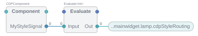
The lamp will now be gray when MyStyleSignal is 0 and red when the value is 1 (assuming flat_gray theme).
Option 3 - Create a Custom SVG
A third option is to make a custom SVG file as described in Creating Custom Lamps. In short, you want to copy the SVG file that styles the lamp, change the colors and configure svgFile with the new file path.
Creating Custom Lamps
The lamp widget is created for convenience as lamps are often used in automation systems user interfaces. It is actually a Picture Sequence Widget configured with a sequence of lamp images in different colors. The integer provided in widgetStyle or cdpStyleRouting selects which image in the sequence to show.
Use the Picture Sequence Widget to create your own lamps. The SVG structure is described in the Detailed Description of the class.
Consider using the lamp widget SVG as a starting point and follow the steps in How to Extend an Existing Theme.
Member Type Documentation
enum CDPBaseLamp::LampType
This enum type specifies how to style the widget:
| Constant | Value | Description |
|---|---|---|
CDPBaseLamp::Custom | 0 | Style the widget using a custom svg file |
CDPBaseLamp::Sunken | 1 | Style the widget using a sunken looking lamp. |
CDPBaseLamp::Ring | 2 | Style the widget using a beveled looking lamp. |
typedef CDPBaseLamp::MapLampSvg
Property Documentation
svgType : LampType
This property holds the lamp type that sets an svg file to show on the widget.
Access functions:
| LampType | lampType() |
| void | setLampType(LampType type) |
See also CDPBasePictureSequence and svgFile.
Get started with CDP Studio today
Let us help you take your great ideas and turn them into the products your customer will love.