CDP Widgets Themes (SVG)
Introduction

The different CDP widgets are styled in shapes and colors that make them look good together. This is achieved by configuring the different widgets to get styled by either Scalable Vector Graphics (SVG) or Cascading Style Sheets (CSS) files that follow a similar styling guideline. A complete set of styling files are referred to as a theme.
The files that form a theme are located in a theme directory. All theme directories must have identical structures and file names to simplify theme switching. This is a requirement to be able to switch themes in run-time, for instance, to switch between night and day colors.
To figure out which file styles a specific widget, we can check the widget property configuration in CDP Studio Design mode. The property that configures the SVG file is usually named svgFile while cssFile is the default for CSS. Widgets that can be styled by both CSS and SVG, like buttons and spin boxes, have a separate type or stylingType property to select between the two. The type property can also include other choices than CSS and SVG. These choices usually configure svgFile with defined paths.
The following shows the default SVG file configuration of a button. It is configured with svgFile set to the following when the flat_gray theme is selected:
themes/flat_gray/buttons/buttonPlain.svg
The paths will change if a different theme is selected and the configured SVG file exists also in the new theme. Switching to the flat_gray_light theme would make the application look for the styling in:
themes/flat_gray_light/buttons/buttonPlain.svg
How to Select Themes
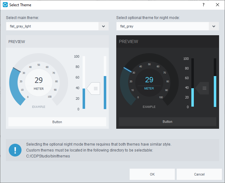
The GUI application can be configured with two themes to enable switching between day and night modes in runtime. In the CDP Studio Design mode, the themes are configured in the themeDay and themeNight properties of the main window widget or using the theme select dialog. The dialog is launched by right-clicking the main window widget and pressing "Select theme..." from the context menu.

The theme selector dialog shows the standard themes in addition to custom themes placed in the CDP Studio working directory and the directory configured in the themeRootDir property of the main window widget. Hence, themes added in the application resources or in the Application project directory will not show in the dialog unless themeRootDir is used to specify the directory.
Switching between the night and day mode themes in runtime is done using routing in themeRouting or using a widget signal and slot connection to either setDayTheme or setNightTheme.
Note: Custom theme directories must be placed within a directory named themes. This means that the full path of a theme placed in themeRootDir is <themeRootDir>/themes/<custom theme name>.
How to Create a Custom Theme
The simplest way to create a new theme is to copy and modify one of the existing ones. All existing theme styling files are in the toolkits at the following path based on where CDP Studio is installed:
<Installation directory>/toolkits/<architecture>/CDP-<version>/templates/themes
Manually copy a theme to a GUI application and give it a proper name. To ensure that the theme is deployed along with the other application files, we place it in the Application directory. This directory also contains the mainwidget.ui file. It can be found by going into CDP Studio Design mode, right-clicking on mainwidget.ui in the upper left, and selecting Show Containing Folder in the context menu.
For instance, doing a manual copy of the flat_gray theme and renaming it to custom_flat_gray, will make the path look something like the following:
<workspace>/systems/<system>/<application>/Application/themes/custom_flat_gray
The new theme is now available in CDP Studio Design mode similar to the standard themes. We can select it using the theme select dialog and start updating the theme files with new colors and shapes. The steps in updating and testing an SVG for a certain widget:
- Add the widget you want to test.
- Make sure the widget is styled using the SVG you are working on. This is described in the Introduction.
- Start changing the SVG after carefully reading the guidelines in Styling by SVG.
- Save the file as described in Saving to SVG.
- To see the changes in CDP Studio Design mode we need to refresh. This can be done by adding and removing a character at the end of the svgFile path or toggling between night and day themes.
Custom Graphics Outside the Application Directory
To make a new theme available to all applications in CDP Studio Design mode, we can place it in the CDP Studio working directory. This is usually the directory containing the CDP Studio executable. The path is listed at the bottom of the theme select dialog as shown in How to Select Themes. Note that we will still have to copy the theme into the application if we want it to deploy along with the other application files.
Again, using custom_flat_gray as an example, copying to the CDP Studio working directory will make the path look something like the following, <Installation directory>/bin/themes/custom_flat_gray.
To place the theme files at a different location outside the project directory, we can use the themeRootDir property in the main window widget. Configuring this to the parent of the themes directory makes the themes available in both CDP Studio Design mode and applications running on the development PC. Deploying to a remote target, however, requires that the theme files exist on the device at the exact path as set in themeRootDir. The directory configured in themeRootDir is not deployed by CDP Studio. Also, if multiple developers work on the same project, they must ensure that themeRootDir is valid for all project members or remember to update the property when updating the GUI.
Finally, the theme can also be added to the application using a resource file. This will compile the themes into the application binary. Adding the theme files in a resource file requires that the paths are similar to having the theme in the application root. Also, similar to having the file at a custom location, we need to configure themeRootDir to see the theme in CDP Studio Design mode (unless it is also located in the CDP Studio working directory). Note that resource files are not supported by WebUI.
Note: To see a preview of the theme in the theme selector, the custom theme directory must include a png file with the same name as the directory. The size of the png file should be 300px x 330px.
How to Extend an Existing Theme
The existing themes can be extended by copying and adding to an existing theme, as described in How to Create a Custom Theme, or by adding files to the application project using the same theme name and structure as the themes we want to extend.
To illustrate the latter with an example, imagine that we have a GUI configured with the flat_gray and flat_gray_light themes. The project requires a special GUI slider with a knob that imitates the product it controls. We make the new SVG file according to the guidelines in Styling by SVG and add it to the project using a resource file, or by placing them in the Application directory as shown below:
themes/flat_gray/sliders/sliderProductKnob.svg
themes/flat_gray_light/sliders/sliderProductKnob.svg
Notice that we have added a version of the slider in both the flat_gray and flat_gray_light directories to make versions of the slider that looks good in both themes. The SVG file name must be identical in both themes to be able to switch styling in runtime. Also, make sure that the file names are different from existing files in the theme unless wanting to override and show the new style on all sliders.
To configure a slider with the new SVG file, we select it in CDP Studio Design mode and edit the slider name in the svgFile property. This will not make the new slider appear in the Design mode unless we also configure the themeRootDir property in the main window widget.
Adding raster images or SVG files showing company logos and similar is done like we explained in the slider example above. The only difference is the name and location of the files. Pictures are usually added to the subdirectory with the same name.
Styling by SVG
All widgets in CDP Studio Design mode can be styled using SVG files. Scalable Vector Graphics (SVG) is an XML-based vector image format for two-dimensional graphics. A typical SVG file includes lots of different elements like texts, shapes, and paths. The elements are placed within element groups that are parsed and rendered by widgets based on element id. Different widgets will parse different elements.
The required elements in the different SVG styling files are described in the widget class details. To find it while in the CDP Studio Design mode, select the widget and press F1. The SVG styling is described in the detailed description of the widget (click 'more' in the brief description at the top of the class documentation).
The following example shows the SVG elements that style the slider:
svg
└─── Layer1
      ├─── cdpTicksColor    (text)
      ├─── cdpTicksNumber   (text)
      ├─── cdpFillColor     (text)
      ├─── cdpTiledFill     (element group)
      │      ├─── < Path >  (transparent rect/path)
      │      └─── < Group > (graphics)
      ├─── cdpKnob          (element group)
      │      ├─── < Path >  (transparent rect/path)
      │      └─── < Group > (graphics)
      ├─── cdpMiddle        (element group)
      │      ├─── < Path >  (transparent rect/path)
      │      └─── < Group > (graphics)
      ├─── cdpKnobDisabled  (element group)
      │      ├─── < Path >  (transparent rect/path)
      │      └─── < Group > (graphics)
      └─── cdpRail          (element group or rect/path)
             ├─── < Path >  (transparent rect/path)
             └─── < Group > (graphics)
Opening an existing slider SVG file might include elements with other names than shown above. These are usually added to help the designer to align elements, making it easier to pick colors with good contrast and similar. The important elements that are parsed by the widgets are always prefixed with the letters cdp.
The element groups that contain graphics are required to have two child elements, a transparent rectangle and a group containing the actual graphics. The rectangle is used to set the size and must cover all elements in the group containing graphics, including any hidden elements. Child elements can be given any name/id while the cdp-prefixed element names must be correct.
Editing SVG Files
The SVG file format is based on XML and can be edited in any text editor, but vector graphics software tools, like Adobe Illustrator (AI) or Inkscape, make the job a whole lot easier. Without tools like this, the designer will have to know the SVG format by heart. Doing anything more complex than changing colors on texts and shapes might be a hard task.

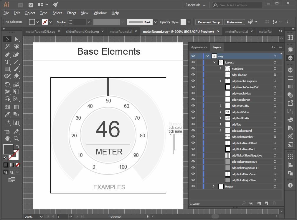
The screenshot from AI shows the meterRound.svg file that styles the meter widget in the flat_light theme. To better understand the different elements that show in the Layers panel, visit the meter class documentation and have a look at the table describing each element. All widgets have table like this in the Styling by SVG section of the class documentation. When there is no link, the section is found by scrolling to the top of the class page and pressing More...
The value of the id attribute of the different elements must be unique across the SVG file. Both AI and Inkscape handle this by automatically adding a postfix to any element id that collides with an existing id. The tools display the id attribute a bit differently:
- Adobe Illustrator shows the id attribute in the Layers panel unless there has been a conflict with an existing id. In that case, the id will get a postfix while the name stays the same in the Layers panel. This can prevent the widget from parsing the element if it expects a fixed id. The designer has to be careful when copying elements as the copy will get a different id than the original element. To fix the faulty id attribute, we can rename the faulty element to any name and save it, then give it back the proper name and save it again. This requires that we first figure out what element is in error.
- In Inkscape, the Objects panel is similar to the Layers panel in Adobe Illustrator. It can be opened from the file menu in Objects > Objects.... This panel shows labels as the element names and not the attribute id. To edit the actual element id we need to open the XML Editor (Edit > XML Editor...) or use the Object Properties panel (Object > Object Properties...).
Supported SVG Features
In addition to the value of the element id attribute, as discussed in the previous section, there are a few other pitfalls the designer needs to know about. The current SVG format version is SVG 1.1, but not all features are supported, like masks and blending modes as described in the following table:
| Feature | Description |
|---|---|
| Blending modes | Do not use blending modes other than normal transparency. |
| Clipping | Not supported |
| CSS/Style attributes | Can be used on child elements in graphics, but the widgets expect XML attributes when parsing properties like color, font, and size. This is not a big issue as both Adobe Illustrator and Inkscape support converting CSS to XML as explained in Saving to SVG. |
| Hidden elements | Hidden elements are not a problem, but the user must be aware that it affects the size of an element. The size of an element depends on the position and size of all its child elements including hidden ones. Thus it is important to ensure that all elements are positioned within our transparent rect. |
| Masks | Not supported |
| Moving grouped elements | Inkscape might add transform attributes when moving an element instead of updating the x and y positions. See the row regarding transforms for more information and how to solve the issue. |
| Rounded rectangle corners | Inkscape users have reported problems showing stroked rectangles with rounded corners. If the corners look pixelated, consider adding the stroke using two separate rectangles on top of each other. The size difference between the two rectangles will decide the width of the stroke. |
| Shadows and effects | Illustrator effects like 'Drop Shadow' can be exported to SVG. Note, however, that shadow effects might change the size of the element. Specifically, when loaded from SVG, the elements that have shadows will get the same size as they had in Illustrator without shadows. Thus, the elements are actually smaller than drawn in Illustrator. This will be a problem when drawing overlays as the overlay item won't match the size of the underlying element. |
| Text in graphics | When adding symbols or text to a graphical element it is usually a good idea to convert the text to graphics using the create outlines functionality in AI, orPath > Object to Path in Inkscape. This ensures that the elements will display correctly on all platforms. |
| Transform | The transform attribute can be a problem if we need to parse x and y positions. It might also affect size calculations and make weird artifacts when styling the widget. To remove a transform that was added due to a move or similar, ungroup the element and group it again when all elements are placed at the correct locations. |
| Transparency | Transparency can be used as long as blending modes other than 'Normal' is avoided. |
Saving to SVG
Saving to SVG in Adobe Illustrator
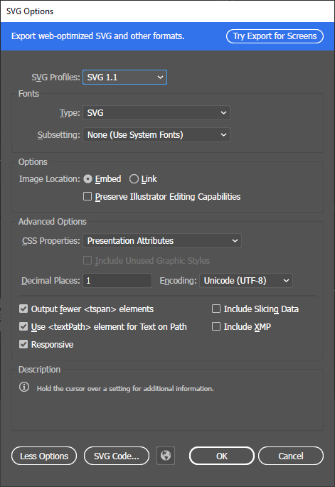
All files in the current themes are stored with SVG Profiles set to SVG 1.1 and Image Location set to Embed. The latter avoids that we get separate files for shadows etc.
Also, make sure to set CSS Properties to Presentation Attributes. This is required for the widgets to parse properties like size, color, and font.

Note: Saving the file with the wrong CSS Properties option, like Style Attributes, can be hard to detect as the file might still load. Check that this option is correct if experiencing wrong colors or other random problems.
Saving to SVG in Inkscape
Saving SVG files in Inkscape has some corner cases that must be addressed depending on what version is being used. The basics are the same as in the section for Illustrator, but in Inkscape, the best format option is usually Optimized SVG (*.svg). This will load a dialog with multiple tabs filled with settings. The most important ones are described in the below table.
| Tab | Setting | Value |
|---|---|---|
| Options | Shorten color values | True |
| Options | Convert CSS attributes to XML attributes | True |
| Options | Collapse groups | False |
| Options | Create groups for similar attributes | False |
| SVG Output | Remove... | False |
| SVG Output | Embed raster images | True |
| IDs | Remove unused IDs | False |
| IDs | Preserve manually created IDs not ending with digits | True |
Opening an SVG in Inkscape and saving it without specifying correct the format and settings will save the file in standard Inkscape formatting. This is likely to prevent the widgets from loading the different elements correctly.
Also, let us again stress the importance of having unique and correct element IDs. Use the Object > Object Properties... panel when editing the IDs of the different layer elements in Object > Objects... Always remember that editing the element display names in the layer/objects panel directly, will only change the Inkscape element label and not the ID.
Auto Generated Images
Some widgets, like CDPBaseComboBox, CDPBaseLineEdit, and CDPBaseSpinBox, render SVG elements to raster image files. The raster image files are stored in the default application data directory of the OS. Usually, the paths will be something like the following:
| Linux | Windows |
|---|---|
| /tmp/cdp/themes | C:/Users/<USER>/AppData/Local/Temp/cdp/themes |
Users can override the default path by creating a cdp2qt.ini file next to the binary and adding a variable named ImageSaveDir. Setting the variable to empty will select the working directory of the application.
ImageSaveDir=
Troubleshooting SVG Files
The first thing to check is the path added in svgFile:
- Verify that the path is correct and has no leading or trailing characters that shouldn't be there.
- Verify that the file is added to the project as described in How to Extend an Existing Theme.
- Verify the path configured in the themeRootDir property of the main window widget. This is usually the problem if the file shows in runtime, but not in CDP Studio Design mode.
- Verify that running the application doesn't print errors of type "No such file or directory" in the Application Output.
Verifying all steps in the previous list indicates that the SVG file is found, but parsing has failed:
- Verify that the id attributes of layers and cdp elements are correct according to the widget class documentation. Make sure that no postfixes have been added to the element id as described in Editing SVG Files. Using an XML Editor or a text editor might be a good idea.
- Verify that the SVG file follows the guidelines in Supported SVG Features.
- Verify that elements containing graphics include a transparent rect that is larger than the graphics.
- Make sure that the SVG file is saved according to Saving to SVG.
It is also possible to turn on verbose information from the parser. This is done by creating a cdp2qt.ini file next to the .ui file in the project and adding a variable named SvgDebug:
SvgDebug=1
Note that warnings related to Layer1 are fine for ordinary images that are not providing widget styling.
Get started with CDP Studio today
Let us help you take your great ideas and turn them into the products your customer will love.