CDPBaseSlider Class
The Slider can be used to change/show any cdp object signal/parameter values on a linear scale. More...
| Header: | #include <CDPBaseSlider> |
| Inherits: | CDPBaseTickMarks, StateChanger, CDPBaseCom, and |
| Inherited By: |
Public Types
| enum | KnobPos { KnobPosCenter, KnobPosFromSVG } |
| enum | SendMethod { onValueChanged, onSliderMoved, onSlotOnly, onMoveAndRelease } |
| typedef | SliderSvgMap |
| enum | SliderType { Custom, RoundKnob, RectangleKnob, TriangleKnob } |
Properties
|
|
- 49 properties inherited from CDPBaseTickMarks
- 6 properties inherited from CDPBaseWidget
Public Functions
| CDPBaseSlider(QWidget *parent = 0, bool bSetSliderType = true) | |
| virtual | ~CDPBaseSlider() |
| QString | cdpStyle() |
| virtual double | disabledStateOpacity() const |
| bool | drawKnobOnly() |
| virtual int | endMargins() |
| bool | fillBeforeBackground() const |
| QColor | fillColor() const |
| bool | fillEnabled() const |
| virtual double | fillStartValue() |
| bool | ignoreMouseEvents() |
| virtual bool | isCustom() |
| bool | joystickMode() const |
| bool | joystickModeDisabled() const |
| virtual KnobPos | knobPosition() |
| virtual int | knobStyle() |
| virtual QColor | knobTextColor() |
| virtual bool | knobTextEnabled() |
| virtual QRect | knobTextRect() |
| QSize | minimumSizeHint() const override |
| virtual Qt::Orientation | orientation() |
| virtual double | pageStep() |
| int | railEndMargin() |
| int | railOffsetMin() |
| QString | routing() |
| SendMethod | sendMethod() |
| void | setCdpStyle(QString routing) |
| virtual void | setDisabledStateOpacity(double opacity) |
| void | setDrawKnobOnly(bool draw) |
| virtual void | setEndMargins(int offset) |
| void | setFillBeforeBackground(bool enabled) |
| void | setFillColor(const QColor &color) |
| void | setFillEnabled(bool enabled) |
| virtual void | setFillStartValue(double value) |
| virtual void | setIgnoreMouseEvents(bool ignore) |
| virtual void | setKnobPosition(KnobPos pos) |
| virtual void | setKnobStyle(int style) |
| virtual void | setKnobTextColor(QColor color) |
| virtual void | setKnobTextEnabled(bool enabled) |
| virtual void | setKnobTextRect(QRect rect) |
| virtual void | setOrientation(Qt::Orientation orientation) |
| virtual void | setPageStep(double value) |
| void | setRailEndMargin(int margin) |
| void | setRailOffsetMin(int offset) |
| void | setRouting(QString routing) |
| void | setSendMethod(SendMethod method) |
| virtual void | setSvgFile(const QString &svg) |
| void | setTickRailEndAlignment(bool aligned) |
| void | setTickRailSpacing(int space) |
| void | setTimeoutMs(int ms) |
| virtual void | setType(SliderType pos) |
| QSize | sizeHint() const override |
| virtual QString | svgFile() |
| bool | tickRailEndAlignment() |
| int | tickRailSpacing() |
| int | timeoutMs() |
| virtual SliderType | type() |
| virtual double | value() |
Reimplemented Public Functions
| virtual void | emitValueChanged(double value) |
| virtual void | setNumPostfix(QString postfix) |
| virtual void | setNumRotate(bool rotate) |
| virtual void | setPrecision(int value) override |
- 90 public functions inherited from CDPBaseTickMarks
- 3 public functions inherited from StateChanger
- 18 public functions inherited from CDPBaseCom
- 8 public functions inherited from CDPBaseWidget
- 4 public functions inherited from CDPBaseControlVisible
Public Slots
| virtual void | PropertyChanged(std::string strFullPropertyName, std::string strNewPropertyValue) |
| virtual void | addStep() |
| virtual const QStringList & | pushRoutables() const |
| void | resetToCdp() override |
| void | sendToCdp() override |
| virtual void | setAlarmSectorCenter2(double value) |
| virtual void | setAlarmSectorCenter(double value, bool indicatorRight = false) |
| virtual void | setAlarmSectorError2(double value) |
| virtual void | setAlarmSectorError(double value, bool indicatorRight = false) |
| virtual void | setAlarmSectorNormal2(double value) |
| virtual void | setAlarmSectorNormal(double value, bool indicatorRight = false) |
| virtual void | setAlarmSectorWarning2(double value) |
| virtual void | setAlarmSectorWarning(double value, bool indicatorRight = false) |
| virtual void | setAlarmSectorWarningHigh2(double value) |
| virtual void | setAlarmSectorWarningHigh(double value, bool indicatorRight = false) |
| virtual void | setGlobalStyle(int style) |
| virtual void | setJoystickMode(bool enabled) |
| virtual void | setJoystickModeDisabled(bool disabled) |
| virtual void | setMaxValue(double value) |
| virtual void | setMinValue(double value) |
| virtual void | setValue(int value) |
| virtual void | setValue(double value) |
| virtual void | setValueAndSendToCdp(double value) |
| virtual void | setValueFromSignal() |
| virtual void | setWidgetStyle(int style) |
| virtual void | setWidgetTheme(const QString &name) |
| virtual void | subtractStep() |
- 16 public slots inherited from CDPBaseTickMarks
- 10 public slots inherited from CDPBaseWidget
Signals
| void | pushRoutablesChanged(const QStringList &pushers) |
| void | sliderMoved(int value) |
| void | sliderMoved(double value) |
| void | valueChanged(int value) |
| void | valueChanged(double value) |
- 1 signal inherited from CDPBaseWidget
Protected Functions
| virtual void | OnValueChanged(double dNewValue) |
| int | calculatedTickOffset(bool calculate = false) |
| virtual void | changeEvent(QEvent *ev) |
| virtual CDPBaseLabel * | initKnobLabel() |
| QPoint | knobPos(double value) |
| double | limitValue(double value, bool silent = true) |
| void | loadSvg() |
| virtual void | mouseMoveEvent(QMouseEvent *ev) |
| virtual void | mousePressEvent(QMouseEvent *ev) |
| virtual void | mouseReleaseEvent(QMouseEvent *ev) |
| virtual void | paintEvent(QPaintEvent *ev) |
| virtual void | resizeEvent(QResizeEvent *ev) |
| virtual void | updateAlarmsFromSector(bool indicatorRight, bool bUpdate = true) |
| virtual void | updateKnobLabelPos() |
| void | updateKnobPos(int pos) |
| double | valueAtPos(int pos) |
| virtual void | wheelEvent(QWheelEvent *ev) |
Reimplemented Protected Functions
| virtual void | loadPixmaps(bool skipSVG = false) |
- 4 protected functions inherited from CDPBaseCom
- 1 protected function inherited from CDPBaseControlVisible
Additional Inherited Members
- 3 static public members inherited from CDPBaseCom
Detailed Description
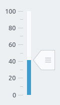
The Slider can be used to change/show any cdp object signal/parameter values on a linear scale.
The CDPBaseSlider supports features like ticks, styling, text on knob, decimal values, and scaling. The cdpSend property decides whether to send the value during move or upon releasing the knob.
Note that ticks are added on both or one of the rail sides. The major and minor ticks both align against the rail center. If we instead want the ticks to align on the edge of the rail and point against the rail center, we have to configure the slider with ticks to the opposite side of where we want them based. Then adjust tickRailSpacing, numTickOffset and widget width until the ticks are at the wanted position.
All widgets support controlling any class property of string or numeric types using routing. When there is no routing property available for a certain feature, we can add it using a Dynamic Property. For more information about this, see the Design Mode Manual regarding Dynamic Routing.
Styling by SVG
Use the svgFile property to style the widget using a svg file. Styling by svg enables switching between different themes in runtime (as long as the files are placed at identical locations within theme directories).
Main element structure
The following tree view shows the svg structure that can be used on the CDPBaseSlider.
svg
└─── Layer1
      ├─── cdpTicksColor    (text)
      ├─── cdpTicksNumber   (text)
      ├─── cdpFillColor     (text)
      ├─── cdpTiledFill     (element group)
      │      ├─── < Path >  (transparent rect/path)
      │      └─── < Group > (graphics)
      ├─── cdpKnob          (element group)
      │      ├─── < Path >  (transparent rect/path)
      │      └─── < Group > (graphics)
      ├─── cdpMiddle        (element group)
      │      ├─── < Path >  (transparent rect/path)
      │      └─── < Group > (graphics)
      ├─── cdpKnobDisabled  (element group)
      │      ├─── < Path >  (transparent rect/path)
      │      └─── < Group > (graphics)
      └─── cdpRail          (element group or rect/path)
             ├─── < Path >  (transparent rect/path)
             └─── < Group > (graphics)
The following table explains the named elements in more detail.
| Property | Type | Description |
|---|---|---|
| cdpTicksColor | text | Sets the color for both ticks and number font (when no other text elements are present). This element replaces the old cdpTextScale element which is now deprecated. |
| cdpTicksNumber | text | Sets the color of tick numbers (overrides the color set by cdpTicksColor). |
| cdpFillColor | text | Sets the color and transparency of the rail fill. This element is the only one required to enable fill. |
| cdpTiledFill | rect or an element group containing a rect | The cdpTiledFill can be used as an alternative to cdpFillColor. It makes it possible to enable rail fill by painting a tiled image. By default, the fill gets painted on the bar as a border pixmap. Note that the rect must have a minimum height of 1px. |
| cdpKnob | rect or an element group containing a rect | This element should contain the knob graphics. To ensure that the svg parser gets the correct background size (and aspect ratio), we have to place a transparent rect along with the graphics within a group element. Note that the position relative to the rail can be used by the widget to position the knob in other positions than center. To ensure correct size and position, the knob width must be larger than the rail. |
| cdpMiddle | rect or an element group containing a rect | This is an optional element that can be used to provide a rail overlay that will get painted after the alarm colors, but below the knob. |
| cdpKnobDisabled | rect or an element group containing a rect | This element should contain the knob graphics when its disabled. To ensure that the svg parser gets the correct background size (and aspect ratio), we have to place a transparent rect along with the graphics within a group element. Note that the position of this element is irrelevant to the widget. |
| cdpRail [cdpTiledRail] | rect or an element group containing a rect | The cdpRail contains graphics for the slider rail. By default, the rail gets painted as a border pixmap, using the top and bottom margins provided in the svgRailEndMargins property. To paint the rail using a tiled (repeated) image, rename cdpRail to cdpTiledRail. The latter can be used to draw patterns like stacked lines or dots etc. |
Style element structure
The slider also supports styles that can be changed by the widgetStyle property or by cdp object. Styles makes it possible to change the shape and color of the rail, knob and fill.
svg
├─── Layer1
│     └─── ...                      (see previous section)
└─── Styles
      ├─── cdpFillColorX            (text)
      ├─── cdpFillStyleX            (element group)
      │     ├─── < Path >           (transparent rect/path)
      │     └─── < Group >          (background graphics)
      ├─── cdpRailStyleX            (element group)
      │     ├─── < Path >           (transparent rect/path)
      │     └─── < Group >          (background graphics)
      ├─── cdpKnobStyleX            (element group)
      │     ├─── < Path >           (transparent rect/path)
      │     └─── < Group >          (background graphics)
      └─── cdpKnobDisabledStyleX    (element group)
            ├─── < Path >           (transparent rect/path)
            └─── < Group >          (actual graphics)
Examples
Member Type Documentation
enum CDPBaseSlider::KnobPos
This enum type specifies knob position:
| Constant | Value | Description |
|---|---|---|
CDPBaseSlider::KnobPosCenter | 0 | Position knob at the center of the rail. |
CDPBaseSlider::KnobPosFromSVG | 1 | Use position defined in svg file. |
enum CDPBaseSlider::SendMethod
This enum type specifies send method
| Constant | Value | Description |
|---|---|---|
CDPBaseSlider::onValueChanged | 0 | Send value on value change event. |
CDPBaseSlider::onSliderMoved | 1 | Send values while the slider is moving. |
CDPBaseSlider::onSlotOnly | 2 | Send values only when triggered by slot. |
CDPBaseSlider::onMoveAndRelease | 3 | Send values while the slider is moving, but reset to fillStartValue on mouse release. Resets to minimum value if fillStartValue is not set. Typically used when wanting to imitate a joystick in GUI and make it easy to get back to neutral position. Note that there is a separate property to select this behavior named joystick. Toggling this property on/off will toggle cdpSend between onSliderMoved and onMoveAndRelease. |
typedef CDPBaseSlider::SliderSvgMap
enum CDPBaseSlider::SliderType
This enum type specifies slider styling:
| Constant | Value | Description |
|---|---|---|
CDPBaseSlider::Custom | 0 | Custom SVG file |
CDPBaseSlider::RoundKnob | 1 | Round knob style |
CDPBaseSlider::RectangleKnob | 2 | Rectangular knob style |
CDPBaseSlider::TriangleKnob | 3 | Triangular knob style |
Property Documentation
cdpOfflineValue : const double
This property holds the value to show when communication is offline and cdpOfflineValueEnabled is set to true.
The property has no effect when cdpOfflineValueEnabled is set to false.
See also cdpOfflineValueEnabled.
cdpOfflineValueEnabled : const bool
This property holds whether or not to show cdpOfflineValue when communication is offline.
Setting the property to false will make the widget keep/show the last value when communication is down.
See also cdpOfflineValue.
cdpRouting : QString
This property holds the routing to the CDP object to connect and control.
The routing is bi-directional. This means that if two sliders are routed to control the same remote object they will always show the same value. In other words, the slider that did not change the remote value will get notified and show the new value.
The widget named CDPBaseSlideIndicator extends the current widget with the ability to ignore mouse events and support multiple knobs, but you can use the same styling/SVG files as the current class.
Access functions:
| QString | routing() |
| void | setRouting(QString routing) |
cdpScaling : const double
This property holds a value with which the value is multiplied/divided.
Input-values to the CDPBaseSlider will be multiplied with this value, output-values will be divided. This works with both signals and properties.
cdpSend : SendMethod
Access functions:
| SendMethod | sendMethod() |
| void | setSendMethod(SendMethod method) |
cdpStyleRouting : QString
This property holds the routing to the cdp object that is used to change the widget svg style.
Access functions:
| QString | cdpStyle() |
| void | setCdpStyle(QString routing) |
cdpTimeoutMs : int
This property holds the time to wait before setting back the previous slider value if the connected cdp object does not respond.
Note: This property is ignored if cdpRouting is not set.
Access functions:
| int | timeoutMs() |
| void | setTimeoutMs(int ms) |
See also cdpRouting and cdpSend.
disabledStateOpacity : double
This property holds the level of opacity for the widget in the disabled state.
The valid range of opacity is from 1.0 (completely opaque) to 0.0 (completely transparent).
You can use this property when you want a different opacity for a specific widget than the global disabled opacity configured in the main window. Setting this property overrides the global setting and applies only to this widget.
Access functions:
| virtual double | disabledStateOpacity() const |
| virtual void | setDisabledStateOpacity(double opacity) |
endMargins : int
This property holds the end margins inside the slider.
This makes it possible to adjust the length of the slider inside the widget.
Access functions:
| virtual int | endMargins() |
| virtual void | setEndMargins(int offset) |
fillBeforeBackground : bool
This property holds whether to paint the fill before or after the background.
The only reason to set this property is when making a custom SVG. Painting the fill before the background allows having transparent parts in the background, making the filling show on different locations and shapes.
Access functions:
| bool | fillBeforeBackground() const |
| void | setFillBeforeBackground(bool enabled) |
See also fillEnabled.
fillColor : QColor
This property holds the color to show on the slider fill. Overrides the SVG when set.
Access functions:
| QColor | fillColor() const |
| void | setFillColor(const QColor &color) |
See also fillEnabled.
fillEnabled : bool
This property holds whether or not to force slider fill and override the SVG.
Access functions:
| bool | fillEnabled() const |
| void | setFillEnabled(bool enabled) |
See also fillColor.
fillStartValue : double
This property holds the fill start value.
When having a range from 0 to 100, setting this property to 10 and having a current value of 50 will fill the slider from 10 to 50.
Access functions:
| virtual double | fillStartValue() |
| virtual void | setFillStartValue(double value) |
See also fillEnabled.
joystick : bool
This property holds whether or not to enable joystick mode.
Enabling this mode will make the slider knob jump back to the start position when it is moved and released. Setting it false will make the slider knob stay at the position it was released. Toggling the property on and off will send values to CDP while the knob is moved in both cases, but only the joystick mode will send the start value upon release. Note that the functionality can also be achieved by configuring the cdpSend property directly, but this will make toggling harder to control in runtime.
Access functions:
| bool | joystickMode() const |
| virtual void | setJoystickMode(bool enabled) |
knobPos : KnobPos
This property holds the position of the slider knob.
This property selects whether the knob should be positioned on the rail center or at the position specified in the svg file.
Access functions:
| virtual KnobPos | knobPosition() |
| virtual void | setKnobPosition(KnobPos pos) |
See also svgFile.
knobStyle : int
This property holds the style of the slider knob. Selected from the svg file.
The property enables the user to select different styles on knob and rail by adjusting widgetStyle and knobStyle. The svg file provided in the svgFile property is required to have style elements for this to work.
When the property is not set, the widget style is used also for the knob.
Access functions:
| virtual int | knobStyle() |
| virtual void | setKnobStyle(int style) |
knobText : bool
This property holds whether to display current value on the knob or not.
Access functions:
| virtual bool | knobTextEnabled() |
| virtual void | setKnobTextEnabled(bool enabled) |
See also knobTextColor and knobTextRect.
knobTextColor : QColor
This property holds the color of the text.
Access functions:
| virtual QColor | knobTextColor() |
| virtual void | setKnobTextColor(QColor color) |
See also knobText and knobTextRect.
knobTextRect : QRect
This property holds the size and location of the text on the knob.
The knobText property must be set to true to see the text. Also, be aware that the width and height of the rectangle might need updating if the orientation of the slider is changed. For instance, if you have a rectangle where the width and height is not identical, the width and height must be swapped if you still want the text to be in center after switching orientation.
Access functions:
| virtual QRect | knobTextRect() |
| virtual void | setKnobTextRect(QRect rect) |
See also knobText and knobTextColor.
orientation : Qt::Orientation
This property holds whether the slider is positioned vertically or horizontally.
Access functions:
| virtual Qt::Orientation | orientation() |
| virtual void | setOrientation(Qt::Orientation orientation) |
pageStep : double
This property holds the length of a single step when using the mouse scroll over the widget.
Increase or decrease this value if you want to speed up or slow down the scrolling speed respectively.
Access functions:
| virtual double | pageStep() |
| virtual void | setPageStep(double value) |
pushRoutables : const QStringList
Access functions:
| virtual const QStringList & | pushRoutables() const |
Notifier signal:
| void | pushRoutablesChanged(const QStringList &pushers) |
svgFile : QString
This property holds the path to the svg file that styles the widget.
The path can be either to a resource or a file on disk.
Note: Resources can be overridden by files on disk with identical names.
Note: This can only be edited when the type property is set to Custom.
Access functions:
| virtual QString | svgFile() |
| virtual void | setSvgFile(const QString &svg) |
See also type.
svgRailEndMargins : int
This property holds the end margins for painting the pixmap of the rail.
Note: This margin is used on the both ends of the slider.
Access functions:
| int | railEndMargin() |
| void | setRailEndMargin(int margin) |
See also svgFile.
tickRailEndAlignment : bool
This property holds whether to make the rail end under the middle of the knob or not.
Set this in order to align the end of the rail with the first and last tickmarks. If not set the rail will go 1/2 knob size outside of the tickmarks
Access functions:
| bool | tickRailEndAlignment() |
| void | setTickRailEndAlignment(bool aligned) |
See also tickRailSpacing.
tickRailSpacing : int
This property holds the spacing value between rail and ticks/numbers.
Note: This effects the size hint, so the widget needs to be in a layout for it to make any effect as CDPBaseTickMarks uses the edges of the widget to paint ticks/numbers.
Access functions:
| int | tickRailSpacing() |
| void | setTickRailSpacing(int space) |
See also tickRailEndAlignment.
type : SliderType
This property holds the style of the slider.
This property directly affects the svgFile property. Setting it to "Custom" allows the user to set a custom svg file to the svgFile. Setting it to any other value, will modify svgFile property to point to a predefined svg file with a style for the knob. The svgFile property can only be edited when this property is set to Custom.
Access functions:
| virtual SliderType | type() |
| virtual void | setType(SliderType pos) |
See also svgFile.
value : double
This property holds the current value of the slider.
Access functions:
| virtual double | value() |
| virtual void | setValue(int value) |
| virtual void | setValue(double value) |
See also cdpScaling.
Member Function Documentation
CDPBaseSlider::CDPBaseSlider(QWidget *parent = 0, bool bSetSliderType = true)
Default constructs an instance of CDPBaseSlider.
[virtual] CDPBaseSlider::~CDPBaseSlider()
Destroys the instance of CDPBaseSlider. The destructor is virtual.
[virtual protected] void CDPBaseSlider::OnValueChanged(double dNewValue)
[virtual slot] void CDPBaseSlider::PropertyChanged(std::string strFullPropertyName, std::string strNewPropertyValue)
[virtual slot] void CDPBaseSlider::addStep()
[protected] int CDPBaseSlider::calculatedTickOffset(bool calculate = false)
[virtual protected] void CDPBaseSlider::changeEvent(QEvent *ev)
bool CDPBaseSlider::drawKnobOnly()
See also setDrawKnobOnly().
[virtual] void CDPBaseSlider::emitValueChanged(double value)
bool CDPBaseSlider::ignoreMouseEvents()
See also setIgnoreMouseEvents().
[virtual protected] CDPBaseLabel *CDPBaseSlider::initKnobLabel()
[virtual] bool CDPBaseSlider::isCustom()
bool CDPBaseSlider::joystickModeDisabled() const
See also setJoystickModeDisabled().
[protected] QPoint CDPBaseSlider::knobPos(double value)
[protected] double CDPBaseSlider::limitValue(double value, bool silent = true)
[virtual protected] void CDPBaseSlider::loadPixmaps(bool skipSVG = false)
[protected] void CDPBaseSlider::loadSvg()
QSize CDPBaseSlider::minimumSizeHint() const
[virtual protected] void CDPBaseSlider::mouseMoveEvent(QMouseEvent *ev)
[virtual protected] void CDPBaseSlider::mousePressEvent(QMouseEvent *ev)
[virtual protected] void CDPBaseSlider::mouseReleaseEvent(QMouseEvent *ev)
[virtual protected] void CDPBaseSlider::paintEvent(QPaintEvent *ev)
int CDPBaseSlider::railOffsetMin()
See also setRailOffsetMin().
[slot] void CDPBaseSlider::resetToCdp()
Executing this slot will reset the widget to the value of the routed CDP object.
The functionality is often used in settings dialogs as described in sendToCdp.
See also sendToCdp and cdpSend.
[virtual protected] void CDPBaseSlider::resizeEvent(QResizeEvent *ev)
[slot] void CDPBaseSlider::sendToCdp()
Executing this slot will make the widget send its value to the routed CDP object.
The functionality is often used in settings dialogs to enable the user to edit values and then select whether to save or cancel the changes. To avoid value changes being sent instantly to the routed object, the property named cdpSend must be set to onSlotOnly.
Note that the container widget has slots for reset and send that will execute resetToCdp and sendToCdp on all child widgets.
See also resetToCdp and cdpSend.
[virtual slot] void CDPBaseSlider::setAlarmSectorCenter2(double value)
[virtual slot] void CDPBaseSlider::setAlarmSectorCenter(double value, bool indicatorRight = false)
[virtual slot] void CDPBaseSlider::setAlarmSectorError2(double value)
[virtual slot] void CDPBaseSlider::setAlarmSectorError(double value, bool indicatorRight = false)
[virtual slot] void CDPBaseSlider::setAlarmSectorNormal2(double value)
[virtual slot] void CDPBaseSlider::setAlarmSectorNormal(double value, bool indicatorRight = false)
[virtual slot] void CDPBaseSlider::setAlarmSectorWarning2(double value)
[virtual slot] void CDPBaseSlider::setAlarmSectorWarning(double value, bool indicatorRight = false)
[virtual slot] void CDPBaseSlider::setAlarmSectorWarningHigh2(double value)
[virtual slot] void CDPBaseSlider::setAlarmSectorWarningHigh(double value, bool indicatorRight = false)
void CDPBaseSlider::setDrawKnobOnly(bool draw)
See also drawKnobOnly().
[virtual slot] void CDPBaseSlider::setGlobalStyle(int style)
[virtual] void CDPBaseSlider::setIgnoreMouseEvents(bool ignore)
See also ignoreMouseEvents().
[virtual slot] void CDPBaseSlider::setJoystickMode(bool enabled)
Slot that sets joystick mode enabled or disabled.
Enabling this mode will make the slider knob jump back to start position when it is moved and released. Setting enabled to false will make the slider knob stay in released position. Both modes will send values to cdp while the knob is moved, but only joystick mode will send start value upon release. Toggling the slot is the same as changing the cdpSend property.
Note: Setter function for property joystick.
See also joystickMode().
[virtual slot] void CDPBaseSlider::setJoystickModeDisabled(bool disabled)
Slot that sets joystick mode disabled or enabled.
The function executes setJoystickMode with inverted argument.
See also joystickModeDisabled().
[virtual slot] void CDPBaseSlider::setMaxValue(double value)
[virtual slot] void CDPBaseSlider::setMinValue(double value)
[virtual] void CDPBaseSlider::setNumPostfix(QString postfix)
[virtual] void CDPBaseSlider::setNumRotate(bool rotate)
[override virtual] void CDPBaseSlider::setPrecision(int value)
void CDPBaseSlider::setRailOffsetMin(int offset)
See also railOffsetMin().
[virtual slot] void CDPBaseSlider::setValueAndSendToCdp(double value)
[virtual slot] void CDPBaseSlider::setValueFromSignal()
[virtual slot] void CDPBaseSlider::setWidgetStyle(int style)
[virtual slot] void CDPBaseSlider::setWidgetTheme(const QString &name)
QSize CDPBaseSlider::sizeHint() const
[signal] void CDPBaseSlider::sliderMoved(int value)
Note: Signal sliderMoved is overloaded in this class. To connect to this one using the function pointer syntax, you must specify the signal type in a static cast, as shown in this example:
connect(cDPBaseSlider, static_cast<void(CDPBaseSlider::*)(int)>(&CDPBaseSlider::sliderMoved),
    [=](int value){ /* ... */ });
[signal] void CDPBaseSlider::sliderMoved(double value)
Note: Signal sliderMoved is overloaded in this class. To connect to this one using the function pointer syntax, you must specify the signal type in a static cast, as shown in this example:
connect(cDPBaseSlider, static_cast<void(CDPBaseSlider::*)(double)>(&CDPBaseSlider::sliderMoved),
    [=](double value){ /* ... */ });
[virtual slot] void CDPBaseSlider::subtractStep()
[virtual protected] void CDPBaseSlider::updateAlarmsFromSector(bool indicatorRight, bool bUpdate = true)
[virtual protected] void CDPBaseSlider::updateKnobLabelPos()
[protected] void CDPBaseSlider::updateKnobPos(int pos)
[protected] double CDPBaseSlider::valueAtPos(int pos)
[signal] void CDPBaseSlider::valueChanged(int value)
Note: Signal valueChanged is overloaded in this class. To connect to this one using the function pointer syntax, you must specify the signal type in a static cast, as shown in this example:
connect(cDPBaseSlider, static_cast<void(CDPBaseSlider::*)(int)>(&CDPBaseSlider::valueChanged),
    [=](int value){ /* ... */ });
[signal] void CDPBaseSlider::valueChanged(double value)
Note: Signal valueChanged is overloaded in this class. To connect to this one using the function pointer syntax, you must specify the signal type in a static cast, as shown in this example:
connect(cDPBaseSlider, static_cast<void(CDPBaseSlider::*)(double)>(&CDPBaseSlider::valueChanged),
    [=](double value){ /* ... */ });
[virtual protected] void CDPBaseSlider::wheelEvent(QWheelEvent *ev)
Get started with CDP Studio today
Let us help you take your great ideas and turn them into the products your customer will love.