CDP Widget Examples
About
This chapter describes how to configure widgets for different use.
Button Examples
About
There are currently several button widgets; Button, Message Button, Popup Dialog Button and Menu Button. The latter widget is just added for convenience while the others inherit each other (in listed order) and add more functionality. Hence, the only button that you actually need is the one named Popup Dialog Button. The other/base buttons can be used to lower memory usage on limited systems.
How to Show Markers/Bubbles on Buttons

Markers or bubbles can be used on buttons to indicate that something is wrong or to notify the user that something has changed. Thus, it is most common to use markers on menu buttons or buttons that load popup dialogs. The user decides how the markers should look like by editing the properties described in CDPBaseButtonMarker. Note that the button supports two markers with separate properties prefixed with m1 and m2.
The above example has been configured as described in the following table:
| Property | Value |
|---|---|
| markerFont | Sans Serif, 14, bold |
| markerSize | 30 |
| m1SvgFile | :/themes/flat_light/markers/circleRed.svg |
| m1ShowNumber | true |
| m1OffsetX | 10 |
| m1OffsetY | 10 |
| m2SvgFile | :/themes/flat_light/markers/circleYellow.svg |
| m2Pos | TopLeftCorner |
| m2ShowNumber | true |
| m2OffsetX | 10 |
| m2OffsetY | 10 |
The marker(s) will show on the button when the m1CurrentPix and/or m2CurrentPix is above 0. The properties can be controlled by connecting the qt slots; setMarkerOne(int) and /or setMarkerTwo(int), or by CDP signal if routing is added in m1CdpRouting and/or m2CdpRouting. Note that you have to preview the form to see how the markers will show on the button.
In the current example, we are using the pre-built marker background from the cdp theme. Users can make their own markers in svg or by adding a raster image path to the properties named m1Pixmap and/or m2Pixmap. Note that though the svg property expects the format described in chapter CDPBasePictureSequence#Styling by SVG, users can add svg files of any format.
Some applications might require different signal values to show different marker backgrounds/icons . In such scenario we have no choice but creating a svg following the guidelines in CDPBasePictureSequence#Styling by SVG. Note that what you name cdpPicture0 will load when there are no elements matching the signal value. Since signal value 0 hides the marker we have to skip cdpPicture1 to make it show cdpPicture0 on signal value 1.
The below image shows the pictures provided by “:/themes/cdp_light/markers/circleAlarms.svg” and the signal value that shows the various images (note that any value above 5 will show image 0):

How to Make Buttons Load Dialogs
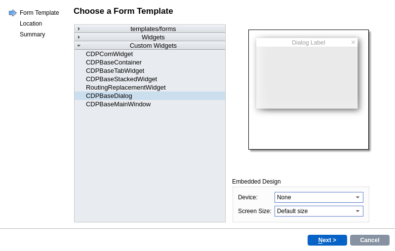
The dialogs loaded by buttons should be based on CDPBaseDialog. This will make the dialog follow the application theme, enable animations and other features as described in CDPBaseDialog. The dialog is created by right clicking on the GUI application in Code mode Project tree and selecting "Add New...". In the wizard, select "Qt" -> "Qt Designer Form" and click "Choose...". In the next page, select "CDPBaseDialog" from the "Custom Widgets" section as the Form Template and continue with the wizard. The defaults should be fine in the remaining steps.

Note properties like renderPixmap, that makes the dialog render a pixmap of itself to be used during move, and properties like animStart that sets the starting point of the pop-up animation.

To make the Popup Dialog Button load the dialog, all we have to do is adding the path to our ui/form in the uiFileName property. Note that there are also properties for making the dialog top level, pin protection and cache to save memory when the same dialog can be loaded by several buttons. The latter is often used in combination with the routingReplacement property. When replaceableRouting has been configured on the dialog, the string in routingReplacement will replace the replaceableRouting string in all cdp routings.
| Property | Value |
|---|---|
| uiFileName | Dialog.ui |
How to Make Buttons Send CDP Messages

To make the Message Button send messages we only have to edit two properties as described in the below table. Note that if we are to send a message with parameter we also have to edit the property named cdpParameter.
| Property | Value |
|---|---|
| cdpRouting | TutorFilter |
| cdpTextCommand | On |
The above example will send message “On” to the TutorFilter top level component and thus turn the filter on. If we also wanted a button to turn the filter off we could copy the button and replace “On” with Off. To make a button suspend or activate the TutorFilter we would have replaced On with CM_SUSPEND or CM_ACTIVATE.
How to Make Buttons Set a CDP Signal or Property Value

The Message Button can be used to set values on any CDP object. In the below example we have configured a button to update the cdp signal that adjusts the sinus amplitude of the generator.
| Property | Value |
|---|---|
| cdpRouting | Generator.Generator.SinusAmplitude |
| cdpProperty | Value |
| cdpParameter | 0.5 |

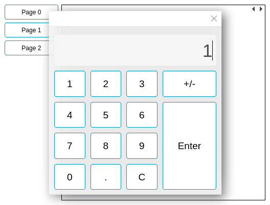
To activate the num pad and set the amplitude to any value we have to configure the button with the properties in the following table (note that “cdpParameter” has been replaced with “padType”).
| Property | Value |
|---|---|
| padType | NumPad |
| cdpRouting | Generator.Generator.SinusAmplitude |
| cdpProperty | Value |
How to Make Buttons in GUI Identical to IO Buttons

Hardware or IO buttons usually outputs value 1 when pressed and 0 otherwise. To make our GUI buttons behave the same we configure the cdpPressed functionality. The following table shows how to set the generator amplitude to “1” when pressing the button and “0” when releasing the button. Setting other values than 1 and 0 during press and release is currently not supported.
| Property | Value |
|---|---|
| cdpPressedRouting | Generator.Generator.SinusAmplitude.Value |
How to Make Buttons Show the State of Remote Objects
In addition to setting signal values and sending messages, as described in the previous sections, we sometimes want the buttons to show the state of remote objects. This is often solved by adding a SVG file (containing various state images) to the button and configure it to show the different states based on a cdp signal.
We have two options in this regard; either to use the checked state of the button or add styles. The checked state is often used when there are only two states or/and when we want to be able to switch state by clicking the button. When there are more than two states, styles have to be used. Note that there are other button states, like disabled and pressed, in addition to the normal state that we are now discussing.
Showing Button States Using Checked Functionality
Creating a button svg that supports the checked state is described in CDPBaseButton#Styling by SVG. In the following example we have added normal, checked and pressed state in the SVG file and are using the default disabled image as created by the button. Note that we have no layer named “Styles” in the current SVG file (though it's fully possible to add styles in addition to the present states).

The following table describes which properties to edit to make the svg look good and make a cdp signal control the checked state of the button.
| Property | Value | Description |
|---|---|---|
| sizePolizy | Expanding | Set to expanding to make the button scale along with our test window size. |
| text | “” | Removed text as the button svg contains an icon. |
| checkable | true | Must set this to true to make the button checkable. |
| svgFile | buttonRunningChecked.svg | The svg file that contains our button state images. |
| svgBorderPixmap | false | Our current image is not a border pixmap. Hence, we have to set this property to false to avoid a blurry button image. |
| lockAspectRatio | true | Since the size polizy is set to expanding we want to make sure that the button doesn't get deformed. |
| checkableByClick | false | We only want the control system to change the state of the button. In some cases you might want to set this to true. |
| cdpCheckedRouting | MyRemote.Signal.Value | Routing to the remote signal. Setting it to “1” sets the checked image and “0” sets it to normal. |
Showing Button States Using Style Functionality
Creating a button svg that supports styles is described in CDPBaseButton#Styling by SVG. In the following example we have added normal (Style0) and pressed state in “Layer1” of the SVG file. The checked element of the previous example has been renamed to “cdpButtonStyle1” and moved to the “Styles” layer. Note that we could have added as many styles as we wanted if required by the task at hand.

The following table describes which properties to edit to make the svg look good and make a cdp signal control the styles of the button.
| Property | Value | Description |
|---|---|---|
| sizePolizy | Expanding | Set to expanding to make the button scale along with our test window size. |
| text | “” | Removed text as the button svg contains an icon. |
| svgFile | buttonRunningStyles.svg | The svg file that contains our button state images. |
| svgBorderPixmap | false | Our current image is not a border pixmap. Hence, we have to set this property to false to avoid a blurry button image. |
| lockAspectRatio | true | Since the size policy is set to expanding we want to make sure that the button doesn't get deformed. |
| cdpStyleRouting | MyRemote.Signal.Value | Routing to the remote signal. Setting it to “1” sets style 1 and “0” sets it to normal (style0). |
How to Configure Buttons in a Radio Group
In the following example we will use the checked svg from the previous section, How to Make Buttons Show the State of Remote Objects, and show how to configure four buttons to be in a radio group. There are a few important differences to note when making a radio group for a control system contra an ordinary PC application. For instance, we might have conditions that make none of the buttons checked (no connection to remote or unknown state). Note that all buttons have to be placed withing the same widget container to add them to the same group.

The below table shows how to configure each button for a typical control system. Note that the size/styling properties from the previous section have been left out to focus purely on the radio button functionality. Further, it is worth noting that we could have solved the checked states using styles as described in the previous chapter. The styles functionality is like a swiss army knife that can be used for almost any purpose when targeting remote applications. However, for tasks like a menu system that is not to be controlled from the remote, the checked functionality is usually preferred.
| Property | Value | Description |
|---|---|---|
| checkable | true | Must set this to true to make the button checkable. |
| autoExclusive | false | This property is often true in ordinary pc applications as we usually want one and only one button to be checked at the time. When true, clicking a button in the group will make the previously checked button unchecked and the currently clicked button checked. In a control system we usually want the buttons to always show the actual state of the system. |
| svgFile | buttonRunningChecked.svg | The svg file that contains our button state images. |
| valueToEmit | [1, 2, 3 or 4] | This value must be unique for each button and should be identical to the signal value, cdpCheckedRouting, that are to select/check the button. Avoid value 0 if you want no buttons to be checked when the control system isn't running. |
| checkableByEmitValue | true | This property ensures that the button is only checked if the value received from cdpCheckedRouting is identical to the value configured in valueToEmit. |
| checkableByClick | true | This property decides whether or not a user click should make the button checked. In our current example, it is set to true, meaning that the button is checked instantly when clicked. If we instead set it to false, the button will only get checked when the remote value matches valueToEmit. This means that we would also have to configure the button to send a change request to the control system. This can be done sending a message, changing a remote value, or setting a remote value to 1 during button push. We don't have to think about any of that in our current example as the property is true. |
| cdpCheckedRouting | MyRemote.Signal.Value | Routing to the remote object that are to control which button to check. |
Note that the plain button of the cdp theme, :/themes/flat_light/buttons/buttonPlain.svg, includes a checked state that can be used to test the above functionality.
How to Use Buttons in a Menu
Buttons in a menu is configured similar to the radio button example of the previous section. The only difference is that we often want the user to be able to switch pages without having to be connected to a control system. Thus, both the autoExclusive and checkableByClick properties are usually set to true.
Note that Menu Button can be used instead of ordinary buttons. This will provide some additional features and styling abilities.
Menu Button Example
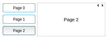
The following example shows how to connect three buttons to a stacked widget. The stacked widget is a standard qt widget located within the “Containers” group of the widget panel. Use the “Filter” function if you have a hard time finding it. Pages are inserted into the stacked widget by right-clicking and selecting “Insert Page”.

The three buttons are added in a widget to the left and configured as described in the following table.
| Property | Value | Description |
|---|---|---|
| checkable | true | Must set this to true to make the button checkable. |
| autoExclusive | true | This property is often true in ordinary pc applications as we usually want one and only one button to be checked at the time. When true, clicking a button in the group will make the previously checked button unchecked and the currently clicked button checked. In a control system we usually want the buttons to always show the actual state of the system. |
| svgFile | :/themes/cdp_light/buttons/buttonPlain.svg | The svg file that contains our button state images. Note that it is also possible to use the svgFileChecked property if we have separate svg files for checked and unchecked state. |
| valueToEmit | [0, 1 or 2] | This value must be unique for each button and must be identical to the page that the button is to select. |
| checkableByClick | true | Must be true as we want to be enable switching pages by user click. |
| (toggleOnPressed) | false (or true) | Decides if we are to check the button on press or release. Making the property false allows users to regret pushing buttons by moving the mouse outside the button area before releasing. |
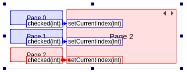
To make the buttons select pages in the stacked widget we also have to connect them using the qt signals and slots mechanism. Press F4 in the designer to enter signal/slot mode and then click and drag from the buttons to the stacked widget. In the dialog that pops up we select the checked(int) signal on the button and setCurrentIndex(int) slot on the stacked widget. When finished connecting all buttons, the dialog should look something like the following picture (press F3 to get back into ordinary edit mode).

Note that it is fully possible also to control buttons and pages from the control system in addition to the above. This is done by adding the missing properties from the previous section.
Pin Protected Pages
The Popup Dialog Button also supports protecting pages by pin code. To make the second page protected by pin, all we have to do is edit the pinCode property of the button and replace the connection to the stacked widget with a connect from clickedPinProtected(int) to setCurrentIndex(int).
| Property | Value | Description |
|---|---|---|
| pinCode | xxx | The pin code that has to bee typed correctly to enter the page. Note that decimal values are supported. |

Switching Pages from the Control System
In some applications we might want to control GUI pages from the control system. For instance to make a joystick button select an important GUI page and/or increase/decrease selected page. To enable this we have to make use of the button property named cdpCheckedRouting. All buttons should be configured with the same routing and will switch selected page when the cdp signal/property value is identical to valueToEmit.
* Note the cdpPressedRouting property that is necessary to notify the control system about user selected pages in GUI. The checkableByClick property must be set to false if the control system is to use the cdpPressedRouting to decide whether or not the user is allowed to switch page.
Slider Examples
About
There is currently only one Slider in the base widgets package. The other widget indicated by a slider icon, named Slide Indicator, is a slider for showing values using up to four knobs on a single rail. Note that the slider supports lots of functionality as described in the Slider documentation.
How to Show Current Value on the Slider Knob
The current value of the slider can be configured to show as text on or beside the knob. The following example demonstrates how to configure a horizontal slider with the current value showing just below the slider knob. Note that in most cases it would be a better idea to create a new svg file that includes knob text in the design. That is to add room for the value either on the knob (or in a transparent area of the knob).

The following table describes how to configure a slider to look like the above.
| Property | Value | Description |
|---|---|---|
| minimumSize | 0 x 40 | Had to adjust the min height of the slider to make room for the knob text. This would not have been necessary if the svg was designed for knob text. |
| font | ||
| numPrecision | 0 | The numPrecion on the slider also affects the precision of the knob text. |
| svgFile | :/themes/flat_light/sliders/sliderTriangleKnob.svg | The default triangular knob svg that is actually not designed to include knob text. |
| knobText | true | Enable knob text |
| knobTextRectangle | 4,27, 30 x 15 | The size and position of the knob value/text relative to the knob upper left corner. Note that the y value has been edited to 27 to position the text below the knob. |
| orientation | Horizontal | The orientation of the slider |
| endMargins | 8 | Increased the end slider margins to 8 to ensure that the whole rect of the knob text is visible at the ends of the slider. |
Note that the changes done to the knob text, like font and precision, will not show on the widget until you preview or reopen the form.
How to Make the Rail Fill to Current Value
Currently, this is a feature that is not built into the slider, but it can be achieved using the alarm sectors and some tweaking of properties:
- Set tick pos to for instance, TicksLeft.
- Set minor tick length equal to rail width.
- Adjust tickRailSpacing to position the minor ticks on top of the rail.
- Set alarmShow to true
- Set max and min on all alarms to 0, except the one you want to control on the rail.
- Press F4 to enter connection mode and connect the slider to itself. For instance, sliderMoved() to setValueMaxNormal().
- This should enough to get the filling going. If also wanting numbers, use numTickOffset or majorTickLength to control distance to rail (use the latter if hidden ticks and numTickOffset are causing number cutoff).
Note: The property named tickRailEndings can be used to avoid rails longer than actual range and that end margins can be used to adjusting for instance a bar to show at the same length as a slider (when in the same layout and having different font size etc).
Get started with CDP Studio today
Let us help you take your great ideas and turn them into the products your customer will love.