CDPBaseDialog Class
The Dialog widget is a popup window shown above the main window. More...
| Header: | #include <CDPBaseDialog> |
| Inherits: | RenderPixWidget, RoutingReplacer, RoutingContainerBase, |
| Inherited By: |
Properties
|
|
- 8 properties inherited from RenderPixWidget
Public Functions
| CDPBaseDialog(QWidget *parent = 0) | |
| virtual | ~CDPBaseDialog() |
| virtual QWidget * | containerWidget() const |
| virtual int | contentMargin() |
| virtual bool | moveOnlyByHeader() |
| virtual void | setContentMargin(int margin) |
| virtual void | setIQtCDPPointer(IQtCDP *pIQtCDP) |
| virtual void | setMoveOnlyByHeader(bool headMove) |
| virtual void | setSvgFile(const QString &svg) |
| void | setTitleSpaceReserved(bool reserved) |
| void | setTranslucentBg(bool translucent) |
| virtual void | setUserEventAction(ExternalUserEventEater::UserEventAction action) |
| QString | svgFile() |
| QString | title() |
| bool | titleSpaceReserved() const |
| bool | translucentBg() |
| virtual ExternalUserEventEater::UserEventAction | userEventAction() |
- 19 public functions inherited from RenderPixWidget
- 3 public functions inherited from RoutingReplacer
- 3 public functions inherited from RoutingContainerBase
Public Slots
| virtual void | hideWidget() |
| void | setContainerWidget(QWidget *widget) override |
| virtual void | setInCommand(bool cmd) |
| virtual void | setSmoothPixmap(bool smooth) |
| virtual void | setTimeOffsetSecs(double value) |
| virtual void | setTitle(const QString &text) |
| virtual void | setWidgetFont(const QString &font) |
| virtual void | setWidgetStyle(int style) |
| virtual void | setWidgetTheme(const QString &theme) |
| virtual void | showWidget() |
- 10 public slots inherited from RenderPixWidget
Signals
| void | sizeChanged(int width, int height) |
- 2 signals inherited from RenderPixWidget
Static Public Members
| QString | titleObjectName() |
- 4 static public members inherited from RoutingContainerBase
Protected Functions
| virtual void | changeEvent(QEvent *e) |
| virtual void | mouseMoveEvent(QMouseEvent *ev) |
| virtual void | mousePressEvent(QMouseEvent *ev) |
| virtual void | mouseReleaseEvent(QMouseEvent *ev) |
| void | processSvgFile(QString svg) |
| virtual void | resizeEvent(QResizeEvent *ev) |
| virtual void | updateShadowMargins() |
| void | updateTitleColor() |
- 9 protected functions inherited from RenderPixWidget
Additional Inherited Members
- 1 protected slot inherited from RenderPixWidget
Detailed Description
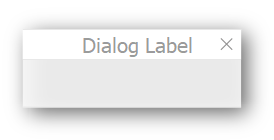
The Dialog widget is a popup window shown above the main window.
The Dialog widget supports features like opening and closing animations, rendered pixmap to make any movement as smooth as possible, themes, and other useful features.
Dialogs are typically opened in the GUI using Popup Dialog Buttons. How to open existing and create new dialog form files in CDP Studio is described in the Design Mode Manual.
To make signal-and-slot connections between dialogs and the main window, use the UI Signal Bridge widget.
Note: Make sure that all objects that are connected using signals and slots have unique names across .ui files. Failing to do so might cause source objects to connect wrong targets. In addition, be aware that connections are error prone when maintaining projects as they are not visible in normal mode and not possible to copy.
How to Configure a Floating Panel
The Open Bridge template files, which can be added to your GUI project as using the CDP Studio wizards, demonstrate how to configure and display floating panels when pressing checkable buttons.
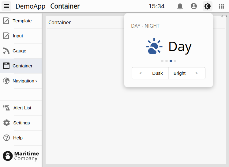
In the picture above, a floating panel is used to show the theme selector in the top menu.
The button itself is an ordinary Popup Dialog Button configured with uiFileName and with checkable set to true. With the checkable option enabled, clicking the button toggles the dialog’s visibility.
All other configuration options are specified on the main dialog element in the form (.ui) file. For example:
animStartis set toNoAnimationto make the panel appear instantly.animEndis set toAlignToButtonRightto align the panel’s right edge with the button’s right edge.animEndOffsetYis adjusted so the panel appears just below the shadow of the top menu.svgFileis set to a file without a title section, andtitleSpaceReservedis set to false, to remove the title area.moveOnlyByHeaderensures the panel stays fixed in place.userEventsExternalis set toHideDialog, so the panel closes automatically when the user clicks elsewhere in the UI.
How to Configure a Floating Submenu
The Open Bridge template files also demonstrate how to configure a floating submenu.
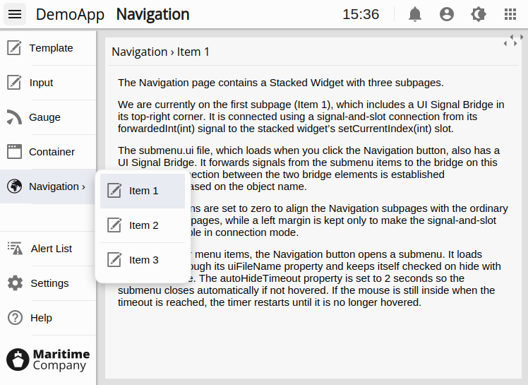
In the picture above, pressing the Navigation button opens a submenu with three items.
Unlike ordinary menu items, the Navigation button is configured to load a submenu through its uiFileName property. It is set to be checkable so that the button stays checked while the submenu is visible. The uncheckOnHide property is disabled to ensure the button remains checked when the submenu closes.
The autoHideTimeoutSec autoHideTimeoutSec property is set to 2 seconds so the submenu closes automatically if not hovered. If the mouse is still inside when the timeout is reached, the timer restarts until the submenu is no longer hovered.
The connections from the submenu items to the Navigation subpages are handled through UI Signal Bridge elements. Each submenu item’s checked(int) signal is connected to a bridge widget in the submenu dialog. That bridge forwards the signal to a matching bridge widget on the Navigation page, using the object name of the target bridge to establish the connection. The forwarded(int) signal of the Navigation page bridge is then connected to the stacked widget’s setCurrentIndex(int), which switches the active subpage.
The main settings in the dialog are similar to those of the floating panel in the previous section. The difference is that animEnd is set to AlignToButtonTopRight, which aligns the submenu to the right of the button without the need for any additional offsets.
How to Configure External Dialog Windows
The dialog is configured to only show inside the GUI application by default. Trying to drag the dialog outside the GUI, to place it on a separate screen, is not possible. To open the dialog as a separate application window, we can configure the preferParent property on the button to false.
The SVG file that styles the dialog often includes transparency to create shadow effects. This might look weird in the external application window as it doesn't enable transparency by default. We can turn this on by setting translucentBg in the dialog to true. This will make the window look exactly like it does when being internal.
Most themes also have a version of the SVG styling file without shadows. The path is identical to the default except for the shadow part, :/themes/< theme >/dialogs/dialogWindow.svg. Use this if you want to keep the draggable window borders and the default system header.
How to Create a Settings Dialog with Save and Cancel
A settings dialog will often allow the user to configure different settings and then decide whether to reset or save the changes. To achieve this, we will have to configure all input widgets, like spin boxes, line edits, and combo boxes to not immediately send their values to the control system when changed. In most input widgets, this is done by setting the property named updateOnSlotOnly to true. This setting makes the widget send new values to the control system only when its sendToCdp slot is triggered. The input widgets have a similar slot for resetting their value to be identical to the remote value, resetToCdp.
Instead of connecting the save and reset buttons to all input widgets in the settings dialog, we can place the widgets in a Container widget. The Container has slots similar to reset and save in the input widgets and will execute on all children when triggered.
How to Reuse Dialogs to Show Different Remote Values
Some applications might require multiple identical dialogs showing values from different remote sources. A good example of such is pipe diagram applications with pumps and valves. Clicking the various elements usually pops up a dialog showing further status/control details. When the dialogs are identical and more than just a few, it would be much simpler to create one dialog and have it show different sources when clicked, than to create hundreds of dialogs. This is where routing replacement comes in handy.
Routing replacement is done using simple string replacement. The dialog property replaceableRouting, must first be configured with a string that does not occur in any remote objects that are to be routed, for instance $(REPLACE). This string can now be used as a placeholder in the different cdp routing properties of our dialog items. When the dialog is opened, by for instance a button of type CDPBaseButtonPopDlg, the placeholder string will get replaced by a string configured in the button. In CDPBaseButtonPopDlg, this property is named routingReplacement.
To illustrate the above with a full example, we'll add two labels to a dialog to show the state and location of a valve. In the control application, the valve is a component having the two as signals. This would make our dialog.ui look something like the following (when wanting valve component name to be replaceable):
| widget | property | value |
|---|---|---|
| CDPBaseDialog | replaceableRouting | $(REPLACE) |
| CDPBaseLabel | cdpRouting | PipeApp.$(REPLACE).state |
| CDPBaseLabel | cdpRouting | PipeApp.$(REPLACE).location |
Next, we need to configure the buttons that are to open the dialog. The properties will be identical in each button instance, except for CDPBaseButtonPopDlg::routingReplacement, which represents the valve component name.
| property | value |
|---|---|
| useCache | true |
| uiFileName | dialog.ui |
| routingReplacement | Valve1 |
Clicking the button will bring up the dialog, replace routings and show the labels with their new routed values. They should now be showing the values of PipeApp.Valve1.state and PipeApp.Valve1.location.
Note: The property named useCache was added to make the dialog global and thus save memory.
Styling by SVG
Use the svgFile property to style the widget using a svg file. Styling by svg enables switching between different themes in runtime (as long as the files are placed at identical locations within theme directories).
Main element structure
In the svg structure for the CDPBaseDialog, all graphics are located in the cdpBackground element. The widget draws the background as a border pixmap based on the border margin rects. Thus, the title and the exit cross gets painted correctly when the widget is scaled. The shadow rects are used to place the content of the dialog correctly when we got shadows and the exit rect for knowing the position of the close box.
svg
└─── Layer1
      ├─── cdpTitleText               (text)
      ├─── cdpShadowTopLeft           (transparent rect/path)
      ├─── cdpShadowBottomRight       (transparent rect/path)
      ├─── cdpBorderMarginBottomRight (transparent rect/path)
      ├─── cdpBorderMarginTopLeft     (transparent rect/path)
      ├─── cdpExitRect                (transparent rect/path)
      └─── cdpBackground              (element group or rect/path)
            ├─── < Path >             (transparent rect/path)
            └─── < Group >            (graphics)
The following tree view shows the svg structure that can be used on the CDPBaseDialog.
| Property | Type | Description |
|---|---|---|
| cdpTitleText | text | Set font color and size. |
| cdpShadowTopLeft | rect | When a shadow is added to the edges of the dialog we can use this property to make sure that the contents of the dialog will not be placed on top of shadows. The width of the rect specifies width of the left shadow while the height specifies the top shadow. |
| cdpShadowBottomRight | rect | When a shadow is added to the edges of the dialog we can use this property to make sure that the contents of the dialog will not be placed on top of shadows. The width of the rect specifies width of the right shadow while the height specifies the bottom shadow. |
| cdpBorderMarginBottomRight | rect | All graphics are placed on the background and rects are used to set the border margins. The right border margin must be wide enough to include the exit rect, else the cross will get stretched when the dialog is extended. Note that the width of the rect specifies the right border margin while its height specifies the bottom margin. |
| cdpBorderMarginTopLeft | rect | The width of the rect specifies the left border margin while the height specifies the top margin. |
| cdpExitRect | rect | Transparent rectangle that specifies the location and size of the close box (exit cross). |
| cdpBackground | rect or an element group containing a rect | The cdpBackground should contain the actual background graphics including shadows and close cross. To ensure that the svg parser gets the correct background size (and aspect ratio), we have to place a transparent rect along with the graphics within a group element. |
Style element structure
The dialog supports the following structure for styles.
svg
├─── Layer1
│     └─── ...                  (see previous section)
└─── Styles
      ├─── cdpTitleTextStyleX   (text)
      └─── cdpBackgroundStyleX  (element group or rect/path)
            ├─── < Path >       (transparent rect/path)
            └─── < Group >      (background graphics)
Note: The X in the above list is just a placeholder for the style number that the element represents.
Property Documentation
cdpFullTargetRouting : const QString
cdpTargetRouting : const QString
contentMargin : int
Access functions:
| virtual int | contentMargin() |
| virtual void | setContentMargin(int margin) |
moveOnlyByHeader : bool
This property holds whether the widget is only movable by clicking on the header.
Access functions:
| virtual bool | moveOnlyByHeader() |
| virtual void | setMoveOnlyByHeader(bool headMove) |
replaceableRouting : const QString
This property holds a string that can be used and replaced in child object routings.
The string added in this property can be used in routing properties of all child objects. The string that are to replace the replaceableRouting is configured in the button that launches the dialog.
Click here for further details.
svgFile : QString
This property holds the path to the svg file that styles the widget.
The path can be either to a resource or a file on disk.
Note: Resources can be overridden by files on disk with identical names.
Access functions:
| QString | svgFile() |
| virtual void | setSvgFile(const QString &svg) |
title : QString
This property holds the dialog title.
Access functions:
| QString | title() |
| virtual void | setTitle(const QString &text) |
titleSpaceReserved : bool
This property holds whether to reserve space for the title label when the title text is empty.
When enabled, this property allows you to hide the default title text by setting it to empty, making it possible to replace that area of the dialog with custom elements, such as icons and specialized labels. This is particularly useful when configuring container dialogs, like those used in the Open Bridge top menu. By hiding the title text, users can place content at the top of the dialog, where the title is typically displayed.
Access functions:
| bool | titleSpaceReserved() const |
| void | setTitleSpaceReserved(bool reserved) |
translucentBg : bool
This property holds whether to allow transparency of the widget or not.
Set this property if you are using a theme that has transparent parts.
Note: Transparency increases cpu usage during move as we also have to redraw the widget behind the widget being moved.
Further, when a dialog is triggered to load without a parent, for instance when loaded by a button that is configured with preferParent to false, we will get a frameless top level window when this property is set.
Access functions:
| bool | translucentBg() |
| void | setTranslucentBg(bool translucent) |
userEventsExternal : ExternalUserEventEater::UserEventAction
This property holds how to behave when the user attemts to interact with widgets outside the dialog.
Access functions:
| virtual ExternalUserEventEater::UserEventAction | userEventAction() |
| virtual void | setUserEventAction(ExternalUserEventEater::UserEventAction action) |
Member Function Documentation
CDPBaseDialog::CDPBaseDialog(QWidget *parent = 0)
Default constructs an instance of CDPBaseDialog.
[virtual] CDPBaseDialog::~CDPBaseDialog()
Destroys the instance of CDPBaseDialog. The destructor is virtual.
[virtual protected] void CDPBaseDialog::changeEvent(QEvent *e)
[virtual] QWidget *CDPBaseDialog::containerWidget() const
See also setContainerWidget().
[virtual slot] void CDPBaseDialog::hideWidget()
[virtual protected] void CDPBaseDialog::mouseMoveEvent(QMouseEvent *ev)
[virtual protected] void CDPBaseDialog::mousePressEvent(QMouseEvent *ev)
[virtual protected] void CDPBaseDialog::mouseReleaseEvent(QMouseEvent *ev)
[protected] void CDPBaseDialog::processSvgFile(QString svg)
[virtual protected] void CDPBaseDialog::resizeEvent(QResizeEvent *ev)
[slot] void CDPBaseDialog::setContainerWidget(QWidget *widget)
See also containerWidget().
[virtual] void CDPBaseDialog::setIQtCDPPointer(IQtCDP *pIQtCDP)
[virtual slot] void CDPBaseDialog::setInCommand(bool cmd)
[virtual slot] void CDPBaseDialog::setSmoothPixmap(bool smooth)
[virtual slot] void CDPBaseDialog::setTimeOffsetSecs(double value)
[virtual slot] void CDPBaseDialog::setWidgetFont(const QString &font)
[virtual slot] void CDPBaseDialog::setWidgetStyle(int style)
[virtual slot] void CDPBaseDialog::setWidgetTheme(const QString &theme)
[virtual slot] void CDPBaseDialog::showWidget()
[signal] void CDPBaseDialog::sizeChanged(int width, int height)
[static] QString CDPBaseDialog::titleObjectName()
[virtual protected] void CDPBaseDialog::updateShadowMargins()
[protected] void CDPBaseDialog::updateTitleColor()
Get started with CDP Studio today
Let us help you take your great ideas and turn them into the products your customer will love.