CDPBaseBar Class
The Vertical Bar is a graphical representation of a value as a filled rectangle. More...
| Header: | #include <CDPBaseBar> |
| Inherits: | CDPBaseTickMarks, StateChanger, and CDPBaseCom |
| Inherited By: |
Properties
|
|
- 49 properties inherited from CDPBaseTickMarks
- 6 properties inherited from CDPBaseWidget
Public Functions
| CDPBaseBar(QWidget *parent) | |
| virtual | ~CDPBaseBar() |
| QString | cdpStyle() |
| int | endMargins() |
| virtual double | fillStartValue() |
| virtual bool | fillStartValueEnabled() |
| virtual Qt::Orientation | orientation() |
| QString | routing() |
| void | setCdpStyle(QString routing) |
| void | setEndMargins(int offset) |
| virtual void | setFillStartValue(double origin) |
| virtual void | setFillStartValueEnabled(bool enabled) |
| virtual void | setOrientation(Qt::Orientation orientation) |
| void | setRouting(QString routing) |
| virtual void | setSvgFile(const QString &svg) |
| virtual void | setTickBarSpacing(double space) |
| virtual QString | svgFile() |
| virtual double | tickBarSpacing() |
| virtual double | value() |
Reimplemented Public Functions
- 90 public functions inherited from CDPBaseTickMarks
- 3 public functions inherited from StateChanger
- 18 public functions inherited from CDPBaseCom
- 8 public functions inherited from CDPBaseWidget
- 4 public functions inherited from CDPBaseControlVisible
Public Slots
| virtual void | forceWidgetStyle(int style) |
| virtual void | forceWidgetStyle(double style) |
| virtual void | setGlobalStyle(int style) |
| virtual void | setMaxValue(double value) |
| virtual void | setMinValue(double value) |
| virtual void | setValue(int value) |
| virtual void | setValue(double value) |
| virtual void | setWidgetStyle(int style) |
| virtual void | setWidgetTheme(const QString &theme) |
- 16 public slots inherited from CDPBaseTickMarks
- 10 public slots inherited from CDPBaseWidget
Signals
| void | valueChanged(double newValue) |
- 1 signal inherited from CDPBaseWidget
Protected Functions
| int | currentTickNumLength() const |
| void | loadSvg() |
| virtual void | paintEvent(QPaintEvent *ev) |
| int | pixelPosFromValue(double value) |
| virtual void | resizeEvent(QResizeEvent *ev) |
| QSize | sizeHint() const override |
Reimplemented Protected Functions
| virtual void | loadPixmaps(bool skipSVG = false) |
- 4 protected functions inherited from CDPBaseCom
- 1 protected function inherited from CDPBaseControlVisible
Additional Inherited Members
- 3 static public members inherited from CDPBaseCom
Detailed Description
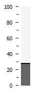
The Vertical Bar is a graphical representation of a value as a filled rectangle.
To show a CDP object/property value, enter the path in the cdpRouting property.
Some basic properties and styling is required to use the Bar widget. The value range, i.e. the minimum and maximum value of the bar must be set using the properties minValue and maxValue.
The following properties are the most important when styling a Bar widget:
| Name | Description |
|---|---|
| tickShow | Show the ticks on the bar. |
| tickPos | Specifies where to display the ticks, to the left, right, above or under. |
| majorTickMethod | SpecifyNumber defines that the property majorTicks sets the number of major ticks to display. SpecifyInterval defines that majorTicks sets the interval between the major ticks, e.g. minValue=0, maxValue=100, majorTicks=25, the major ticks will be for the values 0, 25, 50, 75 and 100. |
| majorTicks | The number of ticks to show or the interval between the ticks. See the above explanation for majorTicksMethod. |
| numPos | To show values of the major ticks or not, where to show the value; left, right above or below |
| numPrecision | The number of digits behind the comma, e.g. value 2 to display as 5.00 |
| numRotate | Setting numRotate will cause the tick numbers to rotate 90 degrees from their normal orientation |
It is possible to add color on either side of the filled rectangle showing the value. This is typically used to visually show normal operation, warning, critical and error range. The property alarmShow enables the range colors. Four different ranges are supported, NormalColor, WarningColor, WarningHighColor, ErrorColor. The ranges are set using the valueMin and valueMax for each of the ranges.
Default is to show the same color on both sides. To show different colors on the right side or below, use the property named alarmIndicatorRight. The min/max properties that ends with Right, set the minimum and maximum values for the different color ranges on that side.
The color ranges can also be set dynamically during runtime. It is only the maximum value in the color range that can be dynamically changed. Use the properties named, cdpValueMax...Routing and insert the path of the CDP object/property that is to control the respective maximum value.
All widgets support controlling any class property of string or numeric types using routing. When there is no routing property available for a certain feature, we can add it using a Dynamic Property. For more information about this, see the Design Mode Manual regarding Dynamic Routing.
Styling by SVG
Use the svgFile property to style the widget using a svg file. Styling by svg enables switching between different themes in runtime (as long as the files are placed at identical locations within theme directories).
Main element structure
The following tree view shows the svg structure that can be used on the CDPBaseBar.
svg
└─── Layer1
      ├─── cdpTicksColor  (text)
      ├─── cdpTicksNumber (text)
      ├─── cdpBarBack     (element group or rect/path)
      ├─── cdpBorderMarginTopLeft     (transparent rect/path)
      ├─── cdpBorderMarginBottomRight (transparent rect/path)
      └─── cdpBarFill     (element group or rect/path)
           ├─── < Path >  (transparent rect/path)
           └─── < Group > (background graphics)
The following table explains the named elements in more detail.
| Property | Type | Description |
|---|---|---|
| cdpTicksColor | text | The color of this text will be used on the bar ticks. |
| cdpTicksNumber | text | The color of this text will be used on the tick numbers. |
| cdpBarBack [cdpTiledBack] | rect or an element group containing a rect | The cdpBarBack should contain the background of the bar. By default, the background is rendered/stretched based on widget size. To rather paint the background using a tiled pixmap (image that is repeated), rename cdpBarBack to cdpTiledBack. This enables having patterns on the background, like a stack of lines or dots. Painting the background as a border pixmap, to maintain border width and corners without stretching, requires adding the cdpBorderMarginTopLeft and cdpBorderMarginBottomRight elements. The size of these rectangles must cover the parts of the background that we do not want stretching. |
| cdpBorderMarginTopLeft | rect | Transparent rectangle that specifies the left border margin by its width and the top border margin by its height. The margins are used both when painting the background and the bar fill (except when these elements are renamed to cdpTiledBack or cdpBarTiledFill). |
| cdpBorderMarginBottomRight | rect | Transparent rectangle that specifies the right border margin by its width and the bottom border margin by its height. The margins are used both when painting the background and the bar fill (except when these elements are renamed to cdpTiledBack or cdpBarTiledFill). |
| cdpBarFill [cdpTiledFill] | rect or an element group containing a rect | The cdpBarFill should contain the fill of the bar. By default, the fill gets painted on the bar as a border pixmap, using the margins provided in the border margin elements. To fill the bar using a tiled image, rename cdpBarFill to cdpTiledFill. As described in the cdpBarBack element, this can be used to draw patterns, like a stack of lines or dots. |
Style element structure
The bar supports the following style structure.
svg
├─── Layer1
│     └─── ...                (see previous section)
└─── Styles
      ├─── cdpBarBackStyleX   (element group or rect/path)
      └─── cdpBarFillStyleX   (element group or rect/path)
            ├─── < Path >     (transparent rect/path)
            └─── < Group >    (background graphics)
Property Documentation
cdpOfflineValue : const double
This property holds the value to show when communication is offline and cdpOfflineValueEnabled is set to true.
The property has no effect when cdpOfflineValueEnabled is set to false.
See also cdpOfflineValueEnabled.
cdpOfflineValueEnabled : const bool
This property holds whether or not to show cdpOfflineValue when communication is offline.
Setting the property to false will make the widget keep/show the last value when communication is down.
See also cdpOfflineValue.
cdpRouting : QString
This property holds the routing to the cdp object we want values from.
Access functions:
| QString | routing() |
| void | setRouting(QString routing) |
cdpScaling : const double
This property holds the factor to multiply the incoming signal/property value.
cdpStyleRouting : QString
This property holds the routing to the cdp object that is used to change the widget svg style.
Access functions:
| QString | cdpStyle() |
| void | setCdpStyle(QString routing) |
endMargins : int
This property holds the end margins of the bar within the widget.
Access functions:
| int | endMargins() |
| void | setEndMargins(int offset) |
fillStartValue : double
This property holds the fill start value when enabled by fillStartValueEnabled.
When having a range from 0 to 100, setting this property to 50 and having a current value of 10 will fill the bare from 10 to 50.
Access functions:
| virtual double | fillStartValue() |
| virtual void | setFillStartValue(double origin) |
See also fillStartValueEnabled.
fillStartValueEnabled : bool
This property holds whether to enable setting custom fill start value or not.
Setting this property true, enables fillStartValue and allows the user to set a custom starting point for the bar filling.
Access functions:
| virtual bool | fillStartValueEnabled() |
| virtual void | setFillStartValueEnabled(bool enabled) |
See also fillStartValue.
maxValue : double
This property holds the maximum value of the bar range.
Access functions:
| virtual double | maxValue() |
| virtual void | setMaxValue(double value) |
minValue : double
This property holds the minimum value of the bar range.
Access functions:
| virtual double | minValue() |
| virtual void | setMinValue(double value) |
orientation : Qt::Orientation
This property holds the orientation of the widget.
The orientation can be horizontal or vertical.
Access functions:
| virtual Qt::Orientation | orientation() |
| virtual void | setOrientation(Qt::Orientation orientation) |
svgFile : QString
This property holds the svg file that styles the widget.
The path can be either to a resource or a file on disk. Note that resources can be overridden by files on disk with identical names.
Access functions:
| virtual QString | svgFile() |
| virtual void | setSvgFile(const QString &svg) |
tickBarSpacing : double
This property holds the distance from the bar to the ticks.
Access functions:
| virtual double | tickBarSpacing() |
| virtual void | setTickBarSpacing(double space) |
value : double
This property holds the current value of the bar.
Access functions:
| virtual double | value() |
| virtual void | setValue(int value) |
| virtual void | setValue(double value) |
Member Function Documentation
CDPBaseBar::CDPBaseBar(QWidget *parent)
Default constructs an instance of CDPBaseBar.
[virtual] CDPBaseBar::~CDPBaseBar()
Destroys the instance of CDPBaseBar. The destructor is virtual.
[protected] int CDPBaseBar::currentTickNumLength() const
[virtual slot] void CDPBaseBar::forceWidgetStyle(int style)
[virtual slot] void CDPBaseBar::forceWidgetStyle(double style)
[virtual protected] void CDPBaseBar::loadPixmaps(bool skipSVG = false)
[protected] void CDPBaseBar::loadSvg()
[virtual protected] void CDPBaseBar::paintEvent(QPaintEvent *ev)
[protected] int CDPBaseBar::pixelPosFromValue(double value)
[virtual protected] void CDPBaseBar::resizeEvent(QResizeEvent *ev)
[virtual slot] void CDPBaseBar::setGlobalStyle(int style)
[virtual slot] void CDPBaseBar::setWidgetStyle(int style)
[virtual slot] void CDPBaseBar::setWidgetTheme(const QString &theme)
[protected] QSize CDPBaseBar::sizeHint() const
[signal] void CDPBaseBar::valueChanged(double newValue)
Get started with CDP Studio today
Let us help you take your great ideas and turn them into the products your customer will love.