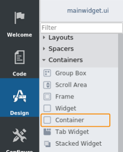
Grouping Widgets with Container in HMI GUI
Grouping Widgets with Container in HMI GUI
The purpose of this example is to show how to use the widget named Container in CDP Studio, the independent automation software for open PC-based real-time distributed control systems with simple NoCode programming.
The Container widget is very useful as you can set the layout and properties for the widgets within the container without having to think about the entire GUI. E.g. changing the margin will at once apply to all content in the container but have no effect on anything outside the container. The Container widget is often used to group menu buttons but is also useful when creating a side menu that can be shown/hidden depending on user actions.
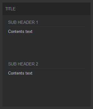
The Container widget
The Container widget is designed to have 2 sections, one to hold a main title and one for the body where the user should place content. The example uses a Label to hold the title and a standard Widget for the body. The body contains widgets that group sub titles and lines, and spacers that fill the empty space between the title elements.
Use the example as a starting point to group the controls in your Application. Study it to get a better understanding about layouts, margins and label properties for making different types of titles.
Note: To preview the GUI in design mode, press SHIFT-ALT-R on the keyboard.
How to Run the Example
To run the example from CDP Studio, open Welcome mode and find it under Examples. Next, in Configure mode right-click on the system project and select Run & Connect. See the Running the Example Project tutorial for more information.
Project Description
The following sections describe how the example was created, important properties and how to reuse widgets and save time during GUI development.
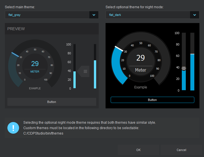
How to Select the Correct Theme
The project uses the theme named flat_gray as this theme makes the title section stand out with the most contrast. To see what the container looks like in other themes, go to CDP Studio Design mode and change the theme as described here.
The various themes can be quite different and the user might want to place contents differently depending on the selected theme. Hence, it is important that a theme is selected at the beginning of a project and not the other way around. Also, if wanting to be able to switch between light and dark colors (day and night mode) during run time, select two themes that have similar widget shapes. This will provide the best result.
The themes named cdp_light and cdp_dark will make the example look weird because these themes were designed to show the main title at the bottom of the containers and not at the top as in our new flat themes.
How to Configure the Main Layout
The layouts were added by selecting the parent widget, the container in this case, and selecting a Vertical Layout from the toolbox above the form. There are also buttons in the toolbox for horizontal layout, grid layout and a button for removing/breaking layouts that are already there. If you are unable to locate the layout toolbox, search the help for design mode manual to get instructions for how to do this.
When layouts are used to group widget elements, the elements will resize based on widget properties like sizePolicy, minimumSize and maximumSize. In the current example, the Widget is set to expanding, while we want the Label to have a fixed vertical size. The default properties are fine in this case and we don't have to configure anything.
The margins and spacing between widgets in a layout can be adjusted using the properties prefixed with layout. They are found in the property panel when you select the container, either by clicking it in the form or by selecting it in the object inspector (the upper right panel in default design mode setup).
To ensure that the top label is positioned correctly, most themes require that layoutTopMargin is set to 0. This has to be done to ensure that the title is centered vertically on the title box of the background for the flat_gray theme.
| Name | Description |
|---|---|
| layoutTopMargin | Must be set to 0 to center the title vertically at the top of the container. |
| layout...Margin | The left, right and bottom margins are also configurable, but the default values are fine for our container. |
| layoutSpacing | This sets the spacing between the elements in a layout, the title and body in our case. Adjust this if wanting more space between the title and the first sub title. |
Sub Title Element and Text Configuration
The sub title is grouped along with a line in a new widget. All layout margins of this widget are set to 0 to avoid the widget from taking up more space than necessary. To select this widget in the form we need to click on the empty spacing between the line and the sub title. Copies can be made by clicking and dragging the widget while holding down the CTRL key on the keyboard.
To ensure that the texts show correctly in all themes, we need to select a styling type for the different labels. This will ensure correct colors, font and alignment when switching between different themes. In our container, the stylingType property is configured as shown in the following table.
| Text | stylingType |
|---|---|
| Title text | Title |
| Sub title text | SubHeading |
| Contents text | Main |
How to Use the Example as a Template
The example project GUI can be used as a template when wanting to create custom containers. Open the project and copy paste into custom forms, or make copies to the scratchpad as described in the below note.
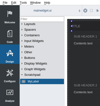
Note: Widgets can be dragged from the form to the widget panel to create reusable elements. The elements will show at the bottom of the widget panel (often referred to as the scratchpad).
Using the widget panel as a scratchpad can save a lot of time. When you drag elements back into the form they will keep the property values they had when added to the scratchpad.
Widgets that are added to the scratchpad are available to all projects and will still be there after a restart.
Right-click elements in the scratchpad and click Edit name to make them easier to find and reuse.
Dragging elements to the scratchpad from the form while holding down CTRL will make a copy rather than a move.
Get started with CDP Studio today
Let us help you take your great ideas and turn them into the products your customer will love.