Adding an Open Bridge Styled GUI to Automation System
Introduction
This example demonstrates how to create a GUI/HMI according to the Open Bridge maritime design standard. CDP Studio comes with pre-made widgets styled in the Open Bridge theme and you can easily create GUI/HMIs according to the standard with simple drag-and-drop.
Open Bridge is an open standard built on modern principles of user interface and workspace design, adapted to maritime context and regulations to improve safety and ease of operations.
The example is a comprehensive user interface with multiple pages with widgets styled and combined to demonstrate Open Bridge GUI design with CDP Studio.
The example can be used as a template or starting point to create Open Bridge styled GUI applications.
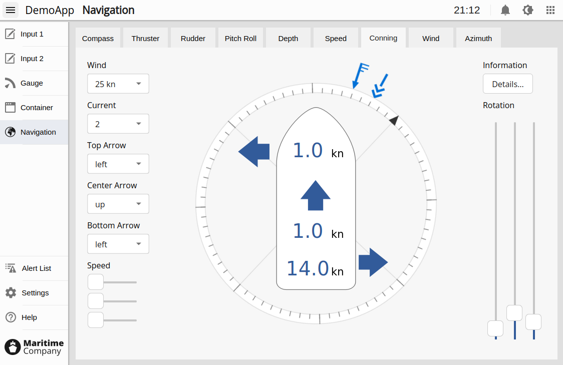
Logic and Styling
The OpenBridge example allows you to change values on widgets like meters and texts using sliders and buttons. This logic is made using Connection Mode / Signals and Slots. Press F4 in Design mode to see the connections, and F3 when you are done editing signals and slots. There is a separate example showing how the widgets can be connected to control logic; Creating an Open Bridge Styled Conning GUI Using Drag and Drop.
All elements in the example are based on standard widgets that are dragged into the UI using CDP Studio WYSIWYG Design mode. Some widgets, like the ones shown on the navigation page, are achieved by first dragging in a standard widget and then changing its properties. To illustrate this with an example, the compass widget is an ordinary meter with four needles, configured to show as a compass by selecting a different SVG file and toggling its style properties.
There are also a few elements, such as the conning meter, that are made by combining or stacking multiple standard widgets. The structure and styling of such elements are described in the UI itself, found by clicking on the buttons named "Details...". To use these complex elements in other projects, we recommend copying from the example using the Scratchpad in Design mode. Note that copying complex/stacked elements must be done by having the parent widget selected and not one of its child elements. The Object Inspector in the Design mode can be helpful to select the correct element.
All styling (SVG) files that are used in the example are available in the toolkit templates within the CDPStudio installation directory:
<Installation directory>/toolkits/<architecture>/CDP-<version>/templates/themes/openbridge_light
The files were exported from the Open Bridge Figma project and have been updated with the correct structure to be able to load them in the CDP widgets. Users that want to extend or update to future Open Bridge versions can use them as a starting point to create new themes.
Design Overview
The example implements both a top menu and a side menu as described in the Open Bridge Design Guidelines. A stacked widget is used for showing the application pages. It is connected to the menu buttons in the side menu and the page display widget in the top menu using signal and slot connections. The connections will show in CDP Studio Design mode after pressing F4 to enter Edit Signals/Slots mode. Press F3 to go back to Edit Widgets mode.
The first button on the left in the top menu controls whether or not to show the side menu. It has a signal and slot connection from signal toggled(bool) to the slot named animateWidth(bool) in the side menu container. In the container, we have configured the maxWidth and animWidthPx to similar sizes in addition to other animation properties like duration. Configured properties will show as bold text in the Design mode property panel.
The menu buttons in the side menu all emit different page numbers when they are clicked as specified in the button property named valueToEmit. We have connected the signal named checked(int) to the slot named setCurrentIndex(int) in the stacked widget to make it show the page requested by the button.
Adding a new button to the menu in CDP Studio Design mode requires the following steps:
- Duplicate one of the existing buttons in the menu by clicking and dragging it while pressing CTRL.
- Click the new button and configure the page it should trigger by editing valueToEmit
- Press F4 and drag a connection from the button to the stacked widget. Select the signal and slot described above.
- Add the page to the stacked widget if required by right-clicking on the arrows in its upper right corner. Select "Insert Page > After Current Page" in the context menu. The new page is added after the current page you are on.
- Finally, add the page name on both the button and the text selector widget in the top menu. The latter is done by right-clicking and selecting Edit Items... The page name must be placed on the same index as in the stacked widget.
OpenBridge Widgets
The example includes a set of Open Bridge UI elements, available in a dedicated OpenBridge group in the widget box. These are intended for users who wish to design their own Open Bridge applications.
By default, dragging a widget from the OpenBridge group into a form will insert a UI Loader Widget widget linked to the original UI file. This makes it quick to embed Open Bridge elements as they appear in the example, but the elements cannot be modified directly (such as changing texts or routings).
To instead create a local, fully editable copy of the form and make all elements configurable, hold the Ctrl key while dragging from the OpenBridge group.
Note: Using the azimuth widgets in a different project requires copying the thrusterL.ui and thrusterM.ui files to the Application directory of your project. Additionally, using the text widgets in dialogs requires placing a TextContainer somewhere in the parent hierarchy. Text sizes are controlled by the properties named valueStyle and titleStyle.
Scratchpad Widgets (Legacy)
In earlier versions, Open Bridge elements were provided through a scratchpad file. This method is still available in the example and can be used to make non-standard widgets appear in the widget box.
The scratchpad file is named openbridge.scratch and is located in the directory that contains the Application folder. You can open this folder by right-clicking on mainwidget.ui in the file selector, selecting Show Containing Folder from the context menu, and then navigating to the parent directory.
To load the scratchpad file, switch to Design mode and follow the steps in the Design Mode Manual.
How to Run the Example
To run the example from CDP Studio, open Welcome mode and find it under Examples. Next, in Configure mode right-click on the system project and select Run & Connect. See the Running the Example Project tutorial for more information.
Get started with CDP Studio today
Let us help you take your great ideas and turn them into the products your customer will love.