How to Use Meter Widgets in HMI GUI
It's beneficial to read through the Glossary before continuing.
About
The following example illustrates how to build a simple user-interface that shows 'Relative memory used' in a meter widget. 'Relative Memory used' is a signal value available from CDP that contains the memory usage of the computer as a number between 0 and 1.
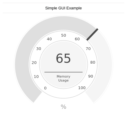
Creating the Simple Meter GUI
Create a new system and gui application in studio
- In Welcome mode, in the Projects tab, under Create Project, click New Project.
- In the wizard that pops up, select CDP System and click Choose....
- Name it Tutorial and click Next >.
- Click Next > one more time to select the default framework version.
- In the Application Type pull-down menu, choose GUI.
- Make sure Application Name is TutorialApp and click Finish
- We now have a basic GUI/CDP2Qt application and can start adding GUI elements to our form. Go to Design mode by first selecting TutorialApp in the Project tree.
- The Design mode menu button should now become enabled. Click it to enter Design mode.
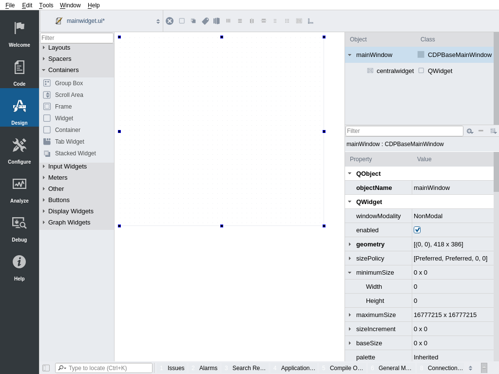
- In Design mode we should now have a canvas looking something like the following:
Adding Widgets to the Form
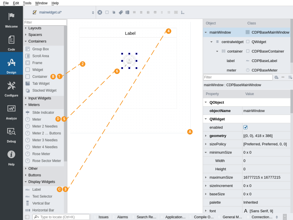
- Start by adjusting the mainWindow form to a reasonable size to work with.
- Drag a Container from the widgets palette to the form. The container widget groups widgets similar to that of a group box.
Roughly adjust the size of the container widget by clicking it and sizing it from either corner. Just make it large enough to work with, but do not spend a lot of time adjusting the widget as the following section explains how to get automatic widget-sizing by using layouts.
- Next, we want to add a Label and a Meter. Drag and drop the Label into the top part of the container (between the horizontal lines), and drag the Meter below it and drop it.
Adding Layouts to the Form
- Layouts align widgets and ensure that they scale along with their parent widgets. We will now show how to add layouts to the container and the main window.
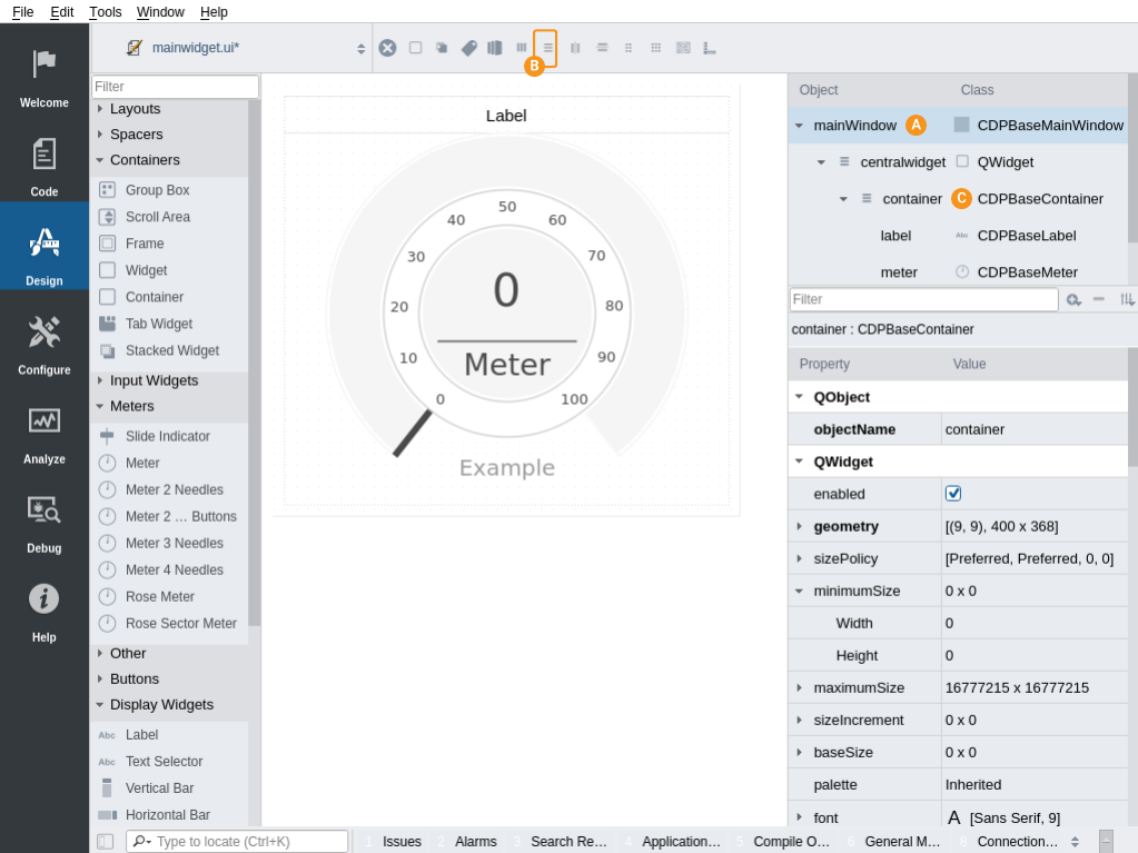
- Select the mainWindow (this is the form background) by clicking it with the mouse in the object inspector or in the form. The background is now selected and shows with blue squares around its edges.
- Click the icon with vertical lines, located in the tool panel just above the form. This inserts a Vertical Layout to the form and should make the container fit/scale nicely to the background.
- Repeat the above steps for the container . Select it by clicking it with the mouse and again add a Vertical Layout. The Meter and Label should now adjust nicely within the container.
Editing Object Properties
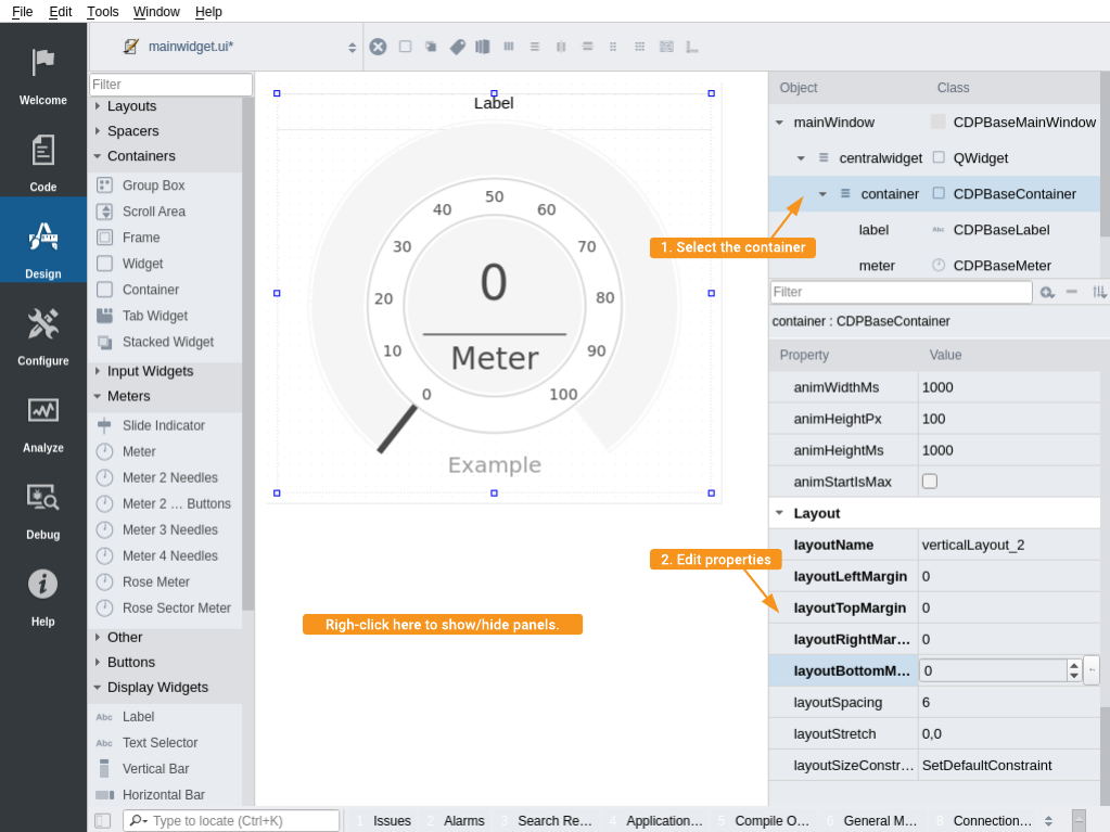
- Properties are edited by first selecting a widget. It can be selected by clicking the widget in the object inspector (top right panel) or in the form. The properties of the selected widget can now be edited in the property panel (bottom right).
- Select the container, and in the property panel, scroll to the bottom.
- Set the layoutLeftMargin, layoutRightMargin, layoutTopMargin and layoutBottomMargin to 0 to make the label fill to the container edges.
Note: The property named layoutSpacing specifies the empty space between widgets in the layout. In this case, it specifies the empty space between the label and the meter.
A Widget can be used to group widgets inside layouts and make them have different spacing and margins than other layout elements. When there is more than one element, the meter in our case, we would typically add a Widget below the title and add all widgets inside this widget. We can then set a different spacing between the widgets than the spacing between the title and the first widget.
- The various windows in GUI designer can be shown or hidden by right-clicking outside the form (on the form view background) and toggling the widget to false or true in the menu that pops up.
- Edited properties shows in bold font. To reset a property to its default value, select it and click the undo button to the far right.
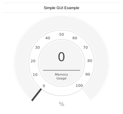
- Next, select the label and change the properties to that shown in the table below:
| Property | Value | Description |
|---|---|---|
| text | Simple GUI Example | Get a descriptive text |
| stylingType | Title | Get a Title styling for the label (Note that this overrides the theme default set by the theme manager) |
| font / Point Size | 16 | Set the font size (after setting stylingType above) |
- Finally, we change some of the meter properties as shown in the table below. Note the properties related to communication, prefixed with cdp. These are explained in the next section.
| Property | Value | Description |
|---|---|---|
| textPrefix | Memory\nUsage | Note that we use \n to get a new line. |
| textSuffix | % | Add unit to meter. |
| numPrecision | 0 | Set to 0 to avoid decimals. |
| cdpScaling | 100 | Multiply value received from CDP by 100 so that the value changes between 0 and 100 instead of between 0 and 1. |
| cdpRouting | TutorialApp.MemUsedRelative | Routing to the CDP signal value to display on the meter. |
Connecting the Meter to CDP
The various CDP display and input widgets have special properties for communication with CDP - these properties are prefixed with cdp.
In the previous section we used the cdpRouting property to connect the meter to a signal named MemUsedRelative. This signal shows memory usage relative to available memory; providing a number ranging from 0 to 1. Since we wanted to display the number in %, we increased the cdpScaling property from 1 to 100. The first part of the cdpRouting string is the application name.
Note: If we change this string to the name of a different application on a different computer in the System, the meter will show the memory usage of that computer.
The meter can be configured to show any numeric properties by setting the cdpRouting to point to the named object in CDP that we want to get the value from.
Note: The Meter widget can only show the object value if it can be converted to a number.
Preview the Form
- Press Alt + Shift + R to preview the form. Exit the preview by pressing Alt + F4.
Note that the CDP communication-interface is not running in preview mode, so widgets will only show default values in the preview mode.
How to Run the Tutorial
To run the tutorial from CDP Studio, select Configure mode, right-click on the system project and select Run & Connect. See the Running and Connecting to the System tutorial for more information.
When the application is running, memory usage should change as memory is allocated/deallocated by the Operating System and various running programs. You should for instance see needle movement when opening or closing a browser with multiple open tabs.

Start the Application Outside Studio
You probably do not want to start studio every time you want to run your applications. The following steps describes how to start it manually.
- Go to configure mode, switch to Deploy Configuration tab and select the system named 'Tutorial', in the top left tree view. Locate the table named Applications'. The column named 'Deploy directory' sets the deploy directory.
- Open a terminal and cd to the path of your deployed application. This directory can be copied to any location.
- Type ./MemoryUsageGUI to start the application in release mode.
Note: Can also start the application by double-clicking the binary.
- See also Runtime Automatic Startup for how to run an application when the computer starts up.
Get started with CDP Studio today
Let us help you take your great ideas and turn them into the products your customer will love.