Creating a Professional HMI GUI
Introduction
The purpose of this example is to demonstrate many of the possibilities that exist to create appealing GUIs.
This example demonstrates:
- The use of themes and how you can switch between themes run-time, e.g. day and night mode
- Examples of the most used widgets
- How to configure a widget to show different style and information
- How to use Qt Signals/Slots to exchange values between widgets
- How to use tabs to have multiple GUI pages
How to Run the Example
To run the example from CDP Studio, open Welcome mode and find it under Examples. Next, in Configure mode right-click on the system project and select Run & Connect. See the Running the Example Project tutorial for more information.
Project Overview
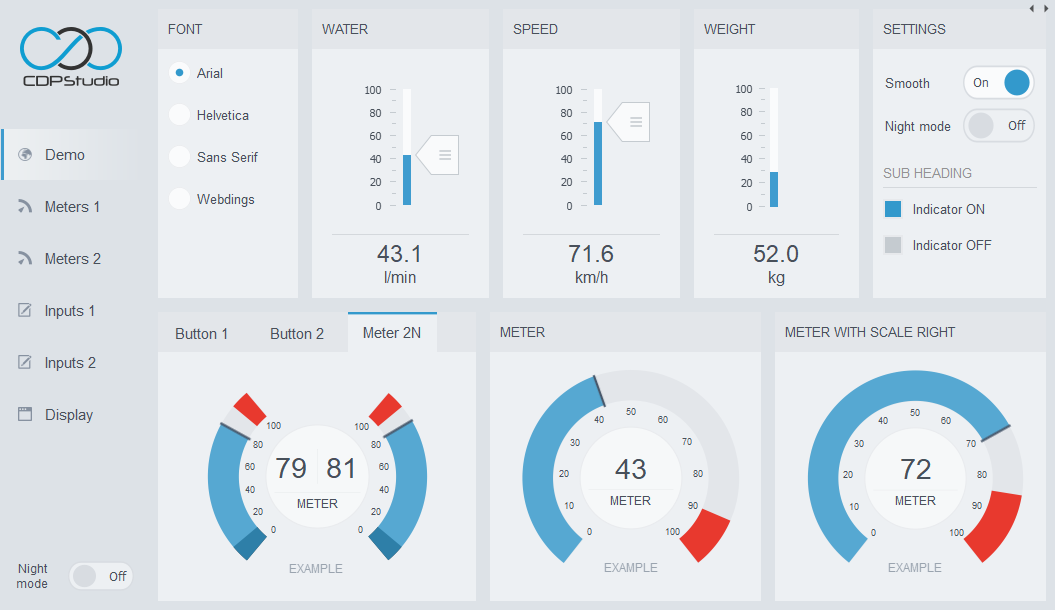
The example gives a good overview of the various widgets that come with CDP Studio and how these can be styled through configuring the widget properties. It demonstrates the use of different themes and how these design templates affect the entire GUI look and feel. The example has 6 pages that are organized in different tabs.
A number of the widgets are connected together using Qt Signals/Slots demonstrating different connection behaviour, e.g. moving a slider makes the needle on a meter move or changing the value in a spin box causes different markers to appear on a button.
Project Description
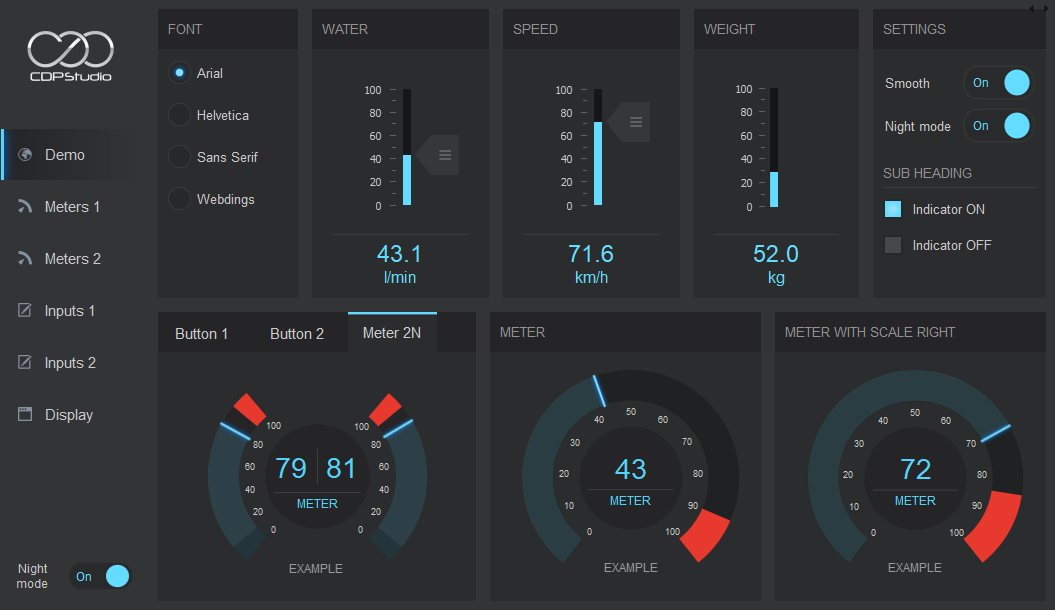
The Theme sets the overall look and feel of the user interface and this can be seen if you toggle the Grey theme on/off. The day and night mode themes are identical except for colour settings and toggling between the general layout, placement of headings etc stay the same.
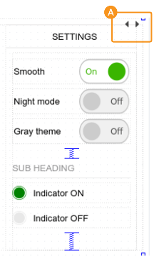
CDP Studio comes with pre-made widgets and these can be extensively styled and have different options that all can be set using the widget properties. In Design mode, select/click on different widgets and examine the property values in the Property-section to the right. To switch between the different pages, click on the small arrows in the top right corner to switch between the pages (Stacked Widgets). You may also push Alt-Shift-R to get a preview of the GUI.
Some of the widgets are connected together via Qt Signal/Slot to exchange values. In Design mode you may push F4 to see graphically how the connections are made. To go back to edit mode again, push F3. A Qt signal is not the same as a CDPSignal, but an internal value transfer from the widget sender to a function in the widget receiver. See Connection Mode.
Tip: A very useful feature is the possibility to save a styled widget or a block of widgets so they can be reused in different projects. To make a reusable styled widget from this example do: In Design mode, select the widget by clicking in the form or clicking in the object inspector to the right. Now, hold down Ctrl-key while dragging the widget to the left and release it in the widget panel. Scroll down to the bottom of the widget panel. The widget is listed at the bottom of the Scratchpad group. Right-click on the name and choose "Edit name" to give it a proper name. This widget is now available for use in custom projects.
When running the example, you may move your mouse-cursor over different widgets to get more information. Many of the widgets have Tooltip to give more description. The tooltip will give the type of widget and possibly describe connections and property used. Most of the widgets have support for common change of theme and font. In addition you may set cdpRouting to connect widgets to CDP values. You will find a more in-depth description of Design mode in the Manual.
Light Theme
Dark Theme
When running the example, to change from light to dark theme, find one of the two Night mode buttons (down to the left, or upper part to the right) and click on it so Night mode becomes On. In Design mode, you can choose theme by clicking on the mainWindow (the Object at the top in Object Inspector, in top right corner), right-click and choose Select theme....
Implementation Details
Menu Buttons
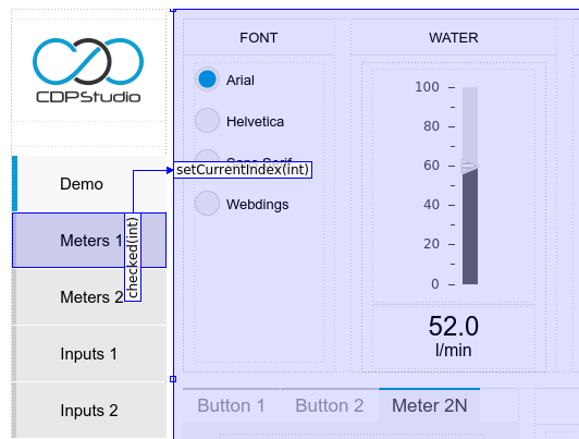
The Menu buttons (to the left in the UI) control which pages to show in the central widget. The central widget has been implemented by using a 'StackedWidget' (named 'WidgetPages' in the object tree). It contains the pages to show. The Menu buttons control the 'WidgetPages' central widget in the following way: Each Menu button has a unique ValueToEmit property value that corresponds to the page index it wants 'WidgetPages' to show. For instance, the 'Meters 1' button has the property ValueToEmit set to 1, and the property checkableByClick is ticked. A Qt Signal/Slot connection is used to trigger setCurrentIndex(int) in 'WidgetPages', so that whenever the 'Meters 1' button becomes selected, setCurrentIndex(1) is called on WidgetPages (since ValueToEmit is 1). This causes the 'WidgetPages' widget to show page 1. The other buttons are set up similarly, but with different valueToEmit values.
Widget Pages
To see the different pages in the 'WidgetPages', in Design mode, the top right corner shows a left and right triangle/arrow close to each other. Clicking either of them goes to either the previous or the next page in the 'WidgetPages' StackedWidget. It is also possible to set the current index of the StackedWidget by typing a page value into the currentIndex property.
Night Mode
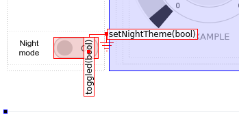
Day mode and Night mode is controlled by the 'Night mode' button in the lower left corner of the GUI. This has been set up using Qt Signals & Slots, so that the NightModeOnOffButton toggled(bool) function is connected to the setNightTheme(bool) in the mainWindow. Whenever toggled() is called, setNightTheme() will be called with the same argument.
Global Font
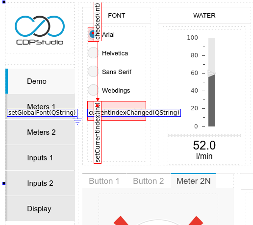
The global font changes are also controlled using 'Signals & Slots'. The 'FontButtonArial' and the other font selection buttons are set up so that the checked(int) is connected to setCurrentIndex(int) in the HiddenFontSelector ComboBox. Each font-button has a different ValueToEmit property, which when clicked, sets the correct index in the HiddenFontSelector ComboBox. The HiddenFontSelector ComboBox is connected to the mainwindow so that when currentIndexChanged(QString) is called, it will cause the mainWindow setGlobalFont(QString) to be called.
Get started with CDP Studio today
Let us help you take your great ideas and turn them into the products your customer will love.