Custom Graphics
Custom Graphics
Examples of custom graphics could be an image showing a company logo, a picture of some industrial site, or perhaps a custom SVG file for styling a slider widget with a different knob and/or rail.
Creating custom SVG graphics to style widgets like the slider requires some knowledge about design tools such as Adobe Illustrator or Inkscape. The SVG files must be structured with named elements as described in the widget class documentation. Pressing 'F1' while having the widget selected in Design mode should take you to the correct documentation. To locate the section about styling, scroll to the top of the class documentation file and click the link named "More...".
Applications that support both light and dark themes might require that the custom images exist in both dark and light versions. This is handled by placing the custom graphics in directories similar to the beginning of the theme paths. For instance, if we want to add a light and dark version of an image named logo.png. We would place the two versions at the following paths depending on our selected themes:
themes/${theme_dark}/pictures/logo.png
themes/${theme_light}/pictures/logo.png
The pictures directory is optional when you are not replacing existing elements in a theme, but using sub-directories is recommended to make files easier to locate.
Custom graphics/images are added to the application by placing them in the Application directory along with the UI file or by adding them in a resource file. Files in the Application directory are deployed along with the other application files while the resource files are compiled into the binary. The first approach must be used if overwriting default files in a theme.
The different widgets have properties for configuring what image to show. File paths are relative to the Application directory or the path given in the resource file depending on where the files are placed.
The CDP Studio Help mode contains more details regarding CDP widgets and how to create custom themes in Themes (SVG).
How to Add Custom Graphics
The simplest way to add custom graphics to a GUI project is to place the files in the Application directory. This ensures that the files are found when working on the GUI in CDP Studio Design mode, deploys the files along with the application, and ensures that they are found by both WebUI and native GUI applications.
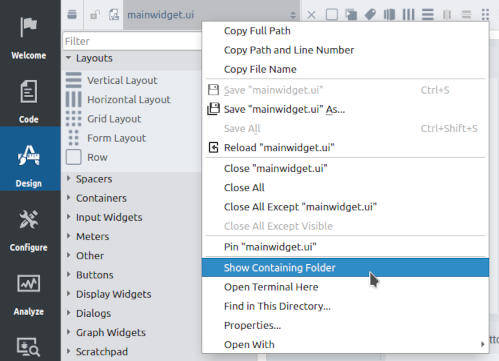
The Application directory contains the mainwidget.ui file and other files that are deployed along with the executable. It can be found by going into CDP Studio Design mode, right-clicking on mainwidget.ui in the upper left, and selecting Show Containing Folder in the context menu.

How to Add Custom Graphics using a Resource File
The following steps show how to add a resource file and custom graphics. This will compile the images into the application/binary file. Note that WebUI applications are not able to load compiled resources. Also, the CDP Studio Design mode might require that the main window widget property named themeRootDir is configured with the location of the images. Due to caching mechanisms in the Design mode, it is usually a good idea to restart CDP Studio when the property has been changed.
Step 1: Adding a Resource File for Custom Graphics
- Enter CDP Studio Code mode, right-click on the application directory and select "Add New...".
- In the dialog that pops up, select Qt and "Qt Resource File" before pressing "Choose...".
- Give the file a name and click "Next".
- Make sure that the file gets added to your project pro and click "Finish".
Step 2: Adding Custom Images to the Resource file
- Enter CDP Studio Code mode and locate the "Resources" directory of your GUI application in the Project tree.
- Right-click the directory and select "Show in Explorer".
- Copy your images to this location. Remember to add the graphics in themes/${theme_light} and themes/${theme_dark} if you wish to have images that change look based on the theme. Replace ${theme_light} and themes/${theme_dark} with the name of the themes you are working on.
- Go back to Code mode and right-click on your resource file. Select "Add Existing Files" to add your images.
Step 3: Using a Custom Image on a GUI Widget
- Enter Design mode as usual and click on the different widgets in the form.
- Ensure that styling is set to SVG and edit the svgFile property.
- The paths to images that are added in resource files are usually prefixed with ":/". This is not necessary when configuring the widgets in CDP Studio as it is handled automatically. To be able to override files in the resources with files on disk, the widgets will first remove the prefix and use that file if it exists. Next, the resource prefix will be added and used if the file exists. Finally, if none of the first two exists, the themeRootDir will be added as a prefix.
Note: properties like svgBorderPixmap, scaledContents, and lockAspectRatio will have great impact on how your image will look and scale. Setting a minimum height on your widget is also a good tip for controlling element size.
Note: that you might have to adjust the form size for the new image to start showing in the form.
Get started with CDP Studio today
Let us help you take your great ideas and turn them into the products your customer will love.