CDP Studio - Design Mode Manual
Introduction
This manual provides an overview of the CDP Studio Design mode and discusses important guidelines regarding GUI development.
The CDP Studio Design mode allows you to visually edit your user interface using drag and drop, and configure graphical elements by adjusting properties from a table. The output will get saved as a human-readable XML file with a .ui extension.
The graphical elements (widgets) that can be added to the form include properties for styling, control features and communication with CDP.
To get help with a specific property, press F1 on the keyboard. It will show relevant information about the property. Scrolling all the way to the top of the page will show a brief explanation about the widget and a link that can be pressed for more information.
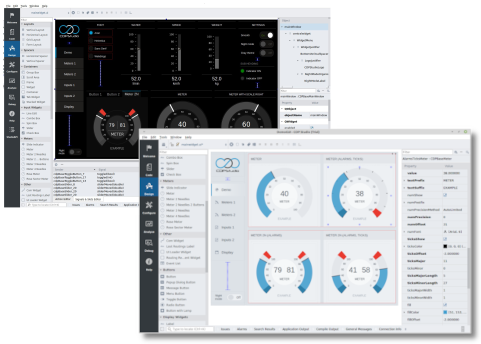
The Simple Meter Tutorial is a good starting point for understanding the different steps in creating a GUI application using CDP Studio.
The GUI Application
The CDP Studio Design mode can be used to create both native and web-UI applications. It is also possible to use wizards to add templates and get a quick start on the GUI project. The GUI Application page provides more details.
Visual Introduction to the Design Mode
The CDP Studio Design mode includes a range of features. Widgets are dragged in from a panel, placed and moved around in the form, and configured using a table with properties.
In addition, we have advanced functionality, like layouts for automatically changing widget sizes and positions when the window size is changed. Special modes where you can connect widgets using something called widget signals and slots, and a preview mode to be able to show and click around in the design without running the application. There is also a scratchpad that enables placing custom elements in the widget box for reuse in other forms.
The Visual Introduction page discusses the different features in more detail.
Widgets
The CDP Studio Design mode includes input widgets, display widgets, containers, meters/gauges, buttons, dialogs, graphs, widgets for communication, debugging, and UI/form loading. With this many widgets to choose from, finding the right one can be a hard task. Visit the CDP Widgets page for an overview and simplify finding the most suitable widgets for the GUI.
Layouts
Layouts are used to position and align widgets. They will ensure that the different widgets adjust their sizes and positions correctly when the window size is changed. The developer can configure which widgets should expand, how much a widget should stretch compared to other widgets, and which should have a fixed size.
There are different types of layouts for arranging widgets vertically, horizontally, or in a grid. In addition, we have a special row widget that will switch the layout from horizontal to vertical on a configurable window width. To better support all types of window sizes, the widgets can also hide or show based on window width by placing them in a container widget. The details of these features are described in How to Create Adaptive GUI.
The visual introduction shows where the layouts are located in the Design mode, while the Simple Meter Tutorial shows an example using a vertical layout.
Connecting Widgets to the Control System
The GUI widgets are connected to the control system (CDP) by configuring routing in widget properties. There are different properties for the different widget features. Some widgets, like the button, can be configured to send both values and messages to the control system.
The widget features that do not have properties for configuring routing, can use dynamic properties for connecting to CDP. It is also possible to connect widget signals and slots to CDP using a special communication widget. Multiple GUI applications can connect the same control system.
See the Connecting Widgets to CDP page for visual guides and details.
Dialogs
The widget named Popup Dialog Button can be used to open form/ui files in separate windows. It has properties to specify the ui file name and features like whether or not the window should be internal or external and movable to different displays. This is done by selecting whether or not the dialog should have a parent.
The dialog form/ui file has lots of properties on its own. The most important ones are properties for animated start, end position and offset, dialog title, and whether or not a top-level window should be transparent or not (translucentBg).
Note that input widgets have special properties for use in settings dialogs. For instance, they can be configured to only send data to the control system when triggered by slot. This can be used to have buttons in the dialog for saving or resetting when the user is done editing. The Container widget can be used to trigger save/reset in multiple inputs.
Virtual Keyboards
The input widgets that accept text and numbers from the keyboard also support virtual keyboards. Depending on the widget type, the developer can choose between a num pad or key pad using widget properties.
Themes
The Design mode supports different themes to completely change the look and feel of the GUI. Though the theme can be changed at any time, both during development and when running the application, it is recommended to select a theme when starting the project. This is because the widgets might have completely different shapes and sizes in the different themes. A design that looks good in one theme might look messy in another.
Always select day and night themes that styles widgets with similar sizes and shapes in both themes.
Open Bridge
The Open Bridge Design Guideline is a free and open resource that draws from ongoing research conducted by multiple academic partners. It combines modern user interface design principles with maritime regulations to deliver a well-tailored user interface design for maritime applications.
The CDP Studio Design mode facilitates Open Bridge (OB) by offering themes in different color palettes. Special OB widgets not available by default in the Design mode can be added to the widget panel using the Scratchpad or copied from OB examples. For further details, please follow the link to the right.
Custom Graphics
Custom graphics/images are added to the application by placing them in the Application directory along with the ui file or by adding them in a resource file. Files in the Application directory are deployed along with the other application files while the resource files are compiled into the binary.
The different widgets have properties for configuring what image to show. File paths are relative to the Application directory or the path given in the resource file depending on where the files are placed.
Custom Widgets
Custom widgets need to be available both in the design mode, to be able to place and configure the widget in the form, and to the application, for it to be able to create an instance of the widget in runtime. This can be solved in multiple ways.
To make a custom widget available in the Design mode we have to create a placeholder as explained on the Custom Widgets page. In short, this is a simple widget, configured with class name and properties idendtical to the custom widget we want to show. The application must be run to test and verify the configured properties.
The simplest way to make a widget available to the application is to add files in the GUI application project along with a custom builder class. This will ensure that the widget is available for the selected target when you build the application. The steps are described on the Custom Widgets page.
Note that an alternative to adding widgets in C++ is to create them in QML.
QML
QML (Qt Modeling Language) is a declarative language for designing user interfaces. The QML elements can include JavaScript code and can be extended in C++.
See Using QML in HMI GUI for an example that combines QML and standard widgets.
Language Support
The CDP Studio GUI Applications have built-in support for translatable user interfaces.
Follow the instruction on the Language Support page to export and import translation files. The language can be selected in GUI using a combo box or similar. Fill it with language names and connect it to the slot named setTranslation in the main window. The connection part is done using the Connection Mode in Design mode.
Reusing Widgets
CDP Studio supports reusing widgets via libraries and scratchpad. Libraries often make sense if you want to create a reusable interface for underlying components in your library.
Security
Once security is configured from Configure mode Security tab, login prompt will automatically appear when GUI application is started. The login prompt can be disabled using loginEnabled property in CDPBaseMainWindow. Read more about different security properties from CDPBaseMainWindow class documentation.
The login dialog can be customized by adding logindialog.ui template to the application using CDP Studio wizards and modifying it. Note that security implementation will search for the predefined objects in logindialog.ui. This means you can move objects around and add more, but you must keep the input widgets with existing object names.
Get started with CDP Studio today
Let us help you take your great ideas and turn them into the products your customer will love.