Visual Introduction
Introduction
The following sections provide an introduction to the CDP Studio Design mode.
The mode is activated only if the GUI application is selected in the Configure mode Project tree.
The Designer Panels
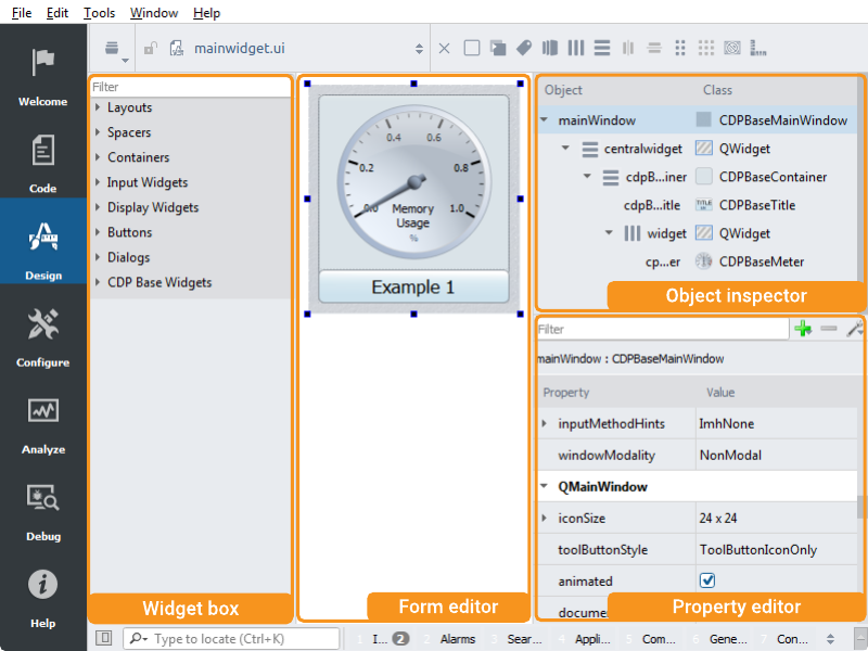
- The form editor provides a canvas where you will create and edit your user interface. Widgets are dragged in from the widget box and their properties are edited in the property editor. The form is stored in an XML formatted file with .ui extension.
- The widget box shows widgets that can be used in your user interface. Note the filter and grouping that can be used to easily find the widgets you are looking for.
- The object inspector shows the object hierarchy and lets you edit the names of the objects, as well as supporting right-click to get the context menu for the object.
- The property editor lets you edit the properties of a widget, such as font, color, etc. Select a property and hit the F1 key to know more about a property.
Layouts
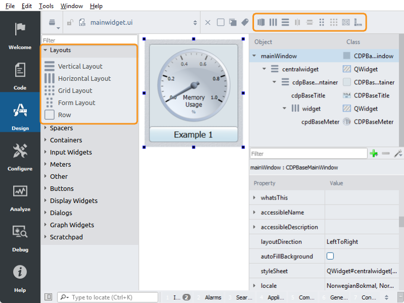
Layouts are used for positioning widgets in relation to each other. A “vertical layout” arranges widgets vertically, while a “horizontal layout” arranges widgets horizontally. A “form layout” lays out its children in a two-column form, while a “grid layout” lays out its items in any number of rows and columns.
Sometimes it can be awkward to put a widget in the right position in a layout. A useful trick is to use the property editor to add some margin where the new widget is to be put. The margin can be removed afterwards.
Read the How to Create Adaptive GUI and Using Layouts in Qt Designer for more information.
Widget Configuration
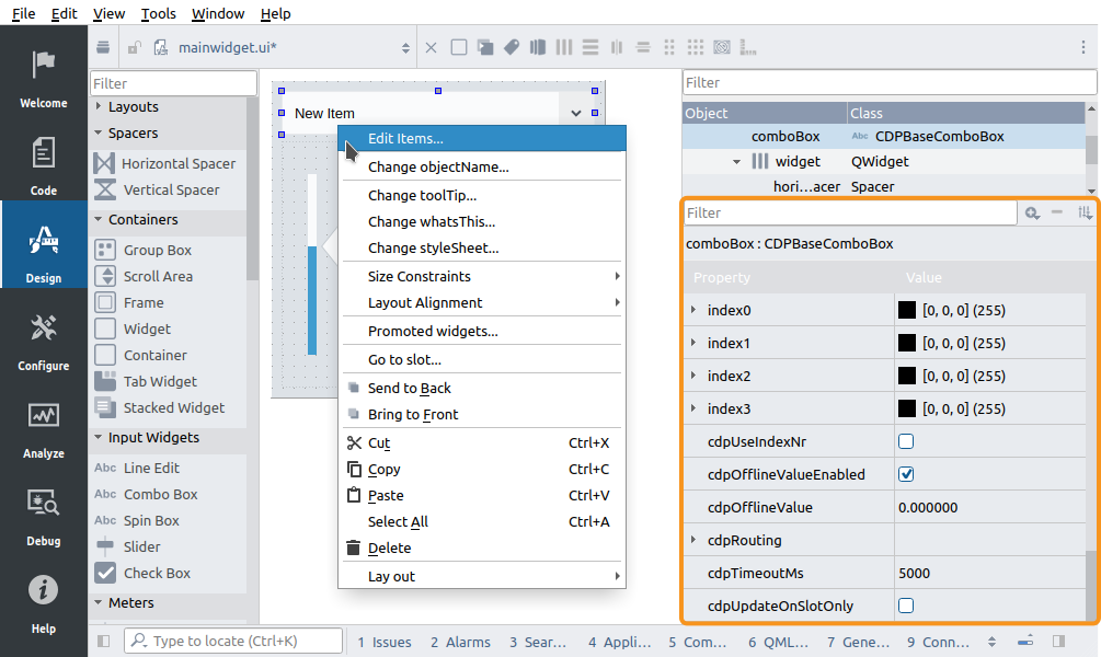
The widget configuration is usually done using the property editor/panel. However, some dynamic functionality, like the items of a combo box, is often edited using a separate dialog. Such dialogs are often launched from the widget context menu. For instance, to edit the items of a combo box, right-click on the widget in the form and select Edit Items... from the context menu.
It should be noted that some styling properties, like the fill color of a meter, can be changed both using SVG files and by properties. The properties will override the SVG styling if the property is listed after the property that sets the SVG file. Also, such styling properties are likely to get overridden by a theme change unless the widget has a property for not updating all styling features by SVG.
Connection Mode
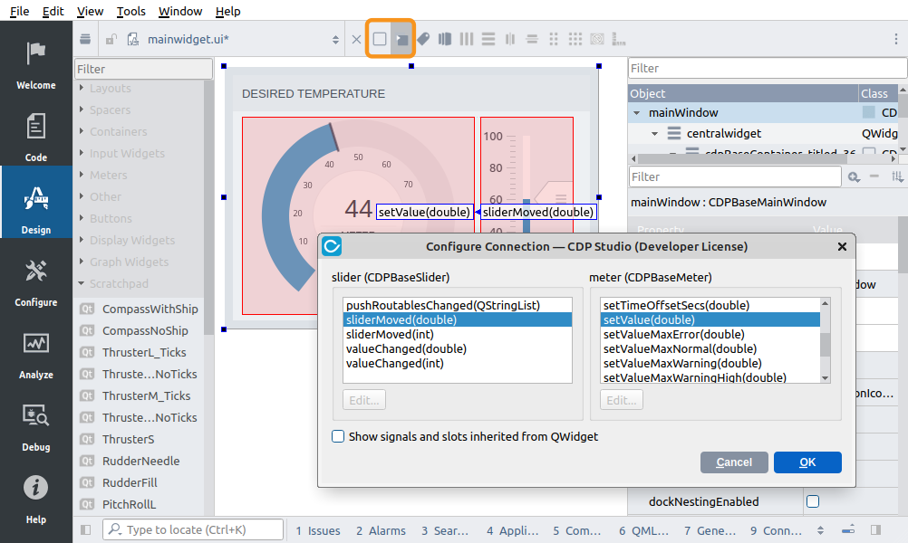
The Design mode has a special connection mode that makes it possible to connect widgets within the form. For instance, we can connect a slider to a bar to make it control the bar fill. This is useful while prototyping and wanting to see how widgets behave without connecting them to CDP, but not recommended in the final design. Logic should rather be placed in the control system (CDP Components) as GUI signal and slot connections complicate the design and makes it harder to read and maintain. Also, copying widgets will not copy the connections and is thus error-prone.
The sending mechanism is called a widget signal while the receive function is called a widget slot. To be able to connect a signal to a slot their type must match.
Connections are made by first entering connection mode. The mode is toggled on and off by pressing F4 and F3 or by selecting mode in the toolbox above the form. We can now click and drag connections between widgets. A click, drag, and release will open a dialog for selecting which widget signal should be connected to which widget slot. A widget signal is not the same as a CDPSignal, but an internal value transfer from the widget sender to a function in the widget receiver. In the above image, we have connected sliderMoved to setValue. To test that the connection works and that the slider actually controls the bar we can enter preview mode as explained in the following section.
Note: The Com Widget is a special widget that can be used to connect widgets to more CDP communication objects than the standard routing properties can provide.
Preview Mode
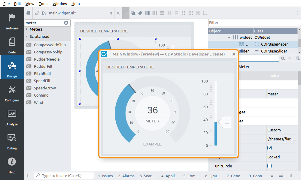
The preview mode is useful when prototyping and designing. Press Alt+Shift+R, and the form will show in a separate window similar to a running application. Communication with CDP will not be enabled, but global features like theme changing, fonts, and signal/slot connections will work similarly to running the actual application.
Scratchpad
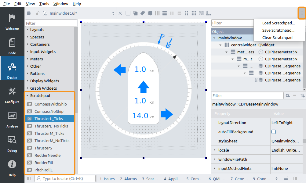
The Design mode provides a scratchpad feature that allows to add custom elements in a separate category in the widget box. It can be filled with any widget currently displayed by dragging it from the form and dropping it onto the widget box. These widgets can be used the same way as any other widgets but can also contain child widgets.
To rename or remove a widget from the scratchpad, right-click the widget and select an action in the context menu.
The scratchpad can be saved and loaded from a file, using the dotted button in the upper right corner of the Design mode. This enables having separate scratch pads for different projects and tasks.
Get started with CDP Studio today
Let us help you take your great ideas and turn them into the products your customer will love.