Themes
Themes

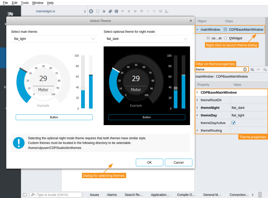
Global features like themes are configured and controlled by CDPBaseMainWindow. Select it in the Object Inspector or by clicking it in the form and write theme in the property editor filer. This will show properties displaying the names of the night and day themes, a check box for toggling which theme should be active, and properties for remote control and theme location.
The light and dark themes are also selectable in a dialog that lists available themes along with preview images. It can be launched by right-clicking CDPBaseMainWindow and pressing "Select Theme..." in the context menu.
The various themes can be quite different and the user might want to place contents differently depending on the selected theme. Hence, it is important that a theme is selected at the beginning of a project and not the other way around. Also, if wanting to be able to switch between light and dark colors (day and night mode) in run time, select two themes that have similar widget shapes. This will provide the best result.
The themes named, cdp_light and cdp_dark, are a bit different than the rest, as they are designed to have main titles at the bottom of the containers. Combining one of these with a theme that is designed to have titles at the top will probably not look that good.
Themes and other global features can be toggled by buttons in GUI using widget signal and slot connections. For instance, drag in a CDPBaseToggleButton, press F4 and drag a connection from the button to the main window. Select toggled(bool) in the left list (signals) and setDayTheme(bool) or setNightTheme(bool) in the right (slots), based on what is active at startup. Pressing F3 brings back the normal development mode.
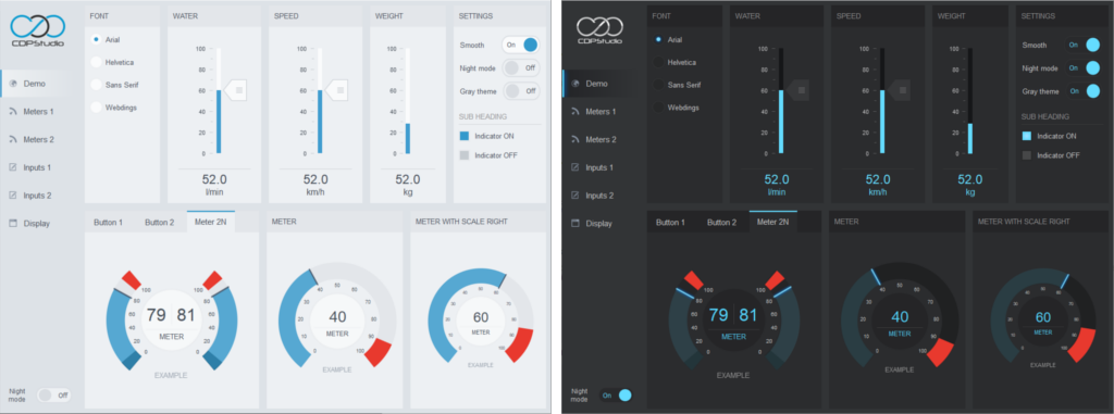
Example showing the light and dark versions of the flat gray CDP theme:

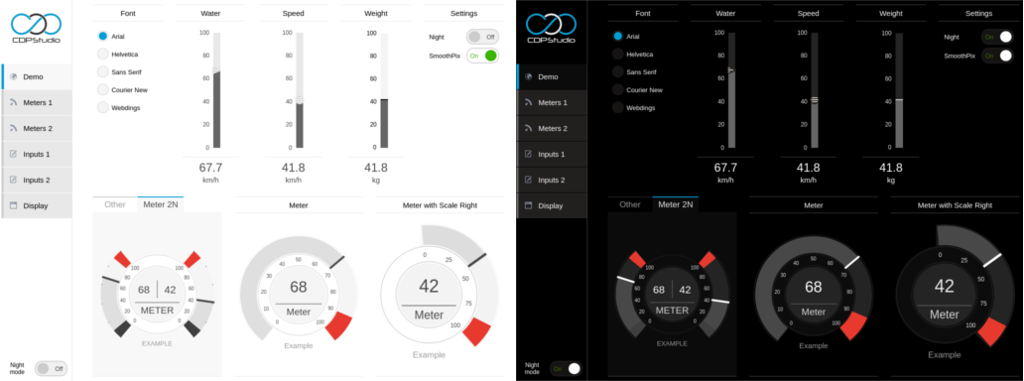
Example showing the light and dark versions of the flat CDP theme:

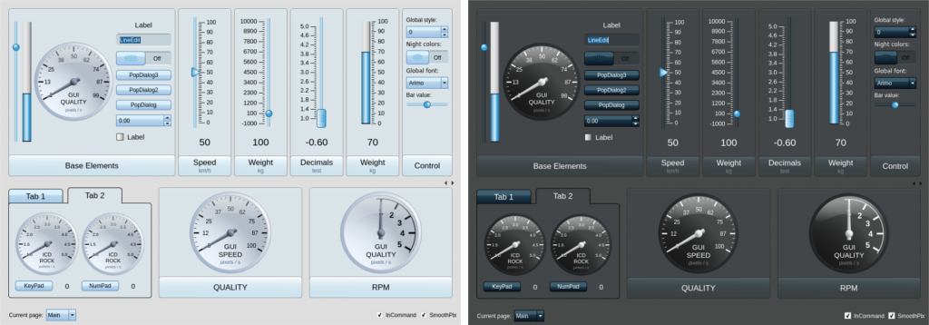
Example showing the light and dark versions of the first CDP theme:

Global Features
Global features like theme, font, style, time, and sound are configured and controlled by the CDPBaseMainWindow. This is the root object in the main UI file, located at the top of the object list in the Object Inspector. Select it by pressing it with the mouse and have a look in the Property Editor for available feature properties.
Some features, like theme, sound, and time offset have properties for configuring routing, while others, like font and sound, require widget signal and slot connections as described in the section regarding themes.
Note: Global features that do not have properties for remote control can still be controlled externally as long as there are widget slots supporting it. This can be done using the Com Widget. Drag it into the form and connect it to the main window using widget signal and slot connections.
Get started with CDP Studio today
Let us help you take your great ideas and turn them into the products your customer will love.