Button Basics 3: Page Navigation
Introduction
This example is part of the Button Basics series, which also includes Communication and Visual Feedback. Together, the examples demonstrate the fundamental ways buttons are used in CDP Studio UI.
This example focuses on page navigation, showing how buttons can control different pages of a Stacked Widget using internal connections, menus, popup dialogs, and sub-menus. The four tabs demonstrate the most common navigation techniques used in real applications.
The entire series implements the concepts from the original Button Examples tutorial, presenting them as clear, runnable examples inside actual applications.
Internal Connections
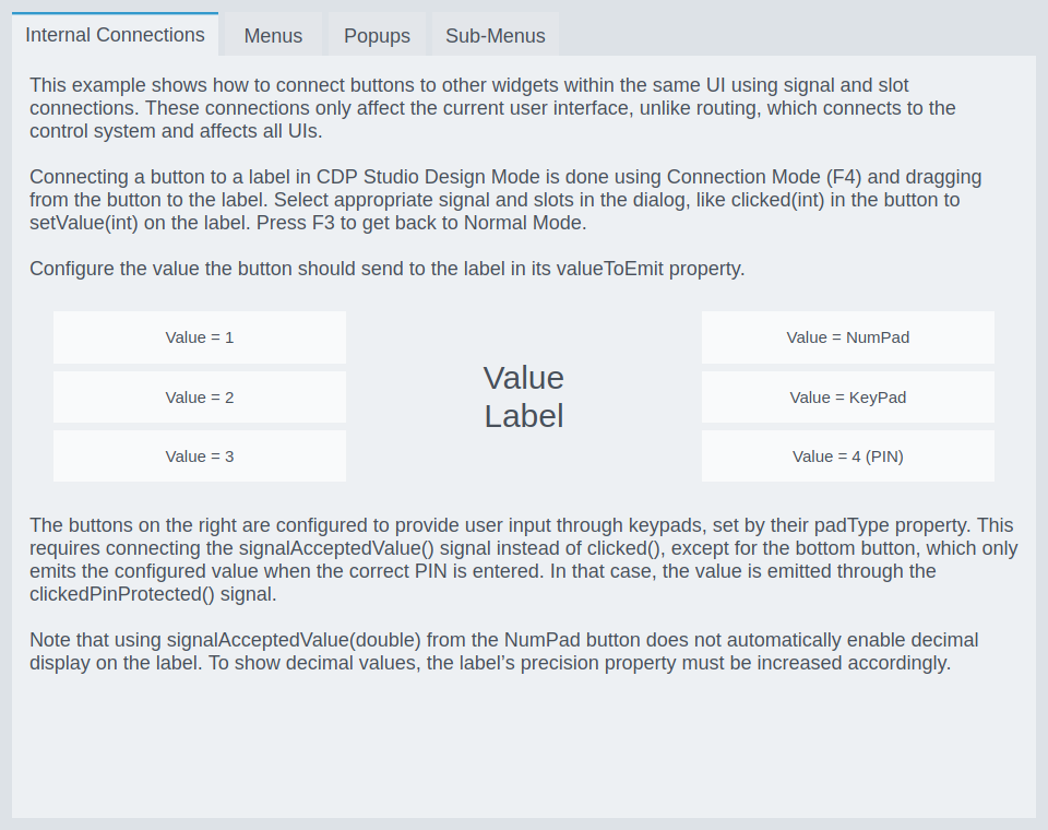
This example shows how to connect buttons to other widgets in the same UI using signal–and-slot connections. Internal connections update only the currently displayed GUI, keeping each UI instance independent. This is different from routing, which synchronizes the state across all UIs connected to the control system.
Buttons are connected to a label using Connection Mode (F4) by dragging from the button’s signal (e.g., clicked(int)) to the label’s slot (e.g., setValue(int)). The valueToEmit property determines the value each button sends.
The buttons on the right demonstrate keypads and PIN input, configured with the button’s padType. Depending on padType, a keypad emits its value through signalAcceptedValue() or, in the case of PIN pads, through clickedPinProtected() when the correct PIN is entered.
Menus
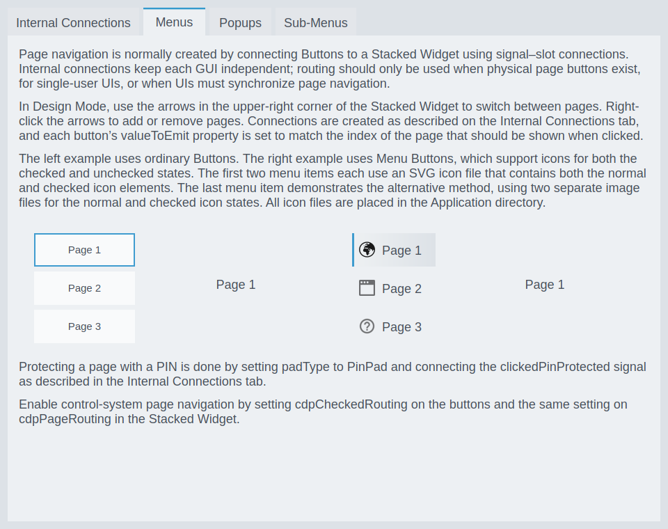
This example shows the most common way to implement page navigation using Buttons and a Stacked Widget. Buttons are connected internally using signal–slot connections, and each button’s valueToEmit matches the index of the page it should display.
In Design Mode, the arrows in the upper-right corner of the Stacked Widget allow switching between pages; right-clicking them lets you add or remove pages.
The menu buttons:
- The left example uses ordinary Buttons.
- The right example uses Menu Buttons, which support custom icons for both checked and unchecked states.
- The first two Menu Buttons demonstrate using an SVG file containing both icon states.
- The last Menu Button demonstrates using two separate image files for the states.
- All icon files are placed in the Application directory.
Pages can be protected with a PIN by setting the button’s padType to PinPad and connecting the clickedPinProtected() signal, allowing access only when the correct PIN is entered.
To enable control-system navigation, configure cdpCheckedRouting on the buttons and use the same routing setting on the Stacked Widget’s cdpPageRouting.
Popups
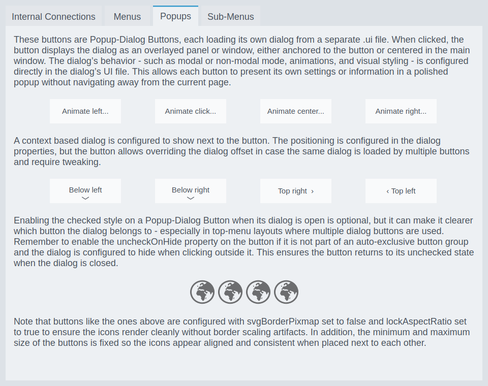
This example demonstrates Popup-Dialog Buttons, each loading its dialog from a separate .ui file. When clicked, the button displays the dialog as an overlayed panel or window, either anchored to the button or centered in the main window. The dialog’s behavior—modal/non-modal, animations, and visual styling—is configured inside the dialog’s UI file.
Enabling the checked state on a Popup-Dialog Button while its dialog is open is optional, but helps indicate which button the dialog belongs to - especially in top-menu layouts. Remember to enable uncheckOnHide when the button is not part of an auto-exclusive button group, so the button returns to its unchecked state when the dialog hides.
The example also shows how svgBorderPixmap = false and lockAspectRatio = true help ensure clean rendering of icons, and how fixed minimum/maximum size keeps popup-related icons aligned.
Sub-Menus
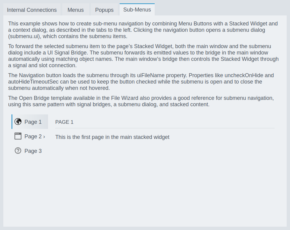
This example shows how to build sub-menu navigation by combining Menu Buttons, a Stacked Widget, and a submenu dialog. Clicking a navigation button opens submenu.ui, which contains the submenu items.
To forward submenu selections to the main window’s Stacked Widget, both the submenu dialog and the main window include a UI Signal Bridge. The submenu bridge forwards its emitted values to the main window bridge automatically using matching object names. The main window bridge then sets the page index through a signal–slot connection.
The Navigation Button loads the submenu via uiFileName. Properties such as uncheckOnHide and autoHideTimeoutSec keep the button checked while the submenu is open and close the submenu when not hovered.
The Open Bridge template, available in the File Wizard, also provides a strong example of submenu navigation using this same pattern.
How to Run the Example
To run the example from CDP Studio, open Welcome mode and find it under Examples. Next, in Configure mode right-click on the system project and select Run & Connect. See the Running the Example Project tutorial for more information..
Get started with CDP Studio today
Let us help you take your great ideas and turn them into the products your customer will love.