Button Basics 2: Visual Feedback
Introduction
This example is part of the Button Basics series, which also includes Communication and Page Navigation. Together, the examples demonstrate the fundamental ways buttons are used in CDP Studio UI.
This example focuses on visual feedback, showing how buttons can reflect remote states, display distinct visual styles, and present markers or indicators. The four tabs demonstrate the most common visual-feedback techniques used in real applications: checked state, checked styling, styles, and markers.
The Checked Styling and Styles examples also include custom SVG files added to the project, structured to demonstrate multiple visual states. These illustrate how users can add their own graphic and define complete visual-state sets for their buttons.
The entire series implements the concepts from the original Button Examples tutorial, presenting them as clear, runnable examples inside actual applications.
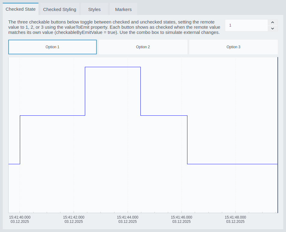
Checked State
This example shows how checkable buttons can display their checked and unchecked state based on a remote value. Each button uses the valueToEmit property to write a specific value to the control system (1, 2, or 3). A button automatically appears checked when the remote value matches its own, using checkableByEmitValue = true. A spin box lets you simulate external changes so you can see how the visual state updates in real time.
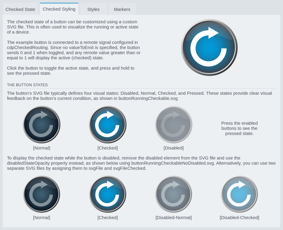
Checked Styling
This example demonstrates how the checked state of a button can be customized using SVG styling. A single SVG file defines separate graphics for normal, checked, pressed, and disabled states. When connected to a remote value via routing, the button switches its appearance dynamically to reflect the running or active state of a device.
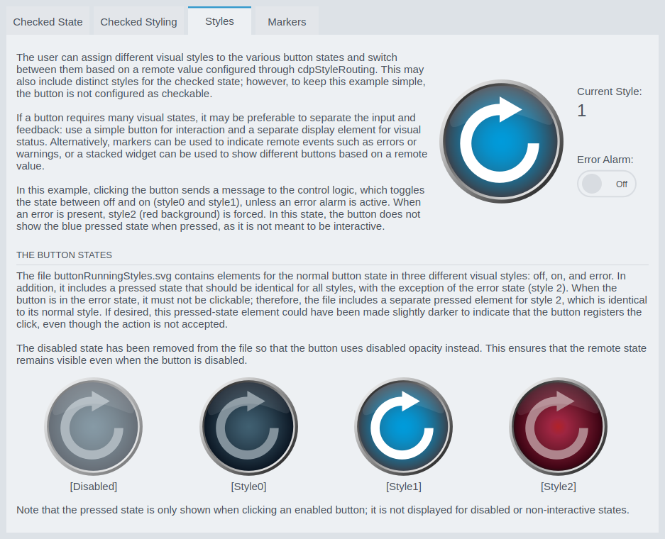
Styles
This example shows how a button can switch between multiple visual styles based on a remote value, using cdpStyleRouting. The button cycles between style 0 and style 1 when clicked—unless an error is active, in which case style 2 (red) is forced. This demonstrates how to combine normal operation with error signaling. The accompanying SVG file includes versions of the button graphics for each style and a pressed version for allowed states.
Markers
This example demonstrates how to use button markers (also called bubbles) to show alarms, warnings, counts, or status indicators. Each button supports up to two markers, configured with the CDPBaseButtonMarker properties. The markers can display icons or numeric values, and their size, position, and offset can be fully customized. The lower example shows an alarm marker displaying the number of active alarms, which updates dynamically as alarms are toggled.

How to Run the Example
To run the example from CDP Studio, open Welcome mode and find it under Examples. Next, in Configure mode right-click on the system project and select Run & Connect. See the Running the Example Project tutorial for more information..
Get started with CDP Studio today
Let us help you take your great ideas and turn them into the products your customer will love.