Creating a Dynamic GUI
Introduction
This example demonstrates how to create a dynamic GUI that adjusts its elements in real time, depending on the number of matching objects/nodes found in a customizable target routing. It also illustrates how to change this target while the UI is active, allowing its graphical elements to display various sub-groups of control objects.
These dynamic features are particularly valuable when designing GUIs with an uncertain number of control objects or when you need to display numerous identical control objects. In such applications, dynamic widgets will save development time and prevent the need for future updates if additional control objects are added to the application.
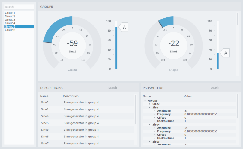
The example application includes six components, grouping a set of Sine components. In the UI, a group is selected by clicking in the list to the left making the widgets show the Sine control components:

See Creating a Dynamic GUI for Showing Dialogs for an additional example showing dynamic UI loading. The dialog example uses the Node Container and demonstrates how relative routing can be used within other relative routing containers, to achieve loading UI files that load other UI files.
GUI Overview
The GUI consists of two separate UI files, mainwidget.ui and node.ui.
The mainwidget.ui UI file contains the main window of the GUI. It has a Node List in the side menu to the left for selecting the component group, while the main contents area contains three node widgets for showing the Sine control objects:
- Node Container for showing and connecting the node.ui file for every Sine it finds in the selected group. The node.ui file displays the Sine Output using a meter and provides a slider for controlling its amplitude. Note that the container is placed within a Scroll Area widget to ensure that it can handle any number of Sine components. Notice that the scrollbar is only visible when the container displays more than two elements.
- Node Table for showing a table of descriptions for every Sine it finds in the selected group.
- Node Tree for showing a tree of parameters for every Sine it finds in the selected group.
The Node List on the left is connected to the container, table, and tree widgets using widget signal and slot connections. This is done as described in the Design Mode Manual, connecting the signal named selectedNodeFullPathChanged(QString) in the list to the setCdpTargetRouting(QString) slot in the widgets. The search fields are configured the same way, connecting textChanged(QString) to setFilterString(QString) in the widgets.
The example contains one graphical element that is not in the standard theme, the SVG that styles the slider in the node.ui file. The only difference compared to the standard slider SVG is the letter 'A' added to the slider knob.
How to Run the Example
To run the example from CDP Studio, open Welcome mode and find it under Examples. Next, in Configure mode right-click on the system project and select Run & Connect. See the Running the Example Project tutorial for more information.
Get started with CDP Studio today
Let us help you take your great ideas and turn them into the products your customer will love.