Creating a Dynamic Map GUI
Introduction
This example demonstrates how to create a dynamic GUI map that adjusts its overlay elements in real-time, depending on the number of matching objects/nodes found in a customizable target routing. Clicking the different elements on the map opens a dialog for adjusting element properties such as rotation, size, position, and type.
The following key features are used in the example:
- How to configure a Node Container with a map image and movable node elements.
- How to use relative routing in the UI file loaded by the Node Container to link UI elements with node components.
- How to open a settings dialog by clicking on map elements using a widget signal and slot connection.
- How to use a Picture Sequence as a container, allowing the inclusion of widgets like the Stacked Widget, enabling the display of different images based on node configuration.
- How to resize, move, and rotate picture elements on the map.
- How to configure the tooltip of the map elements using dynamic property routing.
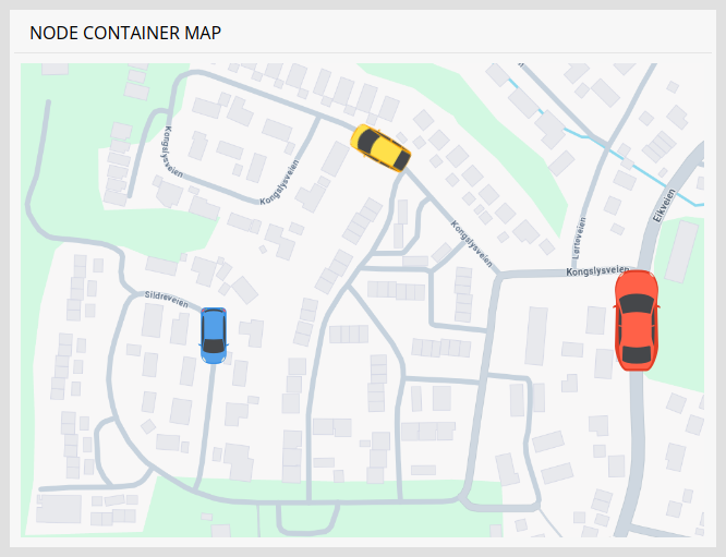
The map picture in the example is a screenshot taken from Google Maps while the three car images are Designed by Freepik.
GUI Overview
The GUI is composed of three separate UI files, mainwidget.ui, node.ui, and settings.ui.
Main Widget (mainwidget.ui)
The mainwidget.ui file defines the main window of the GUI. Its central component is the Node Container, which dynamically displays and connects the node.ui file for each Node detected in the Nodes component of the control application.
To allow nodes to be loaded and displayed as movable elements on the map, a Picture Sequence widget is used both as a child container within the Node Container and as the base class for elements in the node.ui file.
Node UI (node.ui)
The node.ui form file is based on the Picture Sequence class. It is configured with routing to control the position and size of each node on the map. Rotation, however, must be applied directly to individual car picture elements, as the Picture Sequence only rotates the image it is configured with, and not its contents.
Each car image within the Stacked Widget includes a hidden button that opens the settings.ui dialog when clicked. This interaction is managed through a signal and slot connection, where the picture's clicked() signal is connected to the button's animateClick() slot. You can use the Object Inspector in CDP Studio Design mode to select the hidden button and modify its properties. Additionally, each car image has a dynamic property called toolTipRouting, which displays a number when the mouse hovers over the element.
Settings Dialog (settings.ui)
The settings.ui file is loaded when a car element is clicked. This dialog contains input widgets that allow users to update node parameters, including rotation, position, type, and size.
Logic Overview
The NodeMapApp application includes a Nodes component, containing three Node components. Adding more Node components would automatically display them on the map without requiring further changes to the GUI. Note that the addition and removal of nodes could also be handled from the GUI using database functionality, as demonstrated in Creating a Database GUI.
The Nodes component includes four parameters that define the minimum and maximum latitude and longitude of the map image. These parameters are used to correctly position each element on the map, by providing a latitude and longitude for each Node. Each Node contains a MapFromGPS component that converts the latitude and longitude values into relative positions between 0 and 1. While relative positions could be provided directly, this implementation demonstrates how to perform the conversion if the position is received from a GPS device.
Currently, the parameters are stored in the Node component using Parameters, which automatically saves new values to an XML file on every change. This ensures that the positions are preserved the next time the GUI is opened. However, in an application where positions are received periodically from a GPS device, it would be more efficient to use Signals for the positions, as this would avoid the need for frequent saving to disk.
How to Run the Example
To run the example from CDP Studio, open Welcome mode and find it under Examples. Next, in Configure mode right-click on the system project and select Run & Connect. See the Running the Example Project tutorial for more information.
Get started with CDP Studio today
Let us help you take your great ideas and turn them into the products your customer will love.