Creating GUI with Custom Graphics
Introduction
This example demonstrates how to use custom styling files in a GUI to change widget appearance, add alarm states, and change widget style order. The styling files include CSS, SVG, and separate form/UI files to show on top of containers.
The different pages in the GUI cover the following topics:
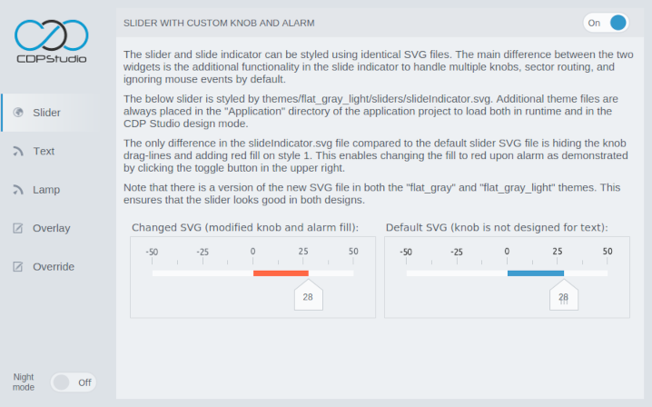
- The Slider page shows a slider styled using a custom SVG file, sliderIndicator.svg. The SVG is based on the default slider SVG with only two modifications: drag-lines are removed from the knob element and red fill is added on style
1to enable switching to red color upon alarm. - The Text page shows different methods for switching text color from normal to red. It covers how to do the switching using a Stacked Widget and how it can be done using a CSS file.
- The Lamp page shows how to control a lamp between normal and red colors using values
0and1. One example shows how to do it using a Stacked Widget and the other uses a custom SVG file, lampRed.svg. The solution with the custom SVG is also discussed in the tutorial named How to Create a Custom Lamp Using SVG Styling. - The Overlay page shows how the overlay feature can be used to show a separate form above the content of a container. This feature is useful for showing alarm states or loading indicators while waiting for control system actions.
- The Override page shows how to override the default styling on all buttons in a theme. This is done by placing a modified SVG file in the GUI application on the same path and with an identical name as the default button SVG file.
- The different pages in the GUI include texts with further details.
CSS Styling
The red text on the Text page is styled using CSS styling. Such styling can be set directly on the text, using the styleSheet property, or in a CSS file with the file path provided in the cssFile property. To use the first approach we need to set the stylingType property of the Label to NoFile. Setting stylingType to CSS will enable styling by CSS file. This option is usually preferred as it enables using different styling in different themes as demonstrated in alternative 2 on the Text page.
The label in alternative 2 on the Text page is styled by value.css, containing the following CSS code:
CDPBaseLabel[widgetStyle="0"]
{
 color: #48505a;
 font-size: 24px;
}
CDPBaseLabel[widgetStyle="1"]
{
 color: #ff6845;
 font-size: 24px;
}
In short, the above code targets CDPBaseLabel widgets and will use the font size and color from the first or second block depending on the widgetStyle property value. Most other properties will not trigger a styling refresh in runtime and cannot be used for such checks in CSS.
The above code can also be set directly in the styleSheet property of the label, but this would set the above colors no matter what theme is selected.
Child Widgets
Setting CSS styling on a container widget, like the Container, will set the styling also on its child widgets (widgets placed within the container). This is useful when wanting multiple widgets to have identical styling, but must be done with caution to avoid styling elements that should have a different style.
A good example demonstrating a potential styling inheritance problem is the styling of the overlay.ui file used on the Overlay page. The overlay.ui file is based on the Container widget, also called CDPBaseContainer. It is configured with stylingType set to CSS and the cssFile property set to themes/flat_gray_light/backgrounds/overlay.css. The styling file contains only one line to set a semi-transparent background that will tone down the content on the Overlay page when the overlay is showing:
background: rgba(237, 240, 243, 0.8);
This means that all child widgets that do not provide a background will also get this background, and as the color is semi-transparent, such children will be less transparent than their parents. To avoid this problem, the widget containing the loading indicator is styled with a styleSheet that sets the background transparent:
background: transparent;
SVG Styling
Styling by SVG allows using any shapes and colors in the widget design. Usually, the default theme files are sufficient to create a GUI, but as shown in the current example, creating or modifying existing theme files can add value to the design by highlighting important states like alarms.
The second lamp on the Lamp page in the current example is styled by an SVG file named lampRed.svg. How the file was created and added to the project is discussed in How to Create a Custom Lamp Using SVG Styling. This tutorial is also useful for understanding how to create a custom slider SVG as shown on the Slider page. The main difference compared to the lamp example is the different structure and names on the SVG elements.
Visit the CDP Widgets Themes (SVG) page for more details regarding themes and custom SVG design.
How to Run the Example
To run the example from CDP Studio, open Welcome mode and find it under Examples. Next, in Configure mode right-click on the system project and select Run & Connect. See the Running the Example Project tutorial for more information.
Get started with CDP Studio today
Let us help you take your great ideas and turn them into the products your customer will love.